Ask Paper Doll: Should I Organize My Space and Time with Color?
This is part of a recurring series of Ask Paper Doll posts where you can get your burning organizing questions answered by Paper Doll, a 20-year veteran professional organizer and amateur goofball.
Dear Paper Doll:
It’s only January and I’m already at a loss for motivation. I’ve been thinking about using color to organize my office and maybe my calendar, but the more I look at my options, the more overwhelmed I get. How can I organize by color and not constantly be tinkering with my systems and remembering what color goes where?
Signed,
Feeling grey with a case of the blues
Grey sky, grey streets, grey mood? Even if we weren’t in the second winter of a pandemic, January is a tough month to feel sparkly. We’re still nine weeks away from Daylight Saving Time, so our late afternoons are dark and gloomy. Plus, after the ongoing glow of holidays from late November through New Year’s Day, of course you’re feeling a loss of spark.
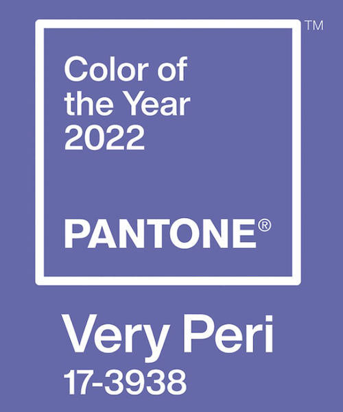
And yes, color is a great way to pump up the mood. If color weren’t so vital, Pantone wouldn’t be known worldwide for coming up with its color of the year. By the way, Paper Doll is a huge fan of this year’s color, Very Peri.
But organizing by color and organizing with color can be very different things.
ORGANIZING BY COLOR
Some people are enthusiastic about using color to organize everything in their homes, offices, and lives. Maybe they have a signature color that serves as a personal brand; others believe in color-coding and sorting everything by hue. Paper Doll isn’t necessarily keen on that. Using color to decide where something goes and with which it is grouped depends on the situation.
Organizing clothing or shoes by color? Sure. Imagine you have all of your long-sleeved shirts hanging in the closet, in roughly ROY-G-BIV color order, or group all your black pumps together, then the blue, then the red, and so-on within your collection of heels.
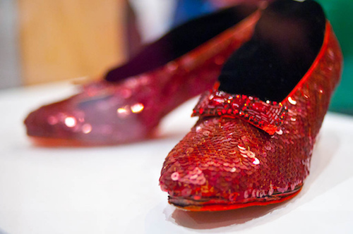
This will make it easy to recognize you’ve tipped the scale toward full-on goth when you’ve got 17 black turtlenecks, or may be mistaken for Dorothy if most of your shoes are ruby red. Sorting and ordering your clothes and shoes by color makes sense, but probably as a secondary sorting characteristic within clothing/shoe types.
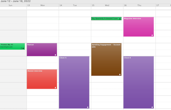
Organizing your calendar by color? Absolutely! Whether you grab a selection of pretty markers to fill in your paper planner (medical appointments in red, billing or tax dates in green, social events in purple) or use the settings in Outlook, Gmail, or any other digital calendar, you can color-code to your heart’s delight.
And the best thing? If you select the wrong color, you don’t need white-out or an eraser to fix it. One little click, and you’re back in business!
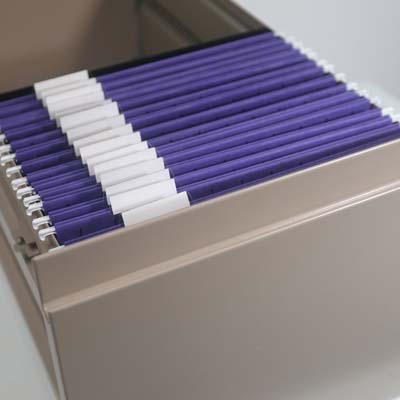
Organizing files by color? Mayyyyyyyybe. I hate to sound coy, but the effectiveness of a system based on color-coding files depends on the level of commitment of the user.
In the abstract, it can be great to organize your files (either tabbed folders or hanging folders) by color. Figure out what your overarching categories are, and assign colors to those categories, whether in your reference or action files. For example:
- Red folders — Urgent tasks or information you always need to get your hands on in a hurry
- Green folders — Financial information related to taxes, payable accounts, and investments
- Blue folders — Planning, like for vacations or work projects
- Yellow folders — Client information or class materials
- Purple folders — Creative tasks
and so on. Color (as we’ll see below) stirs emotions, creates enthusiasm and motivation, and triggers action. What could be better?
The problem isn’t with the system, per se, but with the users. If you let yourself run out of yellow folders just as you sign on a new client, what will you do? Are you likely to order new folders in that color scheme right away? If so, you’re set. If not, you may let a pile of papers related to that client languish in the corner of your desk, risking them getting mislaid or lost.
Plus, keeping many different boxes of colored tabbed folders can be expensive and get out of balance quickly. You may use three times as many purple folders as red ones and your red box may sit year after year, mostly untouched.
If you want to embrace color, there are a few other options beyond a full-on color-coding assault. You could:
- Pick your favorite color, and use those tabbed folders exclusively.
- Start with just two or three of your most used categories and pick colors to define each of those. You’ll still be using color as a sort of trigger or label, as above, but you won’t be going “whole hog,” at least not at the beginning.
- Use plain manilla tabbed folders, but pick a beloved color for hanging folders. (Because hanging folders hold tabbed folders, and can generally accommodate three-in-one, we don’t run out of them as quickly.) Traditional olive/army green hanging folders aren’t likely to cheer anyone up, and using a fun hanging folder uniformly through your filing system will brighten your mood without requiring you to keep up with a complex system.
(These purple Smead hanging folders are bright and bold, and are available in most Big Box stores and at Amazon for $17.89 for a box of 25.)
Organizing your spices by color? How experienced a chef are you that you could catch yourself before you added a visibly similar (but wrong) spice to a recipe? Ground nutmeg, cloves, and cinnamon look alike; but would you want to risk grabbing the wrong one and making iced nutmeg rolls or clove-raisin coffee cake?
Are you willing to mistake similarly-red cayenne pepper for paprika? Perhaps it’s better to group spices by the categories of usage (baking tasks vs. preparing meat/vegetables, etc.). SpiceAdvice has a nice Quick Reference Spice Chart sorted by usage categories.
Organizing your books by color? Oh, gracious. This question has stirred quite a bit of controversy over the last few years. I mean, there’s this person:
I feel like coordinating books by color is one of those things you either love or are wrong about. pic.twitter.com/U6GfIZLgnQ
— Jennifer Wright (@JenAshleyWright) July 15, 2020
I’d take umbrage, but I’m too busy worried about how cold her legs must be.
And then there’s Clea Shearer and Joanna Teplin from the Netflix program Get Organized with the Home Edit. They’re known for their passion for color-coding, and they did that with a few bookshelves on their show. But they were children’s books, and let’s face it, the way tiny humans pull books off shelves, it’s not like alphabetized books are going to stay that way. (Their background, at the above link, shows a full set of bookshelves for grownups arranged by color. I’m looking around for my fainting couch.)
Magazines have been rife with headlines in favor of organizing books by color. For example, Jezebel ran with a piece called Sorry, Color-Coded Bookshelves Look Good, while Slate stood up for the design-oriented folks with Arranging Your Books By Color Is Not a Moral Failure.
Of course, in this highly competitive media market, every online magazine’s job is to stir controversy and curry clicks. Thus, I suspect these headlines recognize that those of us who read may care more about the content of our books than using them as decor and are trying to drive some righteous indignation clicks to their sites.
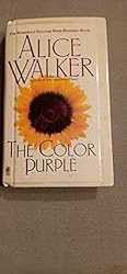
But Paper Doll stands firmly in the NOPE category on organizing books by hue. The color of a book’s cover is about marketing; it was almost certainly chosen by a marketing team based on the designs in fashion for that genre during that season. The color may not even have been approved by the author or seem to make sense. I mean, even early versions of Alice Walker’s The Color Purple didn’t have a purple book cover or spine!
 I’m a practical person. I believe that function should always come before form. A gorgeous outfit that doesn’t cover all your fleshy bits and gives you frostbite? Nuh-uh. A bookshelf that requires you to remember the color of the cover vs. letting you just walk over to peruse the category (fiction? organizing? recipes?) or authors? I can’t countenance that.
I’m not saying you can’t do it; I’m saying I can’t advise it.
And that’s because, as a professional organizer, my role is to help you live a more organized and productive life. Sure, I’ll leave your space looking better than it did before, but my reason for being in your space is to leave it working better than it did before.
ORGANIZING WITH COLOR
So, what’s the difference?
Organizing by color requires creating a system. With clothes or shoes, it might just be ROY-G-BIV and keeping things in order. When you put away your clothes, as you approach with a freshly-laundered shirts on hangers, you’ll be able to put away each item in the general color order. It’s your closet, so you don’t have to be too persnickety unless Vogue is coming to do a photo layout of your walk-in, in which case, good for you!
With file folders, as described above, organizing by color requires a stricter system. In effect, you’re deciding, up front, what all of your categories will be and assigning colors to those categories. You have to be willing to stop, each time you create a folder, to consider what category the contents of the folder belong to, and select that color every time. If you’re comfortable with that, then you have my blessing. I just don’t want to see you get stressed out.
You also have to be relatively sure that you’ll “feel” this association going forward (unless you’re just having fun and don’t care whether there’s a cognitive connection between your colors and your categories); if you soon realize that you hate the color orange but have assigned orange to your accounts payable, you might stop filing your paid bills or (eek!) avoid paying them altogether.
Organizing by color can be great, and I’m absolutely in favorite of it, as long as you, as an individual, feel comfortable sticking to a system. If not, that’s OK. There are still magnificent ways to organize your life with color, without adhering to strict or narrow categories.
Organizing with color lets you pick functional objects that add a pop of color but don’t require a lot of mental or physical effort to maintain.
It’s more thematic than systematic.
It’s sort of how we talked about about goals and resolutions vs. picking a word of the year. (If you haven’t read Review & Renew for 2022: Resolutions, Goals, and Words of the Year, this is a great time to help you get back on that motivation kick!) Goals — and the habits we embrace to achieve them — are like the systems for organizing by color; a word, mantra, or theme of the year, rather, provides a sense of focus, and color can do that for you.
Pantone does it with the color of the year; you can brand yourself, or your year, with color that’s meaningful to you! Think, “2022 in Royal Blue!” (Good luck rhyming a year with periwinkle or burnt sienna, though.)
Let’s get a sense of what color psychology tells us. Our friends at Quill created a nifty explanation to help explain some of the meanings of color in “Color Code Your Way to an Organized Workspace with Office Products.”
Do you have to use the specific colors that are associated with specific feelings? Of course not. I don’t particularly find the color yellow to be “associated with hope, happiness, and positivity.” I don’t even buy the original yellow Post-it® Notes because yellow just doesn’t do it for me. (I’m so into pinks and purples, as you might have guessed.)
But do experiment and take advantage of the aspects of the psychology of color to make your space your own.
A FEW FUN WAYS TO INTRODUCE COLOR INTO YOUR LIFE THIS SEASON
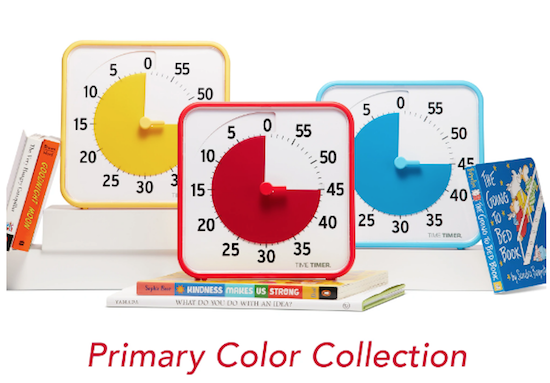
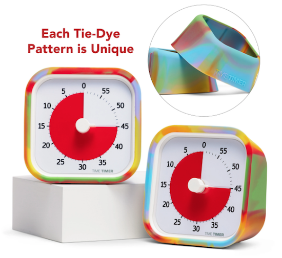
Our friends at Time Timer have come up with some gorgeous, new colorful timers.
First, they’ve released their original 8″ timers in Learning Center Classroom Sets (of 3) in two different color schemes. But you don’t need to be using them in a classroom to brighten up your office or workspace. There’s a primary color set:
and a secondary color set:
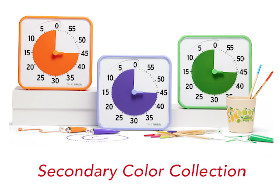
These sets are priced (for pre-order) at $104/set. Again, these are designed for learning activities, but there’s no reason why you couldn’t have one timer in your office, one in your kitchen, and one in your workout area.
Each set comes with three Original 8″ visual timers (for up to a 60-minute duration) with magnetic backs and fold-up feet, three dry erase cards for labeling the current activity (great for helping you focus during a 25-minute pomodoro task), and one free download of the Time Timer Desktop App.
They’re also selling a Time Timer MOD® – Special Edition Tie-Dye version (for pre-order) for $36.95. I’m a big fan of the little MODs, and this 3 1/2″ square MOD provides a tiny pop of color while helping you visualize time passing, and keep you motivated to accomplish your tasks.
For a burst of color for office supplies, consider Poppin desk, wall, and office accessories:
You can buy their products directly from the Poppin website, or at Staples, Quill, and The Container Store. Be sure to check out Poppin’s Work From Home section for more fun, motivating bursts of color.
Do you like to wrap yourself up in color or just use it for accents?
Are you comfortable with intricate color-coding systems, or do you just want to surround yourself with your favorite hues?
And what’s your favorite color?
Meet me in the comments and tell all!


I love when I read a blog post about something I’ve never written about before and agree with completely. Another blog post I don’t have to write! My favorite color is just about anything in the blue-green category, from seafoam to aqua to teal. (I do have preferences within that category, but it’s really hard to pick an exact shade and find it referred to by the same name or number across platforms and mediums, or portrayed the same way on different computer monitors, so it’s good I’m not too picky about it.)
LOL, I think I’ve written about color before, but once I started thinking about it, I realized I had lots of different opinions I wanted to share (or rant about), all related to color. I’d still love to read your take on the concept, though.
And you do wear a lot of what I would call “ocean” colors, in the blue-green (and purple at sunset or before a storm) range!
I’m a teal person as well!
Julie, your posts are always a treat. I love the example of organizing spices by color–it just wouldn’t work!
I LOVE color, but I agree with you that there’s a place for it. Your descriptions about when to use it (the good, bad, and impractical,) are so to the point. Organizing books by color is a nutty thing to do if you actually want to find and read your books. I can see doing it if it’s one type of category, but other than that, it doesn’t make a lot of sense from a systems standpoint.
You said that you tend to go with function over form (or design.) I get that. For me, I try to do both, but know that it’s not always needed or appreciated. So if one had to go, I’d lean toward function.
For instance, if I’m working with a client that is visually-oriented and color/design sensitive, using those elements as part of the organizing solutions helps immensely. However, if someone isn’t sensitive to color or design, it can be a waste of time and resources to make that the overarching part of a system.
My favorite color? I bet you know. But if not, it’s….PURPLE!!!! I’ve loved it since I was under five. My mom told me it was the first color I ever said.
I almost gave you a shoutout, Linda, between Pantone’s Very Peri and the Smead purple folders, and now I’m imagining you as a tiny tot, gleefully saying “purple.”
I get the appeal of using color to organize, but in the end, I only come down to visual organizing if it will actually work. So often, people embrace concepts because they anticipate they will work for them but then realize it’s not happening. Absolutely, if you can accomplish both, then you should. But if not, if there has to be a choice, it usually comes down to working well over looking good.
What a fun post to read. And a great question. I don’t color code when I organize for myself but a bunch of my clients love to color code when time blocking or filing. I even have one client that breathes in color when we practice our centering exercises. She inhales one color and exhales another color.
When I was in high school, I use to color code my index cards when doing research for a paper. Each color would represent an idea that I wanted to assert in the paper. It did help me to stay organized.
My favorite color is blue, by the way.
Thanks for putting this creative and colorful post out into the world!
Jill, I am fascinated by the people who can perceive themselves as inhaling or exhaling color; it’s sort of like synesthesia, where people associate words or numbers with colors. (I’m an utter failure at meditating or even centering, so perhaps all my colors are goth-black inside my head? Or I need a better light bulb.”
Which reminds me of my favorite Groucho Marx line. “Outside of a dog, a book is man’s best friend. Inside of a dog, it’s too dark to read!” 😉
Organizing with index cards for doing research is another area where I’d absolutely be in favor of using color to organize. It’s sensible, and you’re usually not going to run out of cards mid-project!
Thanks for reading!
While I love the look of color-coding, but I prefer bland colors instead of color. I agree that color may be more mind-consuming than we may think. Some of my graphic design clients love using color but my ADHD clients prefer regular manilla and green hanging folders, helping them be less distracted. It all comes down to how much people are willing to invest (time and money) when doing their organizing system.
You’re absolutely right, Sabrina. Sometimes, aesthetic appeal can be a distraction! Obviously, this is why we tell our clients that there’s no ONE right way to organize, because people’s brains work so differently.
I don’t tend to organize by color either. The exception would be with clothing in a closet. After I’ve sorted by clothing type, within that category, I will organize by color. This is because color really matters when putting garments together.
My favorite color? That’s a tough one. Probably blue, or any color that makes me feel like I’m at the beach. Especially this week, when I’m looking at single digits tomorrow!
Hopefully, you’ll have a clear, beautiful blue sky even if you’re feeling like a Seana-sicle!
And yes, color matters with clothing because clothing’s value is aesthetic as well as functional. There’s probably little else in our lives that is so equally balanced between form and function. But almost everything in a home office needs to consider function first; form’s important, but it can’t be paramount if the item doesn’t do (and isn’t used) for its essential purpose!
I love color, but don’t use it in organizing except in the broadest way with file folders – green for finances, blue for health, red for I don’t want to forget this.
My favorite color changes all the time! In general, whatever the color is, I like it if it’s warm-toned.
So, I think we’re on opposite ends of the color spectrum; if color wheels are like the colors in cosmetics, them I’m cool rather than warm. And that’s interesting that your favorites change; it must mean that you are flexible!
I LOVE color and am particularly happy that the color of the year is: Periwinkle! One of my all time favorites.
I tend to organize closets by color just because it makes it easier to see as you say “if you’re going full on goth”.
I use blue for client folders, red for taxes, green for anything financial and after that I’m not persnickety.
I like to see pops of color in a space because I think that makes the space more interesting.
I never, ever organize books by color – UGH!
Thank you, Julie, for talking about this. It’s such a fun topic. As for my favorite colors… I’m with Hazel. I like blues and greens with purple and pink thrown in here and there.
My granddaughter (age 4) loves pink and purple and will tell everyone who asks that those are the BEST colors.
Please tell your granddaughter that I COMPLETELY agree with her!
I feel the way you do; pops of color, rather than blanketing everything in color, is the way to go. It gives you eyes a new place to focus, but doesn’t overwhelm the brain.
Red for taxes? Wow! Thats’ bold! And thank you so much for commenting!
I’m a teal person as well!
Julie, your posts are always a treat. I love the example of organizing spices by color–it just wouldn’t work!
Thanks, Katherine! As someone who once mistakenly used garlic powder instead of butter-salt (thanks to someone repurposing a similarly-colored spice container), I’m a big NOPE when it comes to organizing spices by color. I’m glad you agree!
I use color often, though probably in a weird way. Here’s an example: On my to-do list, I write the day & date in color (a different color for each day), then make the list in black. I mark things off with the color.
This week Tuesday was red and any task completed on Tuesday got marked off with red, then Wednesday was blue. If an undone item on Tuesday’s list got completed on Wednesday, it got marked off in blue. This lets me know when I did things, and also makes my list bright and engaging and I have the fun of choosing different colors each day. Tuesday isn’t always red. Next week it might be purple.
I hang clothing according to color (my partner has definitely tipped the black T-shirt scale!), but my file folders are all manila. Books are shelved in groups – books on writing/English, books in Spanish, fiction, anthologies, unread, etc. Spices are in clear jars, so sort of by color? But they are also labeled to prevent mishaps.
No favorite color for me, though. I love them all.
Your approach is different, but it’s like you’re decorating the semi-fixed items but making the tasks uniform. I can see how that would be both uplifting and steadying. It’s definitely unique to you in its complexity, but it also works with the way you think, and you’re the only one who has to trace the progress.
And I definitely have my share of black clothes. It can make it hard to find the right black T-shirt at a quick glance!
Thanks for reading, Dava!