Noteworthy Notebooks (Part 1): Re-Surveying the Landscape
Portrait vs. Landscape. Vertical vs. Horizontal. Uppy-downy vs. sidey-sidey. While most aspects of organizing are equal opportunity, paper organizing products tend to take sides.
For example, when it comes to most of the paper filing topics we discuss here at Paper Doll HQ, the horizontal view is the norm. Think tabbed folders, hanging files, filing cabinet drawers. Certainly, we look at a lot of vertical organizing solutions at the macro level, but while we file vertically, the products, themselves, generally have a horizontal, or landscape layout.
It’s a real rarity when we look at vertical filing solutions; in fact, we haven’t done it since New Smead Organized-Up Folders Stand At Attention in 2013! (Moreover, other than the main Smead products reviewed, the other items referenced in that post have gone the way of the dodo!)
Conversely, when we talk about organizing our actual writing, it’s the portrait, vertical, uppy-downy approach that gets most of the love. That’s why my 2014 off-ramp post Surveying the Landscape: Around the World with Horizontal Office Supplies was so unusual. I had to hunt for non-filing related paper products in a landscape-orientation.
Indeed, almost every office supply in that post is a riff on a clipboard, and even then, many of the options were only available in Europe and Asia. (Granted, there were some really cool products in that post, like the waterproof clipboard that created a little raincoat to let you keep your papers collected and dry in inclement weather.)
The only thing close to a notebook I found to include in that post was Roaring Spring’s line of 11″ x 9.5″ landscape notepads (available in multiple colors of lined or white graph format).
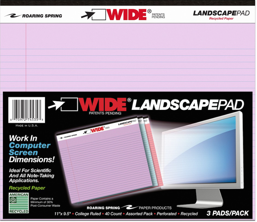
A year later, in 2015, I finally dug deep (or shall I say, wide?) into the topic of landscape-orientation notebooks and notepads in Paper Doll Surveys the (Paper) Landscape, where again, those Roaring Spring notepads took center stage. Beyond those and some special prototyping notebooks for web designers, all I found was a notebook sold in Japan with German marketing copy and the Rhodia Webnotebook sketching journal.
Even then, landscape is seen as primarily for creating landscapes – for drawing, designing, sketching.
At the time, I tried to explain why I thought landscape notebooks were important. (Imagine that I’ve inserted one of those wiggly sit-com flash-back effects here.)
OK, Landscape. But Why?
Most of the time, when we hand-write, we are in portrait mode, and it usually makes sense. However, I can think of a sampling of reasons why we might want to have some side-to-side breathing room.
Most notebooks are portrait, but a landscape orientation has six significant advantages: for notetaking, ergonomics, room for expansive thought, to do mind-mapping and flow charts, and to emulate TV/computer screen dimensions. Share on X1) Notetaking – When we’re taking notes in a committee meeting or for class, we’re often creating a linear, outline-style set of notes. But, as we discussed when we reviewed the exceptional Cornell Notetaking Method, we need to make room for cues or other special attention-getting markings on the left side.
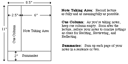
With traditional 8.5″ wide paper, that either reduces our notetaking space or forces us to write in the narrow margin, making it more likely that we’ll get inky smudges on that all-important cue-section. Landscape orientation provides more breathing room.
2) Ergonomics – Look at the available space on and around your desk. If your computer is in front of you, your keyboard is probably somewhere between elbow-and-wrist distance away, not leaving you very much space for alternating typed notes and handwritten notes. Because of that limited space, you may find you’re turning your traditional (portrait-orientation) notepad sideways, with the top to your left (unless you’re a southpaw). This lets you take written notes, but you’re probably twisting at the waist to do so. This is not sustainable or ergonomically friendly.
3) Expansive thought – When we take notes, journal, free-write, or craft letters, we’re often thinking linearly. It’s easy to follow a unidirectional flow of ideas, or paths, with a narrower piece of paper. When we’re on the computer, using Microsoft Word or any other word processing program, unless we’re using design features for creating signs or brochures, we echo that same tall/narrow format.
But what happens when we want to think more broadly (no pun intended)? When we’re on the computer, using a spreadsheet like Excel, we create multiple columns so that we can visualize information best seen side-by-side, like multiple fields in a record. But what’s the paper version? I can think of a number of times when I’ve been working with a client to brainstorm ideas in parallel (like how different departments will handle particular situations), and we end up turning a notepad sideways. The lines go the wrong way, and the content gets messy; it suffices, but it’s not optimum.
4) Mind mapping – Paper Doll is a fairly linear thinker, but when I’m trying to mind-map, or show the relationship between different processes, or do anything that’s more visual, I need more space. With some clients, we may choose mind mapping software or apps like MindNode or XMind, but we often find that an analog solution is faster and more immediate. Most often, we end up using multiple Post-It! Notes on a wall or window. That’s great when we’re in a house or office, but not so optimal when we’re in the field (even in a field), in a warehouse, or going mobile. That’s where these landscape notepads (and the aforementioned landscape clipboards) really come into their own.
5) Flow Charts – It might not be immediately apparent, but a number of law students have posted online comments regarding how landscape writing pads make it easier to visualize case-law timelines, precedents, and conceptual flow. Scientists have also reported that wide-format paper helps conceptualize scientific reactions more clearly.
6) Computer/TV Screen Dimensions – Tablets and phones aside, we spend a lot of time looking at screens in landscape orientation, and sometimes we still need to make our analog notes approximate what we’re seeing, or make our digital notes approximate what we’d like to be seeing on the screen. Writing pads that parallel those dimensions are helpful.
So, What’s New on the Landscape Landscape?
If, other than sketchbooks, it was hard to find a landscape notebook six and seven years ago, how do you think it’s going now for those who want to apply a wide-angle lens to their analog writing?
PANOBOOK
Well, newer on the topic is the Panobook, which I discussed in 2019 in Organizing the Shape of Notebooks to Come: Panobook, Triangle, and Sidekick as part of a look at oddly-shaped notebooks. It works for all of the reasons listed above, but particularly with regard to fitting nicely between your body and the keyboard.
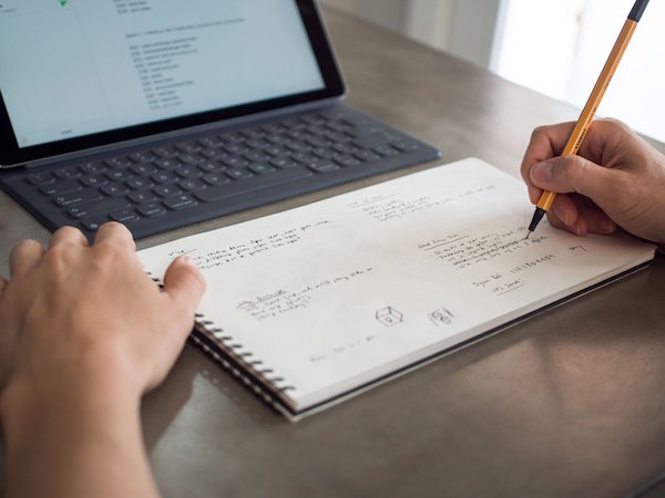
At the time, I noted the difficulty of using your computer and a notebook at the same time, especially when space is at a premium:
If you want to take notes, maybe you can scroll (I mean, slide) your body to the left or right, or you may have to swivel in your seat to use the left side of the desk (or the right side, if you’re left-handed) to take notes. Unless your arms are long (and your eyesight so pristine that your monitor is very far away), there’s just not that much writing space in front of you. (And I’m pretty sure you don’t want a notebook poking into your tummy.)
Panobook measures 160 mm x 288 mm (6.53″ x 11.34″) and is designed to sit squarely in front of your keyboard. It’s made of high-quality (70 lb) paper and meant to perform with a variety of writing instruments and inks without causing bleed-through or smudging.
The front and back covers of Panobook are made of rigid black chipboard, and the whole thing is bound with sturdy black Wire-O (AKA: Twin Loop) spirals measuring 12.7 mm (0.5″) in diameter, so the Panobook sits flat when opened without the cover smacking back into place or bending, as you get with perfect bound notebooks or glued notepads.
Each notebook contains 50 sheets (100 pages). Neither blank nor lined, the Panobook has a subtle dot pattern with grid spacing at 5 mm (0.20″), so you can use it for writing, drawing, or laying out charts. For web interface design or storyboarding, there are guide markers to aid in drawing three rectangles on the page, and edge guides to divide each page and provide cues for layout.
Each Panobook comes with a slip case to make it easy to label the spines with the notebook’s content and start and end dates so you can catalog them together on a shelf.
Panobook is available directly from Studio Neat for $20/notebook for one or two; they’re discounted to $19/notebook when you purchase three to eleven, or to $18 if you buy a dozen.
BetterBook
In June 2020, a group of young designers from Amsterdam called orangered life teamed up and launched BetterBook, a landscape notebook campaign on Kickstarter that really got the attention of the crowdsourcing, uh, crowd. (It successfully moved to IndieGogo for expansion.)
Used to sharing their ideas by passing around their notebooks in the office, they needed a better pandemic-friendly solution as they worked from home, still designing with analog notebooks.
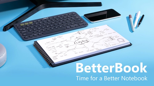
The orangered life team saw their BetterBook creation as having four distinct advantages over the typical notebook:
- Content is sharable – The BetterBook is an analog notebook, but the team figured out how to improve digital capturing and scanning. Each page of the notebook had a 0.5 cm black border on the left and right sides; the notebook’s covers extend beyond the pages, creating a 1 cm border at the top and bottom of each page; the border frames each shot perfectly, so your phone or scanner apps can capture each scan quickly and easily without delays, mistakes, or kerfuffles. (I wish checks were designed this way; it would improve the mobile deposit process.) Create, point, shoot, share!
- Scanned images display better – Because the BetterBook uses an 18:9 ratio, the format matches both mobile phones and computer widescreen monitors perfectly. So, because captured images are designed to fit screens perfectly, there’s no letterboxing effect – no black borders on the top and bottom of the screen, and there’s no pinching and zooming necessary, which often causes a loss of finer details.
- It fits on your desk just below the keyboard – The Betterbook comes in two sizes: the Desk Notebook measures 310 mm (12.2″) x 160 mm (6.3″) and the Pocket Notebook (for when you’re back to working in coffee houses again) measures 130 mm (5.12″) x 70 mm (2.76″).
- There’s a built-in note organizating and time management doodad – In the bottom right corner of each page, there’s a subtle grey symbol designed to help you organize your work. The tiny spaces let you note deadlines, reference edits, or add anything you need to help categorize your important information.
The Betterbook has three acid-free, fine-grain paper options: blank, lined grid, or dotted grid. Both the Desk and Pocket sizes have 40 sheets (80 pages).
The BetterBook team sees its product serving designers, artists, (board/tabletop) gamers, and workers in creative industries. They also promote it for writers and students, though the lack of lines may make it difficult for some writers to get used to.
You can purchase BetterBook via Indigogo for $31 for one book or $79 for a set of three.
Write Notepads & Co.’s Landscape Notebook
Chris Rothe, a third-generation bookbinder at Baltimore-based Write Notepads & Co. has a plan to “make notebooks cool again.” (Paper Doll has always thought notebooks were cool. Paper Doll is unwilling to entertain the thought that not everyone thinks she’s cool.)
So, @WritePads wants to make notebooks cool again. Paper Doll has *always* thought notebooks were cool. (Paper Doll is unwilling to entertain the thought that not everyone thinks she's cool.) Share on XThe company makes a variety of deluxe notebooks – in the United States – using environmentally-friendly materials like vegetable-based inks and premium cover stocks and paper. And yes, they make a landscape notebook inventively called: Landscape Notebook.
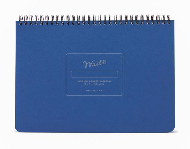
I’ll be honest, there aren’t a lot of fancy doodads here, but in some ways, that’s the charm of this notebook. The 10″ wide, 7″- high, 1/2″-thick, 15-ounce notebook is just really on-target in simple but essential ways.
The sheets are made with heavy, smooth, uncoated 70-pound paper stock, so the pages resist ink bleeding through or feathering across the page. (Nobody wants runaway ink!)
Each notebook’s 60 sheets/120 pages are lined at 1/4″ spacing using soy-based inks to create subtle, unobtrusive lines.
The covers are durable. The top is made from 10″ x 7″ board cover stock, with letterpress impression detailing. Because the back cover is also sturdy (and though it’s not stated, it appears to be chipboard), you can write while standing or during walk-and-talk meetings. Write Notepads & Co. offers matte gold embossed monogramming in 30 point font. (While 3-letter monogramming for a notebook like this strikes me as pretentious, your landscape mileage may vary.)
The durable double-wire binding allows the notebook to lay flat on any work surface. The binding is at the top (unlike with the Panobook and Betterbook), which means under normal use, the wiring runs parallel to your keyboard or desktop. The company sees this as a plus, as lefties are constant finding the length of their forearms pressed against the binding with typical notebooks. I’m inclined to agree, though some people may find it hard to type with their wrists stretched over/across a horizontal binding. (Share your thoughts in the comments section.)
The Write Notepads Landscape Notebooks come in five cover colors: Black, Red, Blue, Pistachio (light green), and Kraft (brown) and cost $20/notebook, with a 15% discount if you purchase 10+ and 25% discount for 50+. Shipping is free on all orders of $60 or more. Monogramming is $10.
Write Notepads & Co. also has a landscape orientation weekly planner.
Landscape Notebook
Obviously, unique naming is not a high priority in the landscape notebook field. Two years ago, Xavier Neyo launched a Kickstarter for a landscape notebook option. He called it Landscape Notebook. OK, then!
As crowdsourcing campaigns go, it was pretty casual: a low-fi video and list of three reasons Neyo was passionate about creating a landscape notebook. He felt that there should be notebooks to match the orientation of chalkboards and whiteboards so that notes taken in class or a meeting should be able to better match what’s written by the instructor or meeting leader.
Neyo also pointed out that narrow notebooks waste even more space with wide left-side margins; his notebook would be wider and the usable space would be more expansive, with minimal margins. And he was miffed about notebooks with flimsy back covers.
Flash forward (imagine the whooshing noise) to today, and Neyo has his own website and version 2 of his Landscape Notebook has debuted:
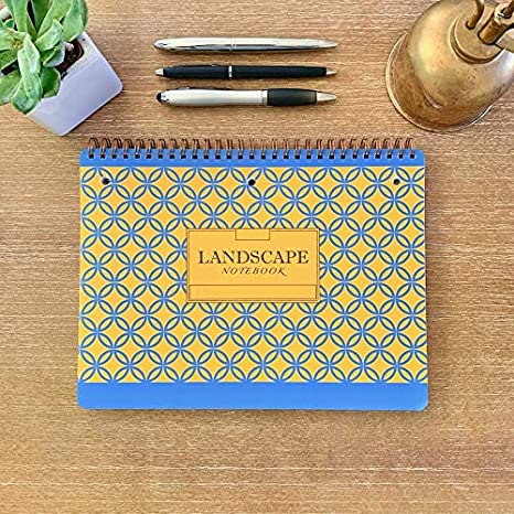
- The Landscape Notebook measures 10″ x 7.5″.
- The 80 sheets (160 pages) are college ruled.
- It has double-loop spiral binding along the top (he refers to it as O-ring, but it appears to be Wire-O) and it has a stiff back cover.
- There are three simple cover designs: solid navy blue with yellow accents, solid light blue with white accents, or a yellow and blue pattern.
- The pages are perforated slightly below the spiral binding; below that, each page is three-hole punched, eliminating any activation energy for getting your papers filed away once you tear them off the notebook.
- Each page is lightly marked with page divider indicators at the top margin to make it each for creating two, three, or five columns or sections.
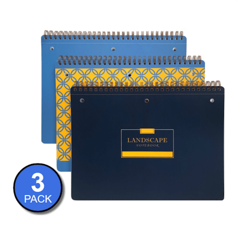
Neyo’s Landscape Notebook is available from his website: 3 notebooks for $24, 12 for $84, or 48 for $288. The site says the Landscape Notebooks are also available on Amazon, where there are priced slightly lower, but are currently out of stock.
This is the first (and least techie) of a short series on innovations in notebooks. Be sure to pop back next week to see what’s new in erasable, reusable, customizable, and even magnetic notebooks!
I’ve always been a huge fan of the Roaring Spring notepads and it’s exciting to see the landscape universe is opening up. So much more mental elbow room with this format, I’ll never go back to vertical.
I’m a big Roaring Spring notepad user, though I use the traditional vertical style (and do the twist-and-turn) if I need to take handwritten notes while typing. But obviously I have a lot of love in my heart for the landscape orientation. It definitely opens up breathing space!
You are sort of rocking my world with this whole concept, Julie. I am so accustomed to the vertical approach that the very idea of a horizontal notebook makes me a little uncomfortable. After reading this, I can see some very solid benefits to “going landscape.” Not sure I can take the plunge, but I will be thinking about it!
Rocking your world? Then my work here is done. Don’t forget to tip your waitress!
Seana, I get that landscape is a whole new vista (ha!) on notebook use. I’d suggest getting one, maybe the Roaring Spring in a color you like, and try using it for mind mapping or maybe sketching out a room design on a dot-grid or graph version. I feel like there are worthy reasons to use both landscape and portrait, but as the years go on, I find the key is to just know all the options out there!
I can definitely see the advantage of using a landscape notebook. Hmmm. But, like Seana, I’m more of a vertical – portrait person. It will take me some time but because I can see the benefits I may just get there.
I get it, Diane. I think there are good reasons for both. As I suggested to Seana, maybe try out an inexpensive landscape version for tasks where going wide makes sense — mind mapping, a kanban board, maybe mapping out a new layout for the furniture in your new space? My posts are never about telling people what to do, but telling them what they have available to try!
I am liking this idea – sitting in front of the keyboard when taking notes during Zoom – sent a link to my son as well to get his take on it.
Neato, Jonda. I’d be interested in what he has to say. Right now, to take handwritten notes on a Zoom call, with a traditional portrait notebook. I have to push the keyboard under the Mac riser, and still there’s not enough space unless I tilt the notebook and twist my body. There are unique advantages to both portrait and landscape.
Let me know what your son thinks!
Wow, this is so new to me! I have run into issues using tall notebooks at the computer before, and landscape is a great fix for this issue. Thanks for this post!
Thanks for reading. I hope this is a useful solution for you!
What a fun and complete post! I loved reading about the advantages and features of each product. I loved watching the videos, too, especially the Panobook one. So darn clever!
I can see how the landscape notepads could be advantageous. For me, I love Levenger pads in portrait view and use them for my notetaking. They work for most things I’m doing, and I especially love the side margin, which gives me dedicated space to highlight certain actions or concepts. And the paper is wonderful to write on- smooth and substantial.
Do you use landscape pads? And if so, do you have a personal favorite?
Diane, the only landscape version I’ve used with any regularity is the graph paper version Roaring Spring makes. I’ve mainly used it with clients for when we’re trying to draw a layout for how we’d change the furniture in a room, but I have one client who loved the approach for mind-mapping. If I were to use one for everyday use at my desk, the Panobook or BetterBook has a measurement and ratio I prefer, but I might find the spiral annoying. I wish there were a notebook with those dimensions but (non-spiral) binding that could still lay flat. But I’m picky! 😉
I can think of so many specialty use cases (like the law and science examples I gave) which make this just one more intriguing options. I’ve got a mound of nifty notebooks for sharing coming up!
WHY have I never seen these before?! Space-mapping would be so much better in this orientation. I also make a lot of worksheets for clients in landscape orientation and it would be great to add these pages into some landscape notebooks for practice. Adding them to my list!
I’m so excited that you’re seeing possibilities in these. It’s funny how there have always been landscape orientation sketchbooks, but outside of artists, they’ve been kept secret! Come back in the future and comment about what you try and like best!
I think landscape notebooks and writing pads would be great for left-handed people, who deal with writing over the barrier of a notebook spine.
I have a landscape notebook but don’t even use it. As you mentioned I go think of it as a sketch pad for drawing more than a place to take note. Need to rethink that.
I definitely agree that landscape notebooks would make everything easier for lefties, but I think everyone would be even better with lay-flat/fold-flat notebooks without spirals, which elevate the profile of part of the notebook. You’ll have to give your landscape notebook a whirl for some special project and see what you get out of it. Good luck!