Paper Doll
Paper Doll’s NANOWRIMOMo(nday): Organize Your Writing Platforms for Maximum Focus
[The following post was originally published in November 2017; content, features, links, and prices, have been updated to reflect available information as of July 2024.]
In ye olden days, serious writing required pen on paper or tapping on a typewriter, or some combination thereof. Then came computers with Wordperfect (and MacWrite, for my fellow 80s kids), and now, most people write using some of the standard software and app platforms most readily available to them: Microsoft Word, Apple Pages, or Google Docs. Each has its advantages as well as demerits, including bloated features that distract from the writing process or elements that don’t quite do what we wish they magically should.
If you’re writing a term paper or a letter of complaint, these big guns, which are likely already part of your regular writing routine, will suffice. But there are so many other platforms you may wish to consider to help you organize your resources, improve your writing focus, and be more productive.
Previously, we’ve looked at how to organize yourself to write for NaNoWriMo and other projects and how to get and maintain your motivation. As we continue our writing-themed Mondays in November, we are looking at options for selecting a writing platform to keep you organized and focused.
ROBUST WRITING PLATFORMS

Scrivener — For serious writers (from novelists and playwrights to journalists and academics), Scrivener seems to be the biggest poorly-kept secret out there. Everyone seems to know of it, though most seem to have some trepidation about getting started with it.
Scrivener is a heavy-duty professional writing tool created by writers for writers. At its most basic, it’s a ring-binder, a scrapbook, a corkboard, an outliner, and text editor all rolled into one. Use it to organize your thoughts on notecards in the virtual corkboard mode, view your research and writing in side by side windows, and use one of Scrivener’s templates to get the ideal format.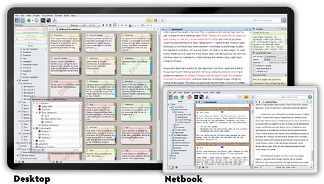
Create narrative or conceptual structure with easy drag-and-drop tools and write in a clean, distraction-free environment. Scrivener makes it possible to write a long presentation or a complete manuscript for a book in a way that a regular word processing application really can’t. Put all your research into it, and break it down into small, manageable chunks (almost like writing on index cards) so you don’t have to constantly scroll up and down 20 (or 200) pages of a document to locate what you need. Then weave everything together to form one unbroken manuscript.
To help you keep track of your goals, there’s a visual feature for seeing your progress toward particular word counts, whether by chapter or document. When you’ve written and edited to your satisfaction, Scrivener lets you format your work to various industry standards and export documents suitable for sharing or for publishing print books or ebooks.
Scrivener is available for Mac or Windows ($59.99), as a bundle of Mac and Windows ($95.98), and iOS ($23.99). To get a feel for what it can do for you, Scrivener’s creator, Literature and Latte, created a video:
Scrivener is complex to customize and comes with an incredibly detailed on-screen tutorial. But the biggest downside to Scrivener is that there’s so much available to you, so many features to accomplish so many different functions, that you’re likely to be overwhelmed. Happily, there’s a particular Scrivener expert I can recommend.
Joseph Michael, AKA @Scrivener Coach on Twitter, is the dude to know. Over the last few years, I’ve taken a few webinars he’s offered via other writers and bloggers I follow, and learned more with less frustration in a no-cost one-hour webinar than I did reading the already superb Scrivener for Dummies. (It’s a good book, but not everyone can translate text instruction into learning computer skills.)
I suggest that if you have or get Scrivener, that you follow Joseph Michael for his Scrivener Ninja Tips:
#Scrivener Ninja Tip: Create a link inside your Scrivener document with this drag and drop tip. #writing pic.twitter.com/37GpBUsvHs
— Joseph Michael (@ScrivenerCoach) November 6, 2017
If you’re really serious about learning all that the software has to offer, though, consider his Learn Scrivener Fast courses. I’m not a shill for him; I just know that no matter where I go on the web, when Scrivener comes up, Joseph Michael’s name is mentioned in short order, and I can honestly say that he ties with my tech-oriented organizing colleagues Deb Lee and Kim Oser for offering the most detailed, fluff-free, information-laden presentations on the planet.

IAwriter — This platform is designed to help eliminate all of the distractions of the menus, toolbars, and icons that may keep you from focusing on what you’re trying to say, rather than how it should look. Explaining their approach:
The cover letter for your dream job. The business proposal that will turn everything around. The love letter, telling them how much you care. Why is it so hard to get started? Few of us grow up without a fear of being judged for our writing. So we pause, we hesitate, we procrastinate, while others advance. In iA Writer, we stripped away everything that might stand between you and how you feel, so that you can write from the heart. This is how great writing gets started.
Features for creating this distraction-free environment include:
- Custom templates find you the form you need.
- Focus Mode dims everything except the current sentence, allowing you to maintain focus, much like how a typewriter’s limited view kept writers in the moment.
- Night Mode puts light text on a dark screen, which is easier on the eyes, especially when writing at night.
- Syntax highlights find weak verbs, unnecessary or repetitive words, erroneous conjunctions. etc.
- Content blocks allow embedding of photos, tables, and text.
- Document library lets you search, sort, and swap between documents all from your current window.
- File export enables exporting your IAwriter document to WordPress for your blog or website, Medium, or HTML, or to Word (.docx) or PDF.
- Multi-Markdown language lets you format and edit for a streamlined but powerful visual approach.
- Keeps track of which things you write and what you’ve copied and pasted from other sources to ensure you don’t accidentally plagiarize. (External sources are dimmed; what you write is in regular text.)
For the person who needs minimalism but doesn’t want to learn any coding and just wants to click a big B for bolded writing, iAWriter will have some tradeoffs. There are a number of video tutorials to help you learn Markdown, exporting and sharing skills, and setting preferences.
While IAwriter was created for a Mac environment, it is now available for all of your desktop, laptop, and mobile settings. After a free trial, you pay for each version of IAwriter as a separate software item, per platform. It’s $49.99 for Mac and iOS (iPhone/iPad), $29.99 for Windows, and Android $29.99 (or $9.99 for an annual Android subscription).
Also, it’s Stephen Fry’s favorite writing platform.

Ulysses — Are you a Mac or iOS person and who wants a clean, spare writing platform? Ulysses clears the decks. From a focus and productivity perspective, Ulysses is all about keeping your fingers on the keyboard and your eyes on the prize.
There’s a markdown-based text editor, so you don’t have to fiddle with fancy formatting or styles. Ulysses includes a built-in grammar- and style-check to help you avoid mistakes and set the fitting tone for your content. It works with more than 20 languages, offering suggestions for capitalization, punctuation, semantics, redundancy, style and more.
Once you’ve finished writing, you can transform your content into a variety of formats: PDFs, Word documents, blog posts, or ebooks — at a keystroke. (If you use it for blogs, you can create features images, tags, and excerpts directly from within Ulysses.)
If you have a specific character limit, set your goal and have Ulysses track your progress toward it. If you have various clients, or different types of projects (or project-owners), you can organize your creations in separate folders for easy access.
All your writing projects get store in Ulysses’ library, so they’ll sync and be available on all of your devices, no matter where you are when inspiration strikes.
Ulysses has been around since 2003, but is constantly being updated. As recently as June 2024, they added internal links between projects and navigation history tracking, and if you previously tried Ulysses, you review all the new features since I originally wrote about the platform in 2017.
Ulysses is designed with a basic, distraction-free interface — but you can explore hundreds of styles and themes in dark or light mode.
The organizational tools include a single library, which autosaves everything you create, hierarchical groupings, so you can keep track of sub-projects, and attachments (PDFs, images, keywords, etc.) which can be associated with a document without being inserted into the document, and filtered searches. You can also easily set word or character goals and share your progress via social media.
Syncing with iCloud and across iOS/MacOS devices is automatic, and you can add Dropbox folders to your text library. For exporting and sharing, you can export in multiple file formats (text, HTML, epub, PDF, and Word), or publish to WordPress, Ghost, Medium, or Micro.blog. There’s a Live Preview feature, so you can see how changes will look when published side-by-side with the changes as you are making them.
Ulysses uses subscription-based pricing, so after a fully-functional free trial, it’s $5.99/month or $39.99/year, or $10.99/six months for qualified students.
WRITING PLATFORMS THAT KICK YOUR INNER CRITIC IN THE TUSH

Ilys, a web-based option, was designed to help writers drop-kick writer’s block and push past self-doubt.
The conceit of Ilys is that it only lets you see one letter at a time, and won’t let you edit until you’ve written your pre-set number of words. There’s even a Ninja mode, where you can’t see any letters you’ve typed at all!
The idea is that Ilys creates a “state of complete absorption and effortless creativity [which] can lead to a profound sense of satisfaction and accomplishment. it can enhance your productivity boost your confidence and self-esteem, and help you express yourself with clarity and ease.”
Obviously, this is only suitable for decent touch-typists, but it’s a huge boon for writers who tend to self-edit every other word stymied by writer’s block. Here’s how it works in the creator’s own words:
Once you get into writing, you’ll have your bare-bones screen with just a few signposts to let you see where you are and where you can go within Ilys.
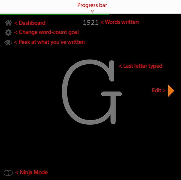
To start an Ilys writing session, enter how many words you want to write. Then just start writing, because there’s nothing else you can do. You can’t go back, delete, or edit anything until you have reached your word count goal. (There is an “eye” icon you can click to view what you’ve already written, in case you can’t remember the name you gave a character, or if you need to refer to a statistic you’ve typed.)
Ilys tracks your progress, identifying where you excel and where writing output dips. Because many writers profess that consistently writing a set number of words per day (irrespective of quality) is the key to success, Ilys is focused on providing a realm in which to keep on writing.
Everything is autosaved, just in case you accidentally delete something (or change your mind). Your data is stored, encrypted, online, until you’re ready to export your work to a word processing platform for more complex formatting.
Ilys offers a free 3000-word 500-word trial; after that, it’s $10.08 $11.11/month (or $99.99/year for 60% 25% off with an annual subscription).
Editor’s note: prices/trial information is no longer visible on the platform site, and it appears the site stopped providing information to non-registered users sometime between 2021 and mid-2024. However, you can use Ilys Classic — an even more bare-bones version, by going to the link and scrolling to the bottom to set your word goal. If you try to exit without having reached your goal, the page will show you what you’ve typed thus far and prompt you to return to the page. Once you have hit your goal, an arrow appears to take you to your viewable content.

The Most Dangerous Writing App, like Ilys, is web-based, and offers a similar, if potentially-paralyzing, approach to shutting down your inner critic. Instead of focusing on a word count, you set the time frame: 5, 10, 20, 30, 45 or 60 minutes, hit “Start” and commence writing.
While you write on the minimalist, unformatted screen, the web app counts your characters, words, and typing speed. If you stop typing for 5 seconds, everything you have written thus far disappears. Once you hit your writing time limit, you can copy and paste (no exporting!) your writing so you can edit and format elsewhere.
The whole concept is to free yourself from constraints and self-doubt by focusing all of your attention on your words. You can write in night mode or go full-screen to hide your desktop, but otherwise, this free web app is all about scaring you into letting the words flow!
To Paper Doll‘s mind, this approach is more suitable for Julia Cameron-inspired “morning pages” or following writing prompts than adhering to an outline for a long-form document. In fact, since I originally wrote this blog in 2017, The Most Dangerous Writing App has added a random prompt generator, so you might want to use the browser-based app to warm up before you get started on your serious writing for the day.

ZenPen is another free, web-based platform.
Actually, it’s barely a platform. It’s a bare-boned writing space with no distractions. None. Zip. When you first click on the link, you’ll see instructions to highlight all of the instruction text, hit delete, and start writing. When you do, all you’ll see on the page is:

See the very faint icons in the upper left corner? That will help you navigate. You can toggle to a full-screen mode, invert colors and go to dark mode, set a target word count, or save your text.
If you must format what you’re writing so that it makes sense to you, just click on any word or phrase you type and a tiny pop-up menu appears to bold, italicize, link, or create a visual marker for quoted material. Save and download what you create in plain text, Markdown or HTML for editing elsewhere.
Whether you choose a robust platform to complete your work of a lifetime or just select one of the web apps to free yourself to write without self-criticism, I hope you find a solution that works for you.
In our next NaNoWriMo Monday, we’ll be looking at wide variety of resources to help you organize your actual text and be more productive with your time. We’ll cover everything from proofreading and editing solutions to transcription options, all designed to help you write faster and create clearer communication, whether for your big novel or a workplace memo.
For related content, see:
- Organize Your Writing Time for NaNoWriMo 2022
- Organize Your Writing: NaNoWriMo 2021
- Paper Doll’s NaNoWriMoMo(nday): Writing Challenges, Dictation Tools, & Organized Writing Advice
- Paper Doll’s NaNoWriMoMo(nday): 10 Tools to Organize Your Writing, Editing, and Proofreading
- Paper Doll’s NaNoWriMoMoMo (Novel Writing Month Monday Motivation)…Even for Non-Writers
- Paper Doll’s How To Organize Yourself to Write for NaNoWriMo 2017
- Organizing Your Writing for NaNoWriMo and More
Paper Doll’s NaNoWriMoMoMo (Novel Writing Month Monday Motivation)…Even for Non-Writers
I always tell prospective clients that organizing isn’t about the stuff. It’s about the person who owns the stuff. That means that getting what you want out of the organizing process depends on getting what you want – a new set of behaviors – out of yourself. Whether you are organizing tangible things (your desktop and workspace, your home, your office) or organizing your time (work obligations, personal projects, family responsibilities, self-care), or organizing your thoughts (plans for the future, dialogue for your novel, deciding whether the other person loves you or just loves vanilla)…getting where you need to go depends upon organizing yourself.
But how do you get there? Last week, in Paper Doll’s How To Organize Yourself to Write for NaNoWriMo 2017, we talked about identifying your goals for writing, organizing your time, and charting your progress, but the truth is that motivation is an underpinning of all success.
In The 7 Secrets of Writing from the Best Writers in the World, Chad Grills collected advice about why to write as well as what to do to write better. My favorite quote from the article is from Steven King, who notably said, “Amateurs sit and wait for inspiration, the rest of us just get up and go to work.”
In my book, 57 Secrets for Organizing Your Small Business (for which I’m working on the second edition) I said that action precedes motivation. We all want the end result: we want to be fit, eat beautiful meals, have organized homes. Not many of us are super-jazzed to get up at dawn to head to the gym, shop and prepare for hours to make magazine-perfect dinners, or develop organizing systems. (Even we professional organizers have trouble getting motivated for our own projects!)
You know what motivates? Small victories! Sit down to write and notice that your word count gets to 500. Then you realize that you’re almost a third of a way to your daily goal of 1667, and you’ll be inspired to keep writing! Head to the grocery store with the recipe for that soup or appetizer whose magazine photo makes you salivate and bring home those ingredients – your investment of time (and money) will inspire you to start chopping! Waiting to be inspired to declutter your room might keep you waiting forever – start by picking up all the clothes that need to be hung, folded, or laundered and get them to the right place, and you’ll start to notice the momentum building.
Organizing a ritual helps, too. Many of my work-from-home clients have trouble getting started; there’s no clear delineation between being at home (lazing over coffee and Twitter, running a load of laundry, chatting on the phone) and the work day when there’s no supervisor peering crankily over the cubicle’s edge. Develop a ritual, whether it’s going out for coffee and then returning to work, or exiting via the garage door, walking around the block, and come back in the front door. It helps trigger that school-bell alert that it’s time to change tasks. Develop a ritual for when it’s time to sit down to write, and soon enough, like Pavlov’s dog, you’ll be conditioned.
There’s a writing ritual story, likely somewhat apocryphal, about Victor Hugo. It’s said that he had his valet take away all of his clothes, and left naked, he had no choice but to write, as he could not go out until his valet would reappear at the appointed hour. In other versions, he was left swathed head-to-toe in a huge knitted shawl, the 19th-Century version of a Snuggie or Slanket. Whatever the truth, without his ritual, the world may never have been graced with The Hunchback of Notre Dame or Les Miserables, meaning we might never otherwise have heard Wolverine (I mean, Hugh Jackman) sing “One Day More.”
Remind yourself why you’re doing this project and develop strategies that reflect your personality. I tell my clients that getting organized (or anything else we do) has to have more than a goal in mind. Knowing you want your living room, dining room, and kitchen to be clear of detritus may be the goal, but why? Is it because you’d like to invite friends over for coffee or dinner parties to keep the loneliness of the cold winter months at bay? Being able to socialize without obstacles or embarrassment is the motivation to keep working toward your goal.
So, just as we discussed last week, know why you want to write. Two recent organizing and productivity posts offer a little inspiration for thinking about your whys:
In Taking A Binge Approach to Organizing Projects in the now-defunct Unclutterer, Alex Fayle talks about the concept of binge projects (like NaNoWriMo and 30-day challenges) and compares the benefits. See what he has to say about creating overall goals, breaking down tasks, getting support, developing positive peer pressure, gamifying your approach, silencing your doubts, and achieving your results.
Meanwhile, Gretchen Rubin, author of such books as The Happiness Project, Better Than Before, and The Four Tendencies, looks at NaNoWriMo from the perspective of how to get from having a creative or entrepreneurial impulse to actually completing a project. In Signing Up for “NaNoWriMo”–National Novel Writing Month? Here’s Why It Works, Rubin looks at what it is about turning thought into deadline-oriented action that actually works for the Upholders, Questioners, Obligers, and Rebels (the four tendencies she’s defined and made famous). Rubin borrows from her own Better Than Before to see how habit strategies like convenience, monitoring, scheduling, loophole-spotting, and taking first steps can help you thrive and excel at NaNoWriMo (and other such challenges).
Finally, over at the blog for Reedsy, a publishing assistance platform, they’ve collected 41 Insider Tips for Winning NaNoWriMo 2017. My favorite tips are:
12. If you can’t block off a few hours each day, write in several shorter ‘sprints’.
In organizing, as in writing, too often people feel that if they can’t devote hours to a project then it is not worth attempting. But just as this article notes that you can use these sprints to get your creative juices flowing, you can do the same with your organizing.
In the five minutes you’re on hold with your credit card company, pull the expired spices out of your cabinet and make a list of what you need to replace. In the fifteen minutes before your favorite show comes on, go through two drawers in your dresser and move the sweaters you haven’t worn for a few seasons to the donation pile. And while you’re waiting for the water to boil for your pasta, open today’s mail, toss out all the exterior envelopes, move the bills to your bill-paying station, and shred those convenience checks and unwanted credit card offers!
16. ‘Perfect is the enemy of good.’ It isn’t exactly best friends with NaNoWriMo authors either.
Professional organizers tell our clients all the time: “Done is better than perfect.” If perfectionist procrastination is keeping you from starting a project because you fear it won’t be ideal when it’s done, then don’t aim for ideal. Just aim for done! Just as you can always edit and revise with writing, you can always modify your organizing systems, whether on your computer, in your paper files, or around your home.
40. Go through your manuscript and cut out all the words you don’t need.
Admittedly, timing is everything. For NaNoWriMo, you should write first, then edit. In organizing, it’s the opposite. Edit – cull, purge, pare down – whatever you don’t need, whatever you can find online (if it’s information), borrow from someone else (if it’s tangible), or cancel altogether (if it’s an obligation crowding you out of your schedule). Let it go.
I hope today’s post helped organize your motivation, whether you’re writing, decluttering, or working on any other kind of project.
Next NaNoWriMo Monday, we’ll be focusing on some tech tools to organize – whether you’re writing for NaNoWriMo, for work, or for academia. Meanwhile, I dare you to have read this whole post and not hum “One Day More” for the rest of your Monday.
Paper Doll’s How To Organize Yourself to Write for NaNoWriMo 2017
November is National Novel Writing Month, and for people in the know, that’s NaNoWriMo. Starting November 1, 2017, the 19th annual celebration of the creative power of words begins. Participants will work toward the goal of writing a 50,000-word novel by 11:59 PM on November 30. As the website puts it, “Valuing enthusiasm, determination, and a deadline, NaNoWriMo is for anyone who has ever thought about writing a novel.”
If you’ve ever wanted to write something big, but you’ve been challenged by time management or productivity issues, NaNoWriMo is your chance to commit to something big(ger than yourself) and get started. Yes, 50,000 words won’t yield a complete novel, but the point is to get started creating. Write, don’t edit. Write, don’t format. Just write.
If you’re like Paper Doll and prefer Shonda Rhimes to create your fictional world, there’s no reason you non-fiction writers can’t play along. There’s Nina Amir’s National Non-Fiction Writing Month 2017 (NaNonFiWriMo? Seriously?), which lacks NaNoWriMo’s infrastructure, but gives you permission to get your non-fiction freak flag flying. More officially, NaNoWriMo rebels exist, participants who are writing something other than novels, from non-fiction to scripts to comic books.
Based on prior years, NaNoWriMo anticipates that 400,000 people will participate this year. What more could you need to feel like you’re part of a movement? Oh, OK, here’s a cool badge!

Getting started is simple:
Fill out your profile, “create” your novel (just name it) in the system, and select your region of the world so you can be notified of events in your area. (It’s a worldwide extravaganza!) Starting November 1st, begin writing, and log your word count. As you go along, award yourself participation, writing, and achievement badges. (If you promise not to acquire too much clutter – I am a professional organizer, after all – shop for some NaNoWriMo inspirational clothing and tchotchkes.)
Anytime from November 20th through the end of the month, paste your completed work in NaNoWriMo’s word count validator and you “win!” What do you win? The right to say you completed NaNoWriMo 2017!
It’s only been a few years since I wrote Organizing Your Writing for NaNoWriMo and More, where I provided the low-down on the program and offered advice for organizing yourself and your work. Start there to get caught up, but there’s plenty more to come!
IDENTIFY YOUR GOAL
When I work with my organizing and productivity clients, I always start with the end in mind. Why do you want to be organized? For most people, organizing is a means to an end. People want to feel at ease when friends pop by unannounced. They want to feel confident when clients or managers visit their workspaces. They want to stop wasting time and money so they can spend their days doing things they value and spend their money on experiences that reflect their priorities.
So, take a moment to think about it. Why do you want to write?
For meaning – In Man’s Search for Meaning, Viktor Frankl wrote, “Life is never made unbearable by circumstances, but only by lack of meaning and purpose.” Sometimes the only way to make sense of the world is to create a world out of words. Find your meaning in writing.
For the joy of language – If you spend your days with toddlers, or grumbly, jargon-spewing, cubicle-dwelling grownups who act like toddlers, you may not get to use your SAT vocabulary or create “palaces of paragraphs” (to borrow a phrase from Lin-Manuel Miranda). Write for the joy of the words.
For fame and fortune – The writing life rarely brings financial fortune, but that doesn’t mean it is without rewards. If being a big fish writer in a small pond of readers is enough for you, that may be reason enough.
For the opportunity to create a legacy – We get about 100 years, give or take. Outside of the legacy of our DNA in future generations, it can be difficult to find a way to make our mark on this big, blue marble. Whether it’s one sentence or a whole book series, your words can only be eternal if they make it out of your head.

ORGANIZE YOUR INSPIRATION
So, you’re generally inspired to write, but not necessarily to write for NaNoWriMo?
- If you write in November, you’ll have something exciting to talk about at Thanksgiving and over the holidays when people ask you what you’ve been up to this year.
- When you’re thinking about what you want to accomplish in 2018, you’ll have your NaNoWriMo writing as the raw materials for your year. You can edit it and learn the steps for self-publishing or try for the path of traditional publishing. If you choose to write non-fiction, in addition to publishing, consider turning your book into a profitable video course or workshop series to support your own business or even a “side hustle.”
- Having a thirty-day challenge is a superior way to strengthen not only your writing muscles, but your discipline muscles. I participated in a fun thirty-day planking challenge with friends and fellow professional organizers this summer. Colleague Janine Adams wrote Recap of My 30-Day Challenges and talked a bit about mutual accountability and setting realistic goals. While I didn’t get six-pack abs from planking, I felt stronger and healthier, and have recognized that I was much more disciplined and rigorous in other areas of my life as a result.
- Kickstart those half-attempted writing projects that haunt you. You know the ones.
- NaNoWriMo offers stellar writing resources to help you grow as a writer, including pep talks from popular writers like John Green, Roxane Gay, Dean Koontz, and Neil Gaiman.
- Participants get discounts for all sorts of sponsor products and services. (Saving money organizes your finances!) Prepare to be impressed with the author-oriented discounts (and some prizes), including:
- 20% off a license for the amazing writing and project management suite Scrivener
- 15% off the professional writing tool Ulysses
- One month free trial of The Great Courses and two months at 50% off
- A free upload of your book to Ingram Spark, a major self-publishing platform
ORGANIZE YOUR WRITING TIME
Chances are, you have to work. You have to eat. You probably should sleep and exercise. It will be hard to make it to the end of November, healthy and solvent, otherwise. So when will you write?
Someday is not a day on the calendar. Later is not a spot on the clock. If you’re going to write, write right now. Write tomorrow. And the next day. But you need to find some sacrosanct portion of your day when your work or your other responsibilities won’t seep in and take “just one minute” of your time. How can you carve time in your day? Brainstorm a list of options:
- Get up an hour earlier. (This wouldn’t write for Paper Doll. I don’t do mornings.)
- Stay up an hour later.
- Shorten your workout (but don’t give it up altogether) or trade going to the gym for an at-home workout to reduce your commute time. (Seriously, don’t stop working out. Your brain will percolate with story ideas while you’re running, riding, kickboxing, and yes, even when you’re doing downward-facing dog.)
- Skip some TV time. Not prime-time – that’s just crazy talk, and we’re in November Sweeps! But DVR those shows that you only watch because you’re waiting for the show you really like.
- Trade child-watching time this month for hours next month. There are parents who will really need free time before the holidays; let them have your kids for an hour a day in November!
- Write at your desk for an hour after work, once everyone else leaves. If you have trouble getting yourself to sit down to write, why not write while you’re already sitting? You’ll avoid rush-hour traffic and can enjoy the evening knowing you’ve already written.
Once you know when you’re going to write, you need to know what you’re going to write about when you put your tush in the chair (assuming you won’t be using a standing desk). Start the month with an outline of your book using these tips from K.M Weiland. Remember, you don’t have to write the story in order – you can even write the end before the beginning. Just have a written roadmap so you know which route you’re going to take or which landmarks you’re going to hit on any given day. (For more on creating a roadmap, once again, I direct you to my 2015 post on NaNoWriMo.)
ELIMINATE THE DISTRACTIONS
What #NaNoWriMo prep looks like: Uninstalling all the dumb games and distractions from your phone and deep-cleaning your apartment.
— Stephanie Gildart (@seliza_gildart) October 29, 2017
Don’t turn eliminating distractions into a distraction. Too many clear-the-decks tasks turn into busy work that allows you to procrastinate on your actual writing. It’s fine if you want to sharpen your pencils, clean and organize your desk, or install all of your software upgrades, but the key is to separate your preparation time (whether that’s pre-November, or just pre-“The Time I Said I’d Sit Down To Write” Time) from your writing time.
CHART YOUR PROGRESS
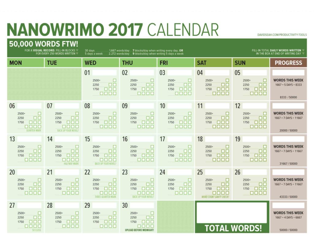
It helps to have the “Big Picture” literally within view so you can see your progress. The brilliant Dave Seah has been creating a NaNoWriMo Word-Counting Calendar since 2012. In Seah’s words:
The theory is pretty simple: To maintain a good pace, you need to write 1667 words a day to meet your 50,000-word count. Every day, write-in the number of words you wrote in the word count box for each day, and then fill-in the pyramid of 10 boxes, each corresponding to 250 words.
As the days go by, the amount of filled-in boxes will show you at-a-glance where your GREAT days were, and also the less-great days where you had to do something important like cook Thanksgiving dinner. Annotate the calendar as necessary! It’s designed to help you feel good about the progress you do make.
Seah’s calendar includes periodic reminders to back up your work, and a progress column for totaling your weekly words and comparing them against the benchmarks for that 50,000-word goal.
©2017 Dave Seah, Investigative Designer
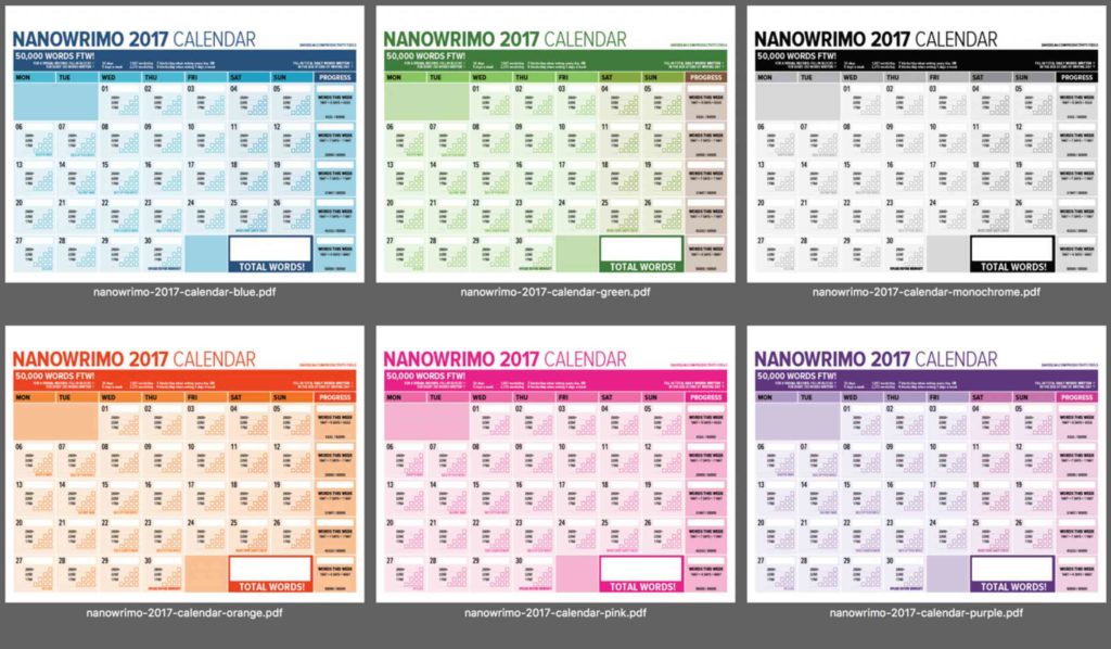
Read more about his 2017 calendar, download and print the standard version, or if you want something truly glorious, head to Seah’s Patreon page for options to purchase a variety of colorful versions (now including purple). For a small monthly patronage of even $1, you get access to the word counting calendar in all of the colors, a 5,000-word version for anyone taking part in NaNoWriMo’s Young Writer’s Program, and Seah’s other great digital creations, like the 365-day version of his deservedly-beloved Emergent Task Planner.
©2017 Dave Seah, Investigative Designer
SEEK HELP WHEN YOU FEEL OVERWHELMED
It’s practically impossible to stay organized when you’re overwhelmed, and overwhelm usually comes from too many sensory inputs at once. In professional organizing, we have a saying, “When everything’s important, then nothing is.” You have to prioritize.
In November, your priority is writing. NaNoWriMo’s participant forums offer assistance on everything from naming your characters to spelling and grammar to doctoring plots. There are “genre lounges” for whatever you write about, whether it’s adventure or literary fiction or young adult. And NaNoWriMo has dozens of other forums for finding your tribe.
During writing time, focus on your writing. But in those quiet moments when you begin to doubt your creativity, find a cheerleader. Todd Brison, author of the forthcoming The Unstoppable Creative, has a YouTube broadcast called Friday Finish. Here’s one of his recent episodes, where he talked about one of my favorite topics, how to beat procrastination.
If your dreams are bigger than writing just one month a year, perhaps the whole writing/publishing/ marketing process overwhelms you. That’s where a really good coach comes in – to help you organize all of the facts, prioritize the tasks, and guide you through the process. I’d recommend Alexa Bigwarfe, an expert in print layout and e-book conversion, author coaching, and book launch marketing. I originally “met” Alexa when I watched her presentation for the stellar Indie Author Fringe Conference, where she was talking about accountability coaching for authors:
Next, I took Alexa’s Just Write It! 30 Day Challenge, an email course for writing accountability. (You might want to try it concurrently with NaNoWriMo, for an extra boost!)
I’m just finishing Alexa’s three-month coaching and accountability program for writers. What I really appreciated was that Alexa skipped the fluff and focused on practical advice (about writing, marketing, and publishing), and provided a bounty of resources. Alexa is launching Write.Publish.Sell Academy, a membership program with monthly training, education, encouragement, and accountability for authors. (Frugal gal that I am, I’m impressed with the low cost and no-contract approach). Check it out.
NANOWRIMOMO
I’m an organizer and a writer, but I’m not a writing coach. I’m planning on using November to work on my own writing, and I know my accountability gets strengthened when I want to be there for others. So, for the next month, in addition to the regular Paper Doll posts, I’ll be publishing NaNoWriMo Monday posts, or NaNoWriMoMo for short. OK, it’s not that short. But the posts will be shorter than usual, with just a few motivational links, technological tools for keeping writers organized, and articles and advice I’ll be curating just for you. Happy November!
Paper Doll’s Manual Override – Part 3: Create & Organize A Digital Owner’s Manual Library
In our last two posts in this Manual Override series, Declutter and Organize Owner’s Manuals and Twelve Resources To Find An Owner’s Manual, we looked at how to get your paper manuals in order and access digital versions of them, whether yours are missing or you just prefer to go electronic for convenience or for environmental reasons.
Keeping all (or even most) of your owner’s manuals, installation instructions, and repair guides in digital form can also give you flexibility. Since we’re never very far from our computers and phones, we can access information about our possessions even when we’re nowhere near them.
Let’s say you and your siblings got your golf-loving grandfather a Bushnell Pro X-series Rangefinder to find the distance to a point on the green.
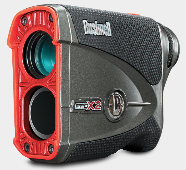
He’s hoping he’ll be using it soon for the first time, eager to show off his fancy-schmancy gadget to his buddies, but he can’t figure out the slope function. The manual is sitting on his kitchen table (much to Grandma’s chagrin) where he unboxed everything this morning. If he’s tech-savvy and has data on his phone, he might step into the clubhouse, Google the product, find the web page, navigate to the online manual, download it, and find what he needs in due time. Is Gramps techie? Well, if he is, be sure to share this three-part series with him. If not, read on.
With one call to you, you can access the manual, walk him through the instructions, and get him back out on the links. You’re now his favorite grandchild, and you can get back to work. But chances are this isn’t a one-time thing. What if you made sure that you had quick digital access to all of your manuals plus those for which your loved ones are likely to need tech support?
If your first thought was, “Great! That’ll save time!” but your second was, “Man, where am I going to keep all of these digital manuals?” then Paper Doll has you covered.
CREATE YOUR OWN DIGITAL MANUAL LIBRARY
Download a manual (in PDF form) as soon as you acquire a new appliance or gadget. Waiting until you need the manual to go spelunking the web will waste time at the very point you’re likely to be stressed and cranky. If you’re the main tech support for your kids, or your elderly parents or grandparents, download manuals sooner rather than later.
Some manuals will only require you to click on a “download” button, while others will display the manual as a web page. That’s fine if you want to bookmark the page and have all your devices’ browser bookmarks synced, but it’s a fairly unwieldy proposition. To download a manual from a web page as a PDF:
- Use File> Export to PDF or Print> Save as PDF (Mac)
- Use File> Print> Microsoft Print to PDF (Windows)
- Review this article for conversions to PDF (for iOS, Android, and Chrome OS)
Revise the file names for easy retrieval. Your operating system will likely default to naming the Rangefinder something like 201740_ProX2_GolfLRF_5LIM_EU_rev071217_web. I suspect Bushnell Rangefinder is going to be much easier to search the next time Gramps needs you.
Don’t print out entire manuals. Most people don’t read manuals from cover to cover. They fiddle around with what they know how to do, and when they run into obstacles, they seek out the section they need. So, if your instinct is to print pages for easier reading, at least save some of the trees. Chances are good that your problems involve very specific issues, like needing to know how to install a minuscule battery or set a timer, so printing out a 100-page manual is excessive. Print the page or two that you need and store that page with other print manuals, if you must.
Create a folder on your hard drive for storing manuals. If you already have a digital home maintenance folder on your hard drive, just create a sub-folder for the manuals. I encourage my clients to set download preferences so all downloads go directly to the desktop. It’s only messy for a moment, and it will be much easier to drag files, en masse, to the right folder than to try to move things from a Downloads folder.
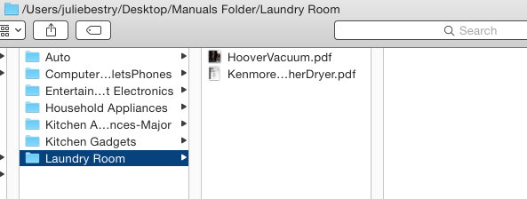
Make subfolders for the different categories of manuals. Remember from our first post in the series, how we talked about having separate folders for manuals for kitchen appliances or household appliances? It works the same way digitally.
BACK UP YOUR MANUALS
- Back up your hard drive. For maximum safety, use the belt-and-suspenders approach, backing up to both a local drive (an external drive in your home) and to a cloud-based backup service, like my sanity-preserving Backblaze. (You know you should be backing up, but if this is something you never quite get around to doing, check out the guest post I wrote for Write.Publish.Sell on the topic, 9 Ways To Keep Your Writing Safe.)
- Make a flash drive for your manuals. In the era of the cloud, flash drives may seem pretty Old School to some of you (while others are wondering if that’s the same thing is as a “thumb drive,” and yes, it is, and I’m proud of you for asking). While flash drives may be less than flashy, they have their advantages. If your computer isn’t working, having the manual solely on your hard drive doesn’t help much. Keeping a back-up on a flash drive lets you borrow a laptop, run to the public library, or otherwise find a quick alternative. Flash drives take up little space and are ideal for when you’re visiting The Land That Time Forgot (homes with no Wi-Fi or cell signal).
Move your manuals folder to the cloud. Chances are good that if you’re reading an article about organizing a digital owner’s manual library, you’re not too afraid of the cloud. You probably have one or more cloud solutions you use for storing documents, and you love how keeping something in the cloud means that it will sync content across your devices. A few major cloud solutions are:
- Dropbox – Dropbox is my favorite cloud storage solution. I have it installed on my computer, iPad, and phone, and it’s where I keep any documents or photos I might need if I’m going to be away from my desktop. A basic account is free for 2 GB of storage (ample for just starting out); $9.99/month for 2 terabytes for a Plus account; and $16.58/month for 3 terabytes of storage. (There are also business accounts, so check all pricing options.) I mostly like that it’s intuitive and couldn’t be easier to use. Dropbox acts just like any other space on your computer, so you just drag any downloaded PDF into the folder you create for your manuals. Access anything in Dropbox via the app on your mobile devices or in your preferred web browser.
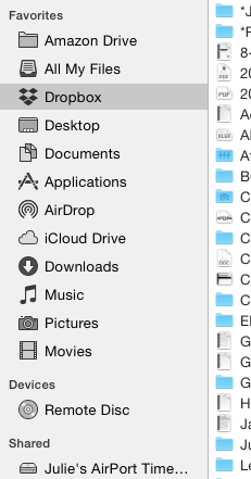
- Google Drive – If you already live and work in Gmail and Google Docs, Google Drive may be for you. A free account provides 15 GB of storage; the expanded Google One plans include $1.99/month for 100 GB, $2.99 for 200 GB, and $9.99/month gets you a terabyte. In case you heard that Google Drive went away, be assured that the service stayed put; it’s only the app that was discontinued in favor of a new version called Backup and Sync. (Google likes to confuse us.)
- OneDrive – If you use Microsoft 365, you probably already have (and use) OneDrive. Accounts range from free for 5GB of storage to $1.99/month for 50GB to a whopping 1 terabyte for $6.99/month. (There’s even a family plan for $9.99/month for up to 1 TB per person, per month, for up to six family members.) While Paper Doll finds OneDrive less intuitive than other options, Microsoft does offer a variety of support documents (hey, manuals!) for organizing your files.
- Evernote – Certainly Evernote is too robust to be considered a mere cloud storage service, whether you’re using a free,
Plus,Premium or Business subscription. I’ve spoken of the magic powers of Evernote on many occasions, since long before I became an Evernote Certified Consultant. But sure, drag and drop (or upload) a PDF from your desktop and you can access any manual from anywhere. (Read on for a special Evernote feature!)
INDEXING YOUR DIGITAL DOCUMENTS
Having digital manuals is only as good as your ability to find what you have. To that end (and to make it easier to know what manuals to toss when you recycle or donate an appliance), you need an index or inventory.
Basic Spreadsheet – If you have a small manual library, sorting your manuals by category or room and listing them in an Excel or Google spreadsheet is fairly easy. With Dropbox, for example, log into the web version, click “Share” for that document, and click “Create a link.” Enter the Dropbox URL for your PDF in the spreadsheet field that corresponds to that product’s manual.
Combined Manual Library and Inventory – Airtable is a secret weapon. If you could cross a spreadsheet with a robust database, add pretty pictures, and make it all easy, you’d be inventing Airtable. (And yes, writing a whole post about Airtable is definitely on Paper Doll‘s ToDo list.)
Using Airtable, you can build a sortable database in spreadsheet form, only instead of just putting in text, you can add photos, PDFs, links, and more, all with the click of a button. I created the following in under two minutes – adding labels, uploading some PDFs, and inputting starting information. I could have made it prettier, but the video above gives you a preview of those options.
 I created fields for the product, the room/category, each item’s date of purchase, the PDF manual (see the photo preview?), and the purchase price, all of which is overkill for a manual database, but helpful for creating a household inventory for insurance purposes. Add one column for serial numbers, another for photos of the item in your home, and one for a snapshot of the receipt.
See the outlined field in the Manuals column, above? To add a document, photo, or any attachment, just click the plus sign to reveal the following menu.
 Drag any file from your desktop, or click the sidebar to navigate to a file on your computer, any URL, or a file in any of your cloud accounts, from Dropbox, Box, Evernote, Google Drive, OneDrive, or GitHub. You can also click to take a photo, upload a photo from Flickr, Facebook, Instagram, or Google Photos; you can even pull an email from your Gmail account.
Use Evernote to store your manuals in the cloud and create a table of contents. Store your scanned or downloaded PDF manuals in an Evernote notebook called “Manuals” (or whatever you prefer). Tag each note appropriately: #manual #laundryroom #washer (for example).
An Evernote Table of Contents is just a note that contains a list of links to other notes; basically, an index to make it easier to find and click through to related notes, all from one place.
- Select multiple notes while holding down Cmd+click (Mac) or Ctrl+click (Windows).
- Select Create Table of Contents Note from the resulting menu. This automatically generates a new note with a list of individual links for each of the selected notes. Done!
- Alternatively, manually create a table of contents by copying the note links for individual notes and pasting them into a new or existing note. Add links to an already-created table of contents this way, too.
I hope this Manual Override series has given you the guidance you need to keep your manuals streamlined, organized, and accessible. For understanding the manuals, though, you’re on your own!
 SciFi Ikea Manuals – CollegeHumor © 2011 Caldwell Tanner & Susanna Wolff
Paper Doll’s Manual Override – Part 2: Twelve Resources To Find An Owner’s Manual
 Got instruction manuals? Organize them! Have too many paper manuals? Can’t find the manuals you need at all? Go digital!
As I detailed in the first post of this series, Manual Override – Part 1: Declutter and Organize Your Owner’s Manuals, if you’re missing a manual, your best bet is always to start with the manufacturer of your product. However, if your item is old, or the company no longer exists, hope is not lost. Any of a variety of online manual databases can come to your rescue.
GENERAL MANUALS
Some of these databases link directly to manufacturers’ sites, while others depend on members of an online community for scanning and uploading household, electronic, and other device manuals. You may be wondering about copyright – after all, don’t most manuals have copyright notices on them? That’s true, but manufacturers generally make manuals available at no charge to their consumers. In many nations outside of North America, it’s even a legally protected consumer right to have access to such manuals. So, with the exception of automobile repair manuals (a for-profit industry), most manufacturers allow the free uploading, downloading, and sharing of manuals for personal use. The next time you need help with an appliance, gadget, or doodad, check out these databases.
ManualsOnline provides free access to more than 700,000 product manuals in more than two dozen categories (only some of which are displayed below).
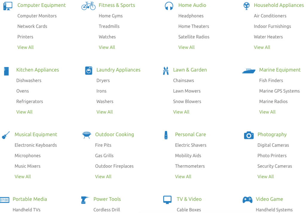
Click through individual categories or use the search box to find your specific product manual, and then print or open it as a PDF, and save to your hard drive or personal cloud. Seek troubleshooting and product support from the ManualsOnline community or browse previous answers to figure out why your thingamajig is doing that weird thing. It’s free to join and share your own expertise – you can sign in with your Facebook account or create your own login with your email address and a password. Share any manual directly from the site via email, Facebook, Twitter, or (yes, sigh) Google Plus, with one click.
ManualsOnline is ad-supported, so you will see sponsored listings to the right of, and below, your search areas.
ManualsLib.com has a collection of more than 2.7 million PDF-formatted manuals for 1.8 million products in 2000+ categories. Enter keywords in the search field to find your product, and the search results yield the manual name, description, size, and the number of pages. Opt to read the manual online, print one page or any/all of them, download it to your computer or save it to Dropbox or a similar cloud option. Share on social networks directly from a manual’s page, or add a comment for other readers to see.
ManualsLib is free to use, and there’s no registration required unless you want to bookmark a manual to your account. Just search, find, and download. And the site makes an interesting suggestion – in addition to accessing the installation, service, and owner’s manuals for the products you have, compare the manuals of similar products to help you decide which you want to purchase!
ManualsLib has targeted advertising, and rather than cluttering the web page, ads are embedded as a pre-cover page of each manual.
The Archive.Org’s Manual Library is yet another genius project from The Internet Archive, an international non-profit that seeks to digitize and provide “universal access to all knowledge.” If you’ve ever bookmarked a website only to find it no longer exists, you’ll appreciate how the Archive’s Wayback Machine has preserved more than 150 billion web pages. One of their lesser-known projects is the Manual Library, “a collection of manuals, instructions, walkthroughs and datasheets for a massive spectrum of items. Manuals covering electronic and mechanical products, instructions on mixing or blending items, and instruction sets for software and computer items are all included.”
Use the search box to find any of more than 90,000 manuals, or get lost for the better part of an afternoon in the sortable displays of 17,000+ hardware and software manuals, 500+ vending machine manuals, guides to making that John Deere tractor purr, and more. The true delight of the Archive.Org’s Manual Library, however, isn’t the useful manual options for what you own, but the quirky and unexpected manual collections, ranging from beekeeper supplies to Howitzer light tanks.

![]()
ManualsMania.com has a selection of more than 200,000 manuals. Start with a brand (from Acer to Krups, Apple to Sunbeam, and many in between) and then narrow your selection, or use the search box to enter keywords about your product.
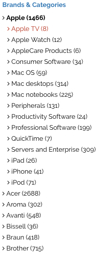 There are on-screen previews for most products to keep you from clicking through to a similar, but inexact, description match.
 Once you have the manual you want, click through and select the language option you prefer. For some products, you may find up to a dozen language versions, giving you the chance to practice your Czech while you learn about your new binkie’s features.
The database is free, requires no registration, and you can upload your own manuals to help further the pro-environmental cause of going digital. ManualsMania also has ads and a little less of a professional feel.

SafeManuals.com is a collaborative site. Access any of the PDF manuals in the database by typing keywords or model numbers into the search box. View any page of a given manual, or download the entire manual with a click. The file sizes are sometimes wonky – I was quoted 0 MB for a 196-page iPhone 6S manual, but the pages are all visible. You can also participate by uploading and sharing PDFs of any manuals you possess.
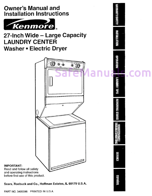 Strangely, manual pages are watermarked with the site’s URL, and ads sometimes appear on the bottom of the online version of the manuals, but not on the downloaded PDFs.
SafeManuals is an Estonian company accessible in English, Chinese, Dutch, French, German, Italian, Portuguese, Russian, and Spanish. The ads are run through the AdChoices network, so you’re more likely to see ads for sites you’ve visited recently (due to your computer’s cookies) than related products.
Retrevo is a shopping and review portal with a searchable database of more than a million product manuals. You can search by product category, like for cameras, video recorders, computers and peripherals, mobile phones, televisions, and a huge variety of consumer electronics and appliances.
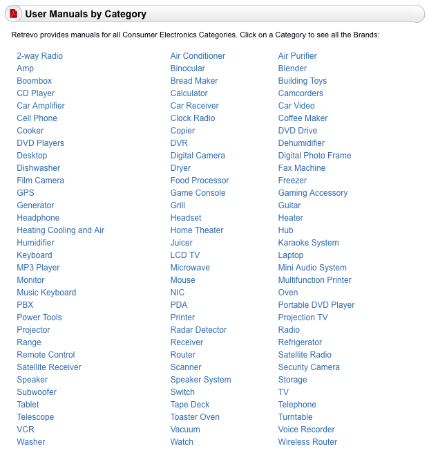
Although most major brands, including Sony, Panasonic, Canon, General Electric, Dell, LG, Maytag, KitchenAid, and Nikon are represented, there are some glaringly absent brands, like Apple. However, there are some equally fun surprises, like manuals for LEGO.
Once you locate the product you want, the download buttons for manuals are embedded in the product sales and review pages, which are full of ads, making the aesthetics of the site somewhat to be desired, and you have to enter a CAPTCHA to access the download. Still, it’s a good stop if you’ve exhausted other sites and are still seeking the right manual.
![]()
The UsersManualGuide.com has a real bare-bones approach to finding the manuals you need. There’s no membership, no forum, and no personalized home page. There’s no easy way to even find out more about who put the site together, but there’s a charm to the gruff simplicity. (The site is available in English, French, German, and Romanian, an unusual combination of options.)
The list of manufacturers ranges from AEG to Zanussi (with plenty from Panasonic, Motorola, Samsung, Kenwood, Sharp, Casio, Yamaha, Philips, and Sanyo). However, once you click through, you will need to know your model number to search directly. Otherwise, you get a Not-Ready-for-Prime-Time search box and there are no product photo previews to help you along.
UsersManualGuide.com has a bounty of on-screen ads, and the products available can be hit-or-miss. I couldn’t locate a manual for my ancient Sony Dream Machine (even knowing it was model ICF-C5W).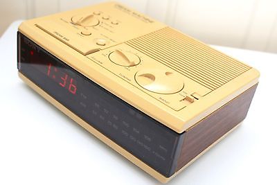
GAMING MANUALS

ReplacementDocs bills itself as “the original web archive of game manuals” but looks more like a circa-1996 web forum. If you’ve decided to dust off that Atari 5250 you haven’t used in eons, or you’ve found a mint condition Apple ][ game collection at a garage sale but can’t figure out the settings sans manual, this site has what you need. (Don’t worry, there’s plenty of Nintendo manuals of all varieties, plus Wii, XBox and more.) Staff editors hand-edit all uploaded submissions to ensure quality. There’s a teeny bit of advertising, but it doesn’t interfere with readability or search functions.

Vimm’s Lair’s Manual Project offers a collection of more than 400 NES and SNES game manuals, as well as guides for other games, all available for viewing online or downloading in .vml or PDF format.
![]()
The Video Game Archaeologist also has a large collection of classic and newer video game manuals, designed to be viewable in your browser (rather than downloaded).
CAR MANUALS
There are two types of automobile manuals. First, there are the owner’s manuals you find in your glove compartment when you buy a new car (or hope to find there when you purchase a used car). Manufacturers provide these for guidance so you will take good care of your car and be a satisfied owner.
The second type of automobile manual is more extensive and filled with in-depth maintenance and repair advice. The companies that produce these guides hire mechanical experts and technical writers to create robust, high-quality manuals, covering everything from standard maintenance to popular repairs to in-depth servicing. Understandably, such companies charge for those products. Consequently, you will not find these manuals available for free, online or elsewhere.
If you’re planning to do any kind of DIY car repair beyond replacing your windshield wipers, consult manuals from two of the best-known companies: Haynes and Chilton. You’ll find that these manuals, once available only in print, are now also available for purchase in digital form. (Bear that in mind when you get to our next post in this series, so you can keep track of all the major manuals for your household’s automobiles.)
But, back to the first type of manual. If you’ve spilled coffee on your owner’s manual, your toddler crushed wet Cheerios into the binding, or your new-to-you vehicle arrived without a manual, go to the ultimate car source.

Edmund’s.com, best known for helping consumers identify the right used or new car for their needs, has a nifty chart with links to each auto manufacturer’s site for downloading digital car manuals. Although the page hasn’t been updated in a few years, the links to individual automobile company sites yield the pages you’ll need to find the official manual for your car. In most cases, the digital versions of the manuals are free; acquiring a paper copy will generally cost $25-$45.

The Manuals.co Project is a collaborative site run by car enthusiasts seeking to overcome the challenges related to the “difficulty, stress and complications we encountered when looking for documentation relating to our vehicles.” The team seeks to collect and make available “workshop manuals” for a wide variety of cars. From Alfa Romeo to Vauxhall, they have an impressive variety of manuals, though none for my 20-year-old (let’s say vintage) Saturn SL1. Select the make and model of the car you’re seeking, then click to find the PDF for the year of your vehicle. View or download it for free. No registration is necessary, and you can also upload manuals you’ve scanned to help expand the database.
DEALING WITH THE CLUTTER OF MANUAL PDFs
The big question is, what do you do with all of these digital manuals you acquire? Sure, sometimes it’s good enough to look up a manual online, read how to reset your whatchamacallit, and move on. But if you’d prefer to have a neatly organized digital archive, Paper Doll has you covered. Watch this space for the final post in this Manual Override series to final post in this Manual Override series to learn how to create your own organized digital manual library with an easily searchable database.




Follow Me