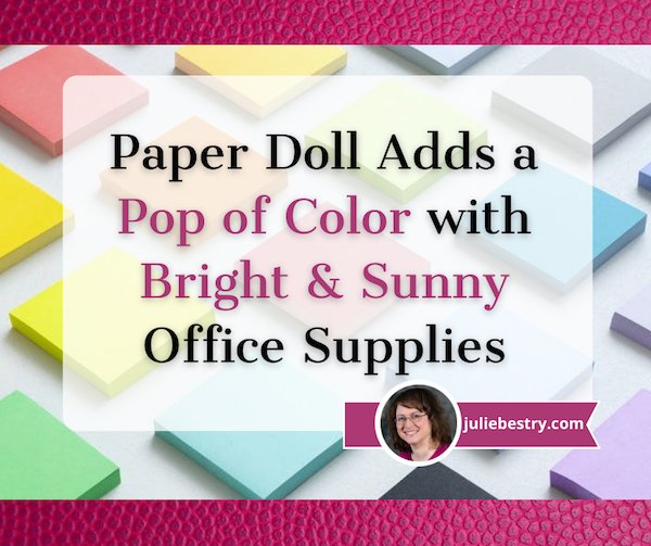
Paper Doll Adds a Pop of Color with Bright & Sunny Office Supplies
It’s May!
“April showers bring May flowers,” or so goes the children’s nursery rhyme. (“And what do May flowers bring?” the riddle asks? Pilgrims, of course!) But seriously, folks…
After a long, dark winter, we can all use some springtime sunshine, not just outside our windows, but in our workspaces, as well. For the theory behind the power of color to improve our moods, I direct you to my January post, Ask Paper Doll: Should I Organize My Space and Time with Color?
In that post, I talked about the difference between organizing by color and organizing with color. As a refresher, the wisdom of organizing by color depends on whether categorizing by color makes sense, both in general and for you.
Clothes? Yes. Types of activities on your calendar? Sure, if that adds to your ability to perceive and think about tasks. Spices? Foods? Maybe not. Books? Paper Doll gave that a big, old h-e-double-hockey-sticks NO!
But organizing with color is different. If color improves your mood, lifts your spirits, helps your cognition so that you can differentiate between categories, or otherwise makes you feel like you can take on the world, then bring on the kaleidoscope. Taste the rainbow! (With apologies to our friends at Skittles.) Pull out the Crayolas.
Today is less about theory than practice. (That means fewer words, and more photos!) We’re going to look at some new and noteworthy ways to add color to your office supplies and make your May less “maybe” and your workdays more “heck, yeah!”
CAPTURE WITH COLOR: 3M MEETS PANTONE
3M Post-it® Notes Color Collections
I’m sure you’re thinking that Post-its are not new, and indeed, you’re right. They were invented in 1964 and found the full embrace of office-dwellers everywhere by the 1980s, but they are constantly coming out with new color schemes. For several decades, it was all about that original canary yellow. For the past decade, city-themes (like Cape Town, Rio de Janiero, Miami, Marrakesh, etc.) got their due.
Recently 3M partnered with the Pantone Color Institute (whose Very Peri we discussed in the aforementioned Ask Paper Doll post) to come up with nine updated color collections and two new color schemes. Collections include a panorama, from bright and bold colors to muted and neutral tones, all in the hopes of making your workspace more of a delight. Or more serene. Or otherwise make you feel a certain way other than, “Oh, man, I wish I didn’t have to work.”
Recognizing that these beloved sticky notes were no longer just filling a role in drab office cubicles where any pop of color would do, Post-it® and Pantone realized that with more and more people working from home, there was a hunger for colors that fit with home decor.
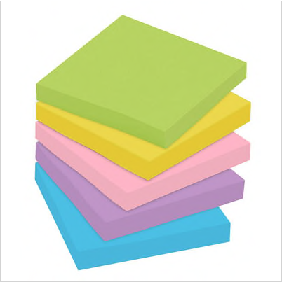
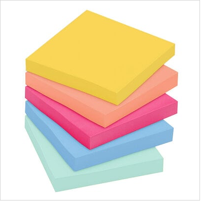
First, let’s look at the bright collections of notes. (Unless otherwise stated, this refers to the 5- or 6-packs of unlined 3″ x 3″ pads.)
SuperNova Neons — You’ll definite stay awake to finish your work with a color palette of Super Sticky notes featuring Acid Lime, Aqua Splash, Guava, Iris Infusion, and Tropical Pink. This collection comes with 6 pads per back (doubling up on one color), with 65 notes per pad.
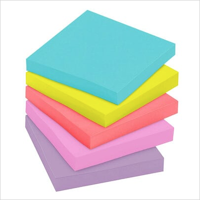
Energy Boost (a reworking of the original Rio collection) — These Super Sticky notes include Blue Paradise, Limeade, Sunnyside, Tropical Pink, and Vital Orange. They come 5 pads per pack, with 90 notes per pad.
Poptimistic — This peppy collection mixes Acid Lime, Aqua Splash, Guava, Power Pink, and Vital Orange in 5 pack per pad, 100 note pads.
Floral Fantasy — The collection combines pads with Blue Paradise, Citron, Iris Infusion, Limeade, and Positively Pink for slightly softer brights. These are standard, not-Super Sticky, notes and come 5 pads per pack, 100 notes per pad.
Playful Primaries — Note, this Super Sticky collection has six colors: Blue Paradise, Candy Apple Red, Iris Infusion, Lucky Green, Sunnyside, and Vital Orange. It comes 6 pads per pack, 65 notes per pad.
Summer Joy — This Super Sticky collection includes Citron, Fresh Mint, Papaya Fizz, Power Pink, and Washed Denim. Expect 5 pads per pack, 90 notes per pad. Aren’t these hues just Popsicle-level refreshing?
All of the above brights are 3″ x 3″ Post-it® Notes. Most collections also come in 4″ x 4″ lined versions, with 200 sheets per pad, 4″ x 6″ lined versions with 100 sheets per pad, and 12-packs of 1 3/8″ x 1 7/8″ notes; some (but not all) of these collections come in other sizes of multi-packs.
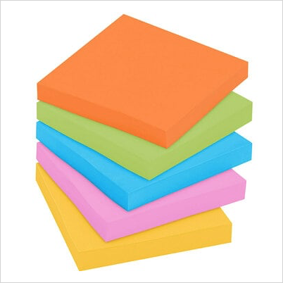
Perhaps the above brights aren’t your jam. If you’re back in the cacophony of an open floor plan office, or if vivid colors just don’t fit your carefully curated home office aesthetic, 3M and Pantone have kept you in mind. Check out their lovely, softly muted color schemes:
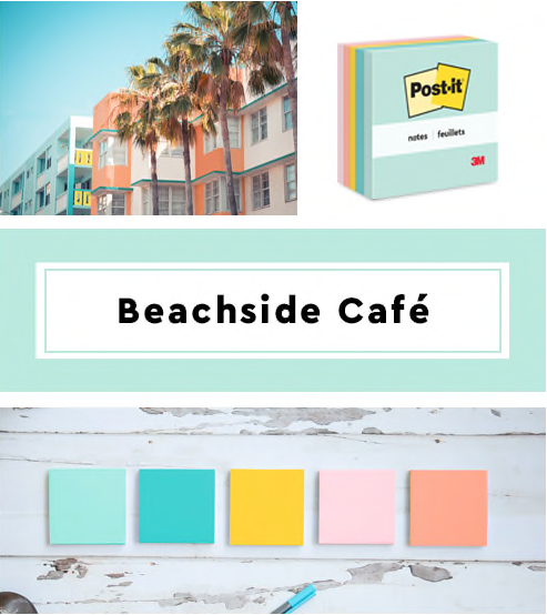
Beachside Café — This summery collection (a refresh of the former Marseille palette), includes Fresh Mint, Aqua Splash, Sunnyside, Papaya Fizz, and Pink Salt, so even if you can’t be on the beach, you can write on boat drink-themed notes. There are 6 pads per pack, with 100 notes per pad.
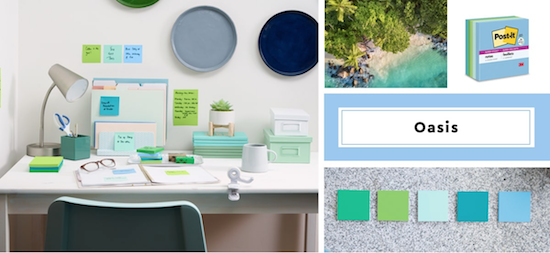
Oasis — This watery haven color palette includes Fresh Mint, Limeade, Lucky Green, Sea Glass, and Washed Denim. Each set includes 6 colored pads per pack, with 65 sheets per pad.
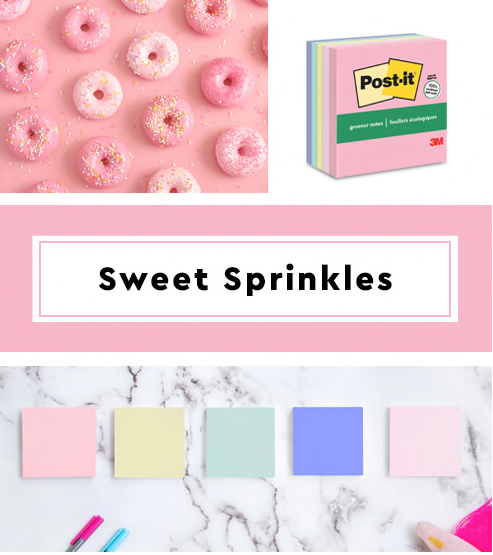
Sweet Sprinkles — This updated scheme includes Positively Pink, Pink Salt, Canary Yellow (the Post-It® that started them all!), Fresh Mint, and Moonstone. This collection is a greener version of the classic, made with 67% plant-based adhesive and 100% recycled material, so no new trees were used to make these sweet notes. Each set includes 6 colored pads per pack, with 75 sheets per pad.
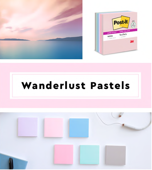
Wanderlust Pastels — When you combine Pink Salt, Positively Pink, Orchid Frost, Soft Denim, Fresh Mint, and Pebble Grey, you get a soft, cozy color scheme that’s perfect for soothing frayed nerves (perhaps after too many Zoom calls?). This collection has 90 sheets per pad and 5 pads per pack, so one 5–pack will not get get you all of the colors; perhaps opt for a larger multi-pack.
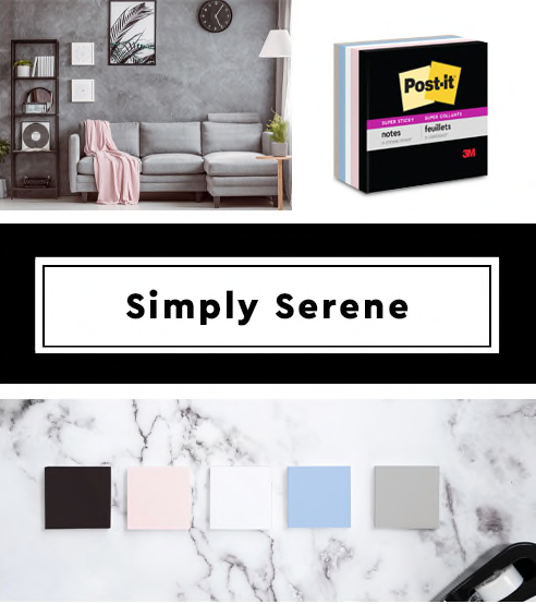
Simply Serene — If you’re looking for something really Zen to take you out of the hubbub of working, this collection may be ideal for you. The colors are Onyx, Pink Salt, First Snow, Pebble Grey, and Washed Denim. (Picture the set of a Nancy Myers-directed movie with Meryl Streep and Diane Keaton.) Although the marketing shows a traditional 5-pad pack, it seems Simply Serene is only available in a smaller set. I’ve only been able to find this collection listed with 4 pads with 45 sheets per pad, and one pad with 35 sheets per pad. So, FYI, you’re getting more ambiance than value with this collection.
As with the brights, the softer collections all come in 3″ x 3″ notes, and all but the Simply Serene are available in 4″ x 4″ lined and 4″ x 6″ lined. Some also come in a variety of multi-packs. I have no explanation as to why pads-per-pack vary from 65 to 100, except that 3M knows it’s the belle of the sticky note ball.
All of the above Post-it® Notes are recyclable and 3M states that the paper is sourced from certified, renewable and responsibly managed forests. You should be able to find Post-It® products in all office supply stores, both brick & mortar and online. However, these eleven collections are new, so not all versions have made it to the shelves. I was able to find a pack of Supernova Neons at Amazon for $5.39 and a 12-pack of the Wanderlust collection for $18.54. (To aid your online searches, select the Post-It® brand checkbox on the left to keep generic versions from filling your search results.)
SMEAD POLY HANGING FOLDERS
The problem with traditional, Army-green hanging folders is that they are that depressing shade of green. Bleah. They aren’t bright enough to seem like they belong in nature (unless it’s nature buried under a winter’s worth of dead leaves and dirty snow).
As for quality, as long as you go with one of the trusted brands of hanging folders (generally Smead, Pendaflex, or Big Box-store branded versions), the paper quality is usually quite good. After years (OK, decades) of suffering wimpy hanging files that bent, broke, or bowed, I think we’re all delighted with modern hanging files, with stiffer plastic (vs. bendy metal) hanging rods.
And certainly, there’s no shortage of colorful hanging files out there. But I have to admit, I got a little excited when Smead launched its line of poly filing products.
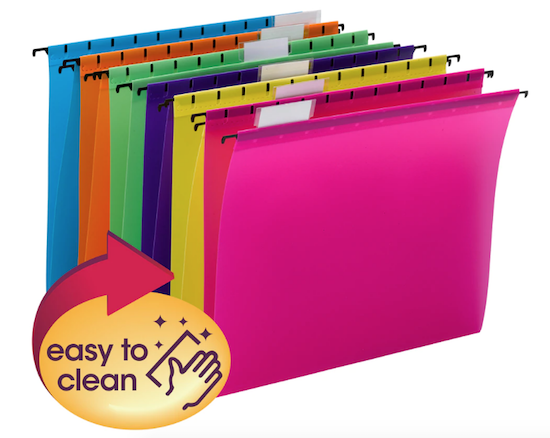
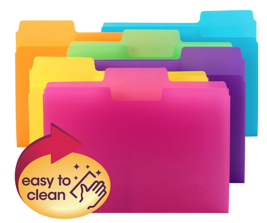
The acid-free and PVC-free Smead Poly Hanging Folders are letter-sized, measuring 11-3/4″ wide (not counting the hanging rods) by 10″ high. They come two color schemes: Bright Colors (fuchsia, yellow, purple, green, orange, and blue) or Primary Colors (red, yellow, green, and blue).
The durable poly hanging folders are tear-proof and water-resistant, both big plusses, especially if you tend to spill your coffee or overload your hanging files. If you’re a germaphobe (as I am) or a bit of a klutz (no comment), you may appreciate the fact that you can easily clean these hanging folders by wiping them with a damp towel or disinfecting wipe.
The coated rod tips are sturdy and slide smoothly across hanging rails in file drawers, crates, or desktop file boxes. Each set comes with clear tabs and the standard, replaceable white inserts, and can be re-positioned at the front or rear panels of the folders, depending on your preferences.
Whether you pick the Bright or Primary versions, a pack of twelve is $24.49 per pack from Smead or $21.05 from Amazon.
If I had my “druthers,” as they used to say, I’d love it if Smead would package these for purchase by individual colors; I’d rather be able to buy a dozen pink and a dozen purple poly hanging folders and none, ever, in orange.
SMEAD SUPERTAB® POLY FILE FOLDERS
Smead didn’t stop the poly train at the hanging file station; they’ve also expanded their popular (traditional-style) SuperTab® File Folders in a Smead SuperTab® Poly File Folder version.
Like the hanging files above, the durable poly material is tear-resistant, water-resistant, and super-easy to clean with a damp cloth or disinfecting wipe. Like the hanging folders, these are acid-free and PVC-free.
Compatible with any vertical or lateral filing system, in a filing drawer/cabinet, crate, or desktop file box, the 1/3-cut SuperTab® Poly File Folders measure 11.88″ wide by 10.5″ high.
The oversized SuperTab® has a 90% larger labeling area than traditional file folders, so you can use larger labels (whether labelmaker-printed or hand-written) and/or more text. (Disclaimer: I have never been huge fan of the SuperTab; I just don’t find it aesthetically pleasing, but I also don’t need my label text to be large, and (notwithstanding the length of my blog posts), I tend to label files with brevity. Your mileage may vary.)
The SuperTab® Poly Folders come in two assorted color sets, Primary Colors (red, blue, yellow, and green) and Bright Colors (pink, yellow, purple, green, orange, and blue).
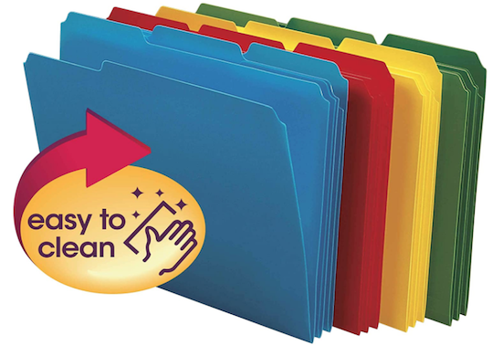
Smead sells the Bright version on their site for $19.03 for a set of 18) or the Primary set of 24 for $20.09; however, Amazon has a 24-box of the Brights for $18.49, but does not sell the Primary set at all.
In addition, Smead sells 24-packs of individual color packs for $20.09. Amazon sells 24-packs of all-red, all-yellow, and all-green SuperTab® Poly File Folders for $18.49, and mysteriously, a 24-pack of all-blue for only $12.59. I’m not sure if Smead thinks consumers find the bright blue boring, but it’s still better than Army-green!
There’s yet one more version of the SuperTab® Poly File Folders — a 25-pack (yes, 25, not 24) box of 1/3-cut, letter-sized, translucent folders with only the label portion colored (in red, orange, yellow, green, and blue).
![]()
I prefer opaque folders so the contents remain unknown to casual passersby, but if you like this version, a 25-pack is $25.39 at Smead or $21.70 at Amazon.
A STICKIER DIVIDE AND CONQUER: REDI-TAG DIVDER STICKY NOTES
In general, I try to recommend actual name-brand Post-it® Notes because the 3M adhesives (regular, Super Sticky, or Extreme) offer a super adhesive, but sometimes, they just don’t make the product a client wants or needs.
Obviously, they make sticky notes, and they make all sorts of tabs, but I’ve had no luck finding the right kind of tabbed sticky note. (Their Noted by Post-it® brand does make a tabbed note that’s more like a cutesie to-do list, but it only has three tabbed positions and is not available in a multi-color set.)
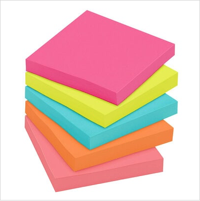
So, with that in mind, I offer up the Redi-Tag Divider Sticky Notes. These six-position, tabbed, 4″ x 6″ ruled notes come in assorted neon colors. The notes are bound by color to allow the user to flip to the preferred hue to more easily maintain color-coded organizing system.

As you can see from the photo above, the notes are ideal for students, or anyone taking notes on a contract or book; the tabs let you find your notes easily, and you can color-code your categories. You can easily imagine a home chef writing notes on personalized variations and using the tabs to mark favorite recipes.
The product notes say that the Redi-Tag Diver Sticky Notes use “water-based, as opposed to chemical-based, adhesive,” but I don’t feel qualified to state how that might impact your use. However, at only $5.79 for a pack, this is a tabbed pop of color worth trying.
(And hey, 3M? I’d love to see you come out with a line of these!)
From Paper Doll HQ to your homes and offices, I hope you have a colorful, uplifting, organized, and healthy month of May!

I like some things color-coded and others not so much. While I love Post-Its in all colors, when I created my tasks section on my markerboard that breaks down tasks in 15-minute increments, I found the colors too distracting. So I had to swap out my colored Post-Its for yellow ones in various sizes. So far, so good. Thank you for sharing this thorough post.
I feel the same way you do, Sabrina. I can’t use more than three colors when I’m doing a Kanban board, for example, because it overwhelms. But I do like having a stack of a Post-it collection so that I can switch from day-to-day for my 1-2-3 priority note for the day.
I wish the giant-sized Post-its, the ones that are a foot square, came in multiple colors. I have the yellow ones, which I mainly use to leave can’t-miss-it notes on the front door for delivery guys (though, with a blue crayon, I made a great Ted Lasso sign on one). They also make a neon pink, but I’d love other shades.
Thanks for sharing!
Summer to me means BEACH! I’m definitely into the beachside cafe color scheme. Might have to add those to my Amazon wishlist.
I don’t generally use a lot of color, but when I want to remember something or have it catch my eye, color is the way to go.
This was so fun for the beginning of May. We’re moving into my “happy season,” so I’m just sitting here, smiling:)
Beachside Café and Summer Joy are both just so lovely for making it feel like summer.
I’m so happy this made you smile. I had a different post planned for today but postponed it because *I* needed something to make me smile. 🙂
Thanks for reading and sharing!
I’m all about color, so you can imagine how much I LOVED this post! All of the new post-it set colors are wonderful. The packs I liked Oasis with the cool blues and greens. And I wish I could get an entire pack from the Sweet Sprinkles set of Orchid Frost.
The color tabbed sticky is awesome too. I’m going to get a pack and test out the stickiness. There is a company, Knock Knock (https://knockknockstuff.com/collections/sticky-notes) I love buying sticky notes from because they are so funny, but they don’t have a great stick to them…not as good as 3M’s. They are colorful, but not quite as colorful as the ones you shared in this post. So much fun, Julie!!!
I thought of you, Linda, when I made the comment about wanting a box of pink or purple poly hanging folders! We’re purple girls! And yes, the Orchid Frost is lovely. I think the closest you can get is a 5-pack of Purple Iris Post-its, but that is definitely darker.
And I adore the Knock Knock designs for their sticky notes and long list pads — so funny! And I’m a huge fan of Anne Taintor but am always disappointed by such great notes having almost no decent adhesive quality. I wish 3M would just make ALLLLLLL the notes, but that all the good stuff would still be produced. Ah, well.
Thanks for reading!
I’ve never been too keen on multi-colored Post-It packs. I did used to buy them, and offer clients a choice when we were labeling things with them. But we often ran out of the color they chose. Also there’s always one color that’s too dark and one that’s too bright (for me to want to use it). I always wish there was more of the color I like best. But then, I’d never seen the Oasis color palette before, either. Ohhhh!
I get it, Hazel. The multi-color packs always had lots of darker colors, but I found that many of the city-themed packs of yore (Miami https://www.staples.com/Miami-Post-It-Stickies-Notes/cat_CL165755/282ph for example) had all light enough colors. These collections, however, yield a LOT of choice!
But I’ll admit, I kept thinking of Maria Muldaur’s 1970s song, Midnight at the Oasis, when I wrote that section. 🙂
Post-it Notes are such a popular giveaway at trade shows and the like that I can’t remember the last time I needed to buy any. If I do, I will definitely go for the pretty ones!
I wish I’d read your previous post earlier, before I decided to arrange my books by color. It looked so good in pictures I saw online, but I forgot to notice that their books were nicely uniform in shape and size. Not only did my shelves look messy, I couldn’t find anything easily.
Most sticky notes I’ve received at trade shows have had branded logos on them, and I can’t use those for anything except a grocery list; I need a clean, empty 3-inch square canvas. 😉 But I’m sure that even if I’d taken any before, I’d definitely have used them up after 2+ years of not being out in the world. No trade shows for me!
As for the books, I guess you’re just going to have to read ALL my posts from now on, Janet. 😉 But seriously, I’m pretty vociferous (along with Jacki Hollywood Brown) about the dysfunction of organizing books by color. Books are functional items, not decor. I suspect the people driving the interior design books-by-color trend don’t actually read very many books. (Oooh, that was mean of me!)
I love the colored post-its and find that some people are more motivated to write things down when the notes are pretty. I use the different colors for different topics when I’m doing a brain dump or planning.
Beautiful colors are definitely motivating, whether it’s just the delight of seeing a color we love, or if it’s as the research shows, and different colors yield different emotional results. I have to say, I like the softer colors better than the brightest neons, but I’ll take color over something drab, any day!