Archive for ‘Notes and Notebooks’ Category
Noteworthy Notebooks (Part 1): Re-Surveying the Landscape
Portrait vs. Landscape. Vertical vs. Horizontal. Uppy-downy vs. sidey-sidey. While most aspects of organizing are equal opportunity, paper organizing products tend to take sides.
For example, when it comes to most of the paper filing topics we discuss here at Paper Doll HQ, the horizontal view is the norm. Think tabbed folders, hanging files, filing cabinet drawers. Certainly, we look at a lot of vertical organizing solutions at the macro level, but while we file vertically, the products, themselves, generally have a horizontal, or landscape layout.
It’s a real rarity when we look at vertical filing solutions; in fact, we haven’t done it since New Smead Organized-Up Folders Stand At Attention in 2013! (Moreover, other than the main Smead products reviewed, the other items referenced in that post have gone the way of the dodo!)
Conversely, when we talk about organizing our actual writing, it’s the portrait, vertical, uppy-downy approach that gets most of the love. That’s why my 2014 off-ramp post Surveying the Landscape: Around the World with Horizontal Office Supplies was so unusual. I had to hunt for non-filing related paper products in a landscape-orientation.
Indeed, almost every office supply in that post is a riff on a clipboard, and even then, many of the options were only available in Europe and Asia. (Granted, there were some really cool products in that post, like the waterproof clipboard that created a little raincoat to let you keep your papers collected and dry in inclement weather.)
The only thing close to a notebook I found to include in that post was Roaring Spring’s line of 11″ x 9.5″ landscape notepads (available in multiple colors of lined or white graph format).
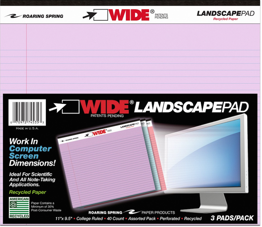
A year later, in 2015, I finally dug deep (or shall I say, wide?) into the topic of landscape-orientation notebooks and notepads in Paper Doll Surveys the (Paper) Landscape, where again, those Roaring Spring notepads took center stage. Beyond those and some special prototyping notebooks for web designers, all I found was a notebook sold in Japan with German marketing copy and the Rhodia Webnotebook sketching journal.
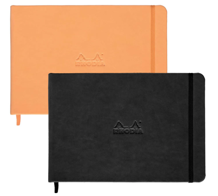
Even then, landscape is seen as primarily for creating landscapes – for drawing, designing, sketching.
At the time, I tried to explain why I thought landscape notebooks were important. (Imagine that I’ve inserted one of those wiggly sit-com flash-back effects here.)
OK, Landscape. But Why?
Most of the time, when we hand-write, we are in portrait mode, and it usually makes sense. However, I can think of a sampling of reasons why we might want to have some side-to-side breathing room.
Most notebooks are portrait, but a landscape orientation has six significant advantages: for notetaking, ergonomics, room for expansive thought, to do mind-mapping and flow charts, and to emulate TV/computer screen dimensions. Share on X1) Notetaking – When we’re taking notes in a committee meeting or for class, we’re often creating a linear, outline-style set of notes. But, as we discussed when we reviewed the exceptional Cornell Notetaking Method, we need to make room for cues or other special attention-getting markings on the left side.
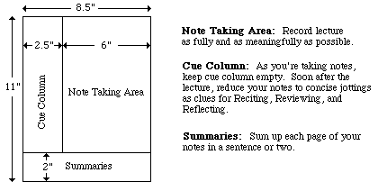
With traditional 8.5″ wide paper, that either reduces our notetaking space or forces us to write in the narrow margin, making it more likely that we’ll get inky smudges on that all-important cue-section. Landscape orientation provides more breathing room.
2) Ergonomics – Look at the available space on and around your desk. If your computer is in front of you, your keyboard is probably somewhere between elbow-and-wrist distance away, not leaving you very much space for alternating typed notes and handwritten notes. Because of that limited space, you may find you’re turning your traditional (portrait-orientation) notepad sideways, with the top to your left (unless you’re a southpaw). This lets you take written notes, but you’re probably twisting at the waist to do so. This is not sustainable or ergonomically friendly.
3) Expansive thought – When we take notes, journal, free-write, or craft letters, we’re often thinking linearly. It’s easy to follow a unidirectional flow of ideas, or paths, with a narrower piece of paper. When we’re on the computer, using Microsoft Word or any other word processing program, unless we’re using design features for creating signs or brochures, we echo that same tall/narrow format.
But what happens when we want to think more broadly (no pun intended)? When we’re on the computer, using a spreadsheet like Excel, we create multiple columns so that we can visualize information best seen side-by-side, like multiple fields in a record. But what’s the paper version? I can think of a number of times when I’ve been working with a client to brainstorm ideas in parallel (like how different departments will handle particular situations), and we end up turning a notepad sideways. The lines go the wrong way, and the content gets messy; it suffices, but it’s not optimum.
4) Mind mapping – Paper Doll is a fairly linear thinker, but when I’m trying to mind-map, or show the relationship between different processes, or do anything that’s more visual, I need more space. With some clients, we may choose mind mapping software or apps like MindNode or XMind, but we often find that an analog solution is faster and more immediate. Most often, we end up using multiple Post-It! Notes on a wall or window. That’s great when we’re in a house or office, but not so optimal when we’re in the field (even in a field), in a warehouse, or going mobile. That’s where these landscape notepads (and the aforementioned landscape clipboards) really come into their own.
5) Flow Charts – It might not be immediately apparent, but a number of law students have posted online comments regarding how landscape writing pads make it easier to visualize case-law timelines, precedents, and conceptual flow. Scientists have also reported that wide-format paper helps conceptualize scientific reactions more clearly.
6) Computer/TV Screen Dimensions – Tablets and phones aside, we spend a lot of time looking at screens in landscape orientation, and sometimes we still need to make our analog notes approximate what we’re seeing, or make our digital notes approximate what we’d like to be seeing on the screen. Writing pads that parallel those dimensions are helpful.
So, What’s New on the Landscape Landscape?
If, other than sketchbooks, it was hard to find a landscape notebook six and seven years ago, how do you think it’s going now for those who want to apply a wide-angle lens to their analog writing?
PANOBOOK
Well, newer on the topic is the Panobook, which I discussed in 2019 in Organizing the Shape of Notebooks to Come: Panobook, Triangle, and Sidekick as part of a look at oddly-shaped notebooks. It works for all of the reasons listed above, but particularly with regard to fitting nicely between your body and the keyboard.
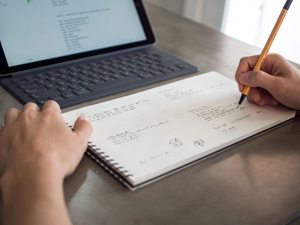
At the time, I noted the difficulty of using your computer and a notebook at the same time, especially when space is at a premium:
If you want to take notes, maybe you can scroll (I mean, slide) your body to the left or right, or you may have to swivel in your seat to use the left side of the desk (or the right side, if you’re left-handed) to take notes. Unless your arms are long (and your eyesight so pristine that your monitor is very far away), there’s just not that much writing space in front of you. (And I’m pretty sure you don’t want a notebook poking into your tummy.)
Panobook measures 160 mm x 288 mm (6.53″ x 11.34″) and is designed to sit squarely in front of your keyboard. It’s made of high-quality (70 lb) paper and meant to perform with a variety of writing instruments and inks without causing bleed-through or smudging.
The front and back covers of Panobook are made of rigid black chipboard, and the whole thing is bound with sturdy black Wire-O (AKA: Twin Loop) spirals measuring 12.7 mm (0.5″) in diameter, so the Panobook sits flat when opened without the cover smacking back into place or bending, as you get with perfect bound notebooks or glued notepads.
Each notebook contains 50 sheets (100 pages). Neither blank nor lined, the Panobook has a subtle dot pattern with grid spacing at 5 mm (0.20″), so you can use it for writing, drawing, or laying out charts. For web interface design or storyboarding, there are guide markers to aid in drawing three rectangles on the page, and edge guides to divide each page and provide cues for layout.
Each Panobook comes with a slip case to make it easy to label the spines with the notebook’s content and start and end dates so you can catalog them together on a shelf.
Panobook is available directly from Studio Neat for $20/notebook for one or two; they’re discounted to $19/notebook when you purchase three to eleven, or to $18 if you buy a dozen.
BetterBook
In June 2020, a group of young designers from Amsterdam called orangered life teamed up and launched BetterBook, a landscape notebook campaign on Kickstarter that really got the attention of the crowdsourcing, uh, crowd. (It successfully moved to IndieGogo for expansion.)
Used to sharing their ideas by passing around their notebooks in the office, they needed a better pandemic-friendly solution as they worked from home, still designing with analog notebooks.
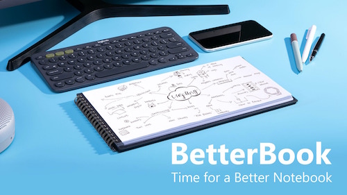
The orangered life team saw their BetterBook creation as having four distinct advantages over the typical notebook:
- Content is sharable – The BetterBook is an analog notebook, but the team figured out how to improve digital capturing and scanning. Each page of the notebook had a 0.5 cm black border on the left and right sides; the notebook’s covers extend beyond the pages, creating a 1 cm border at the top and bottom of each page; the border frames each shot perfectly, so your phone or scanner apps can capture each scan quickly and easily without delays, mistakes, or kerfuffles. (I wish checks were designed this way; it would improve the mobile deposit process.) Create, point, shoot, share!
- Scanned images display better – Because the BetterBook uses an 18:9 ratio, the format matches both mobile phones and computer widescreen monitors perfectly. So, because captured images are designed to fit screens perfectly, there’s no letterboxing effect – no black borders on the top and bottom of the screen, and there’s no pinching and zooming necessary, which often causes a loss of finer details.
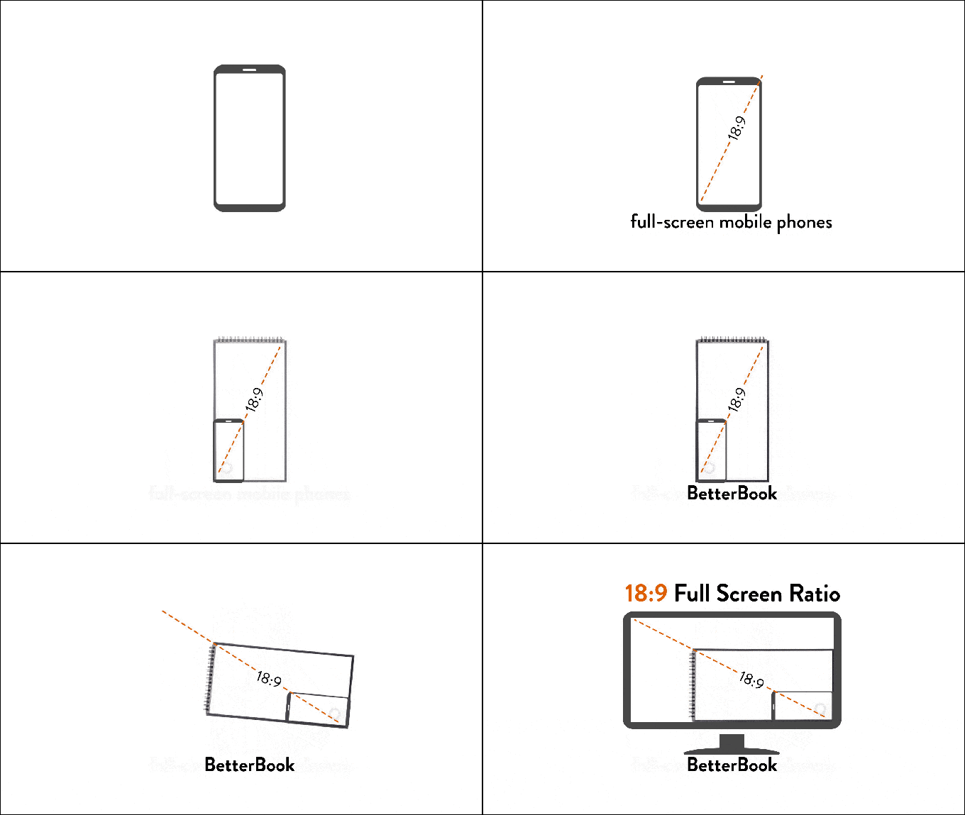
- It fits on your desk just below the keyboard – The Betterbook comes in two sizes: the Desk Notebook measures 310 mm (12.2″) x 160 mm (6.3″) and the Pocket Notebook (for when you’re back to working in coffee houses again) measures 130 mm (5.12″) x 70 mm (2.76″).
- There’s a built-in note organizating and time management doodad – In the bottom right corner of each page, there’s a subtle grey symbol designed to help you organize your work. The tiny spaces let you note deadlines, reference edits, or add anything you need to help categorize your important information.
The Betterbook has three acid-free, fine-grain paper options: blank, lined grid, or dotted grid. Both the Desk and Pocket sizes have 40 sheets (80 pages).
The BetterBook team sees its product serving designers, artists, (board/tabletop) gamers, and workers in creative industries. They also promote it for writers and students, though the lack of lines may make it difficult for some writers to get used to.
You can purchase BetterBook via Indigogo for $31 for one book or $79 for a set of three.
Write Notepads & Co.’s Landscape Notebook
Chris Rothe, a third-generation bookbinder at Baltimore-based Write Notepads & Co. has a plan to “make notebooks cool again.” (Paper Doll has always thought notebooks were cool. Paper Doll is unwilling to entertain the thought that not everyone thinks she’s cool.)
So, @WritePads wants to make notebooks cool again. Paper Doll has *always* thought notebooks were cool. (Paper Doll is unwilling to entertain the thought that not everyone thinks she's cool.) Share on XThe company makes a variety of deluxe notebooks – in the United States – using environmentally-friendly materials like vegetable-based inks and premium cover stocks and paper. And yes, they make a landscape notebook inventively called: Landscape Notebook.
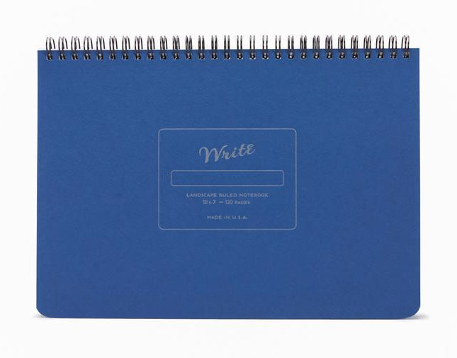
I’ll be honest, there aren’t a lot of fancy doodads here, but in some ways, that’s the charm of this notebook. The 10″ wide, 7″- high, 1/2″-thick, 15-ounce notebook is just really on-target in simple but essential ways.
The sheets are made with heavy, smooth, uncoated 70-pound paper stock, so the pages resist ink bleeding through or feathering across the page. (Nobody wants runaway ink!)
Each notebook’s 60 sheets/120 pages are lined at 1/4″ spacing using soy-based inks to create subtle, unobtrusive lines.
The covers are durable. The top is made from 10″ x 7″ board cover stock, with letterpress impression detailing. Because the back cover is also sturdy (and though it’s not stated, it appears to be chipboard), you can write while standing or during walk-and-talk meetings. Write Notepads & Co. offers matte gold embossed monogramming in 30 point font. (While 3-letter monogramming for a notebook like this strikes me as pretentious, your landscape mileage may vary.)
The durable double-wire binding allows the notebook to lay flat on any work surface. The binding is at the top (unlike with the Panobook and Betterbook), which means under normal use, the wiring runs parallel to your keyboard or desktop. The company sees this as a plus, as lefties are constant finding the length of their forearms pressed against the binding with typical notebooks. I’m inclined to agree, though some people may find it hard to type with their wrists stretched over/across a horizontal binding. (Share your thoughts in the comments section.)
The Write Notepads Landscape Notebooks come in five cover colors: Black, Red, Blue, Pistachio (light green), and Kraft (brown) and cost $20/notebook, with a 15% discount if you purchase 10+ and 25% discount for 50+. Shipping is free on all orders of $60 or more. Monogramming is $10.
Write Notepads & Co. also has a landscape orientation weekly planner.
Landscape Notebook
Obviously, unique naming is not a high priority in the landscape notebook field. Two years ago, Xavier Neyo launched a Kickstarter for a landscape notebook option. He called it Landscape Notebook. OK, then!
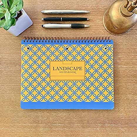
As crowdsourcing campaigns go, it was pretty casual: a low-fi video and list of three reasons Neyo was passionate about creating a landscape notebook. He felt that there should be notebooks to match the orientation of chalkboards and whiteboards so that notes taken in class or a meeting should be able to better match what’s written by the instructor or meeting leader.
Neyo also pointed out that narrow notebooks waste even more space with wide left-side margins; his notebook would be wider and the usable space would be more expansive, with minimal margins. And he was miffed about notebooks with flimsy back covers.
Flash forward (imagine the whooshing noise) to today, and Neyo has his own website and version 2 of his Landscape Notebook has debuted:
- The Landscape Notebook measures 10″ x 7.5″.
- The 80 sheets (160 pages) are college ruled.
- It has double-loop spiral binding along the top (he refers to it as O-ring, but it appears to be Wire-O) and it has a stiff back cover.
- There are three simple cover designs: solid navy blue with yellow accents, solid light blue with white accents, or a yellow and blue pattern.
- The pages are perforated slightly below the spiral binding; below that, each page is three-hole punched, eliminating any activation energy for getting your papers filed away once you tear them off the notebook.
- Each page is lightly marked with page divider indicators at the top margin to make it each for creating two, three, or five columns or sections.
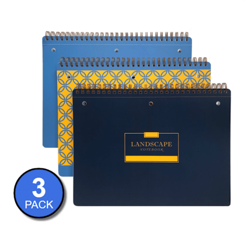
Neyo’s Landscape Notebook is available from his website: 3 notebooks for $24, 12 for $84, or 48 for $288. The site says the Landscape Notebooks are also available on Amazon, where there are priced slightly lower, but are currently out of stock.
This is the first (and least techie) of a short series on innovations in notebooks. Be sure to pop back next week to see what’s new in erasable, reusable, customizable, and even magnetic notebooks!
Organizing the Shape of Notebooks to Come: Panobook, Triangle, and Sidekick
Notebooks. Bullet Journals. Diaries. Sketchbooks. Whatever you use, notebooks are essential to capturing words, feelings, designs, and brilliant ideas so they don’t fade away into oblivion.
We’ve talked a lot of notebooks here at Paper Doll HQ, everything from waterproof notebooks to notebooks for left-handers. We’ve discussed various types of hybrid paper/digital notebooks, like Ampad’s Shot Notes and Versa Crossover, TOPS’ Focus Notes, and Evernote’s Smart Notebook by Moleskine. We’ve dug into magnetic notebooks, dry-erase notebooks, and customizable notebooks.
The blog has also looked at the 5 Key Points for Organizing with Notebooks, and in Notions on Notebooks: Organize Your Paper Picks, we delved into all of the considerations to take into account when choosing a notebook solution, including: price, branding, portability, binding, paper quality, lines, and color.
We’ve even looked at the shape of notebooks before when we presented Paper Doll Surveys the (Paper) Landscape. Because, sometimes, you just want something a little different. Today, we’re going to embrace three very different notebook styles.
PANOBOOK
Most notebooks have a portrait orientation. It’s rare, other than with sketchbooks, to see a notebook with a landscape orientation. Panobook, however, takes landscape one step further and delivers a panoramic (landscape-orientation, but wider) notebook designed to sit on your desk (in that bit of space between your abdomen and your keyboard), and eventually, on your bookshelf.

Created by Texas-based Studio Neat, known for a variety of innovative products, from wooden charging docks to cocktail-making tools to video-related apps, Panobook began life as a Kickstarter and quickly gathered community support.
It’s easy to understand why. Depending on the width of your desk, you may or may not have space to the left or right of your body. But your monitor is generally straight in front of you, and so is your keyboard, so unless you have an L-shaped desk, the real estate in front of you is pretty tightly packed.
If you want to take notes, maybe you can scroll (I mean, slide) your body to the left or right, or you may have to swivel in your seat to use the left side of the desk (or the right side, if you’re left-handed) to take notes. Unless your arms are long (and your eyesight so pristine that your monitor is very far away), there’s just not that much writing space in front of you. (And I’m pretty sure you don’t want a notebook poking into your tummy.)
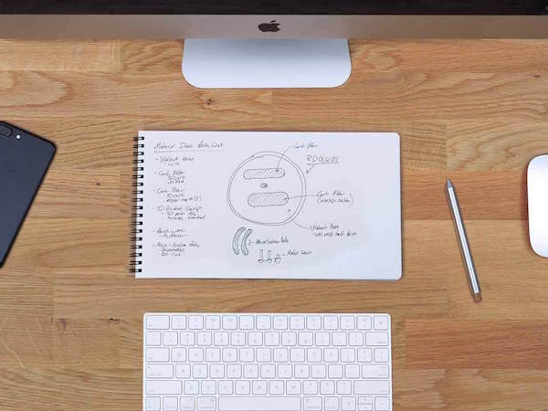
Panobook was created to solve this problem of limited space. The panoramic format, measuring 160 mm x 288 mm (6.53″ x 11.34″) is designed to sit squarely in front of, or if you prefer, behind, your keyboard. (Turned vertically, of course, it can sit to the left or right, if you have that much space. But then you’d probably be using a traditional notebook or legal pad, right?)
Panobook is made of high-quality (Finch Fine Soft White Ultra Smooth 70 lb text-quality) paper and designed to perform with a variety of writing instruments and inks without causing bleed-through or smudging. Both the front and back of Panobook are rigid, made of Neenah LaCrema 617 Charcoal-colored 50 pt black chipboard. It’s all bound with sturdy black Wire-O (12.7 mm (0.5″) diameter), so Panobook will sit flat when opened on your desk. (For some of us, this is a huge deal!)
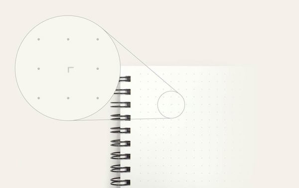
Each notebook contains 50 sheets (100 pages). Instead of being lined or blank, Panobook has a subtle dot pattern with grid spacing at 5 mm (0.20″). And there’s a quirky little twist. There are guide markers on each page that make it easy to quickly draw three rectangles on the page, sized ideally for web designers doing smartphone user interface design or creative types for doing storyboarding. There are also edge guides to divide each page and provide cues for layout. They’re subtle, so if you don’t need them, you might not even notice them.
So what do you do when you finish the notebook? Panobook is designed to let you archive your creations and comes with a slip case in a French Paper Kraft-Tone Standard White 100 lb Cover (for people who know about such things). Write on the spines to catalog your notebooks and keep your collection together on a shelf.
See the Panobook in action:
You can buy Panobook directly from Studio Neat for $20/notebook for one or two; they’re discounted to $19/notebook when you purchase three or more.
TRIANGLE NOTEBOOK
When I first saw the Triangle Notebook last summer, it seemed vaguely familiar. Back in 2012, there were quite a few posts on the design blogs about this product and it was selling at the Metropolitan Museum of Art shop. However, by the time I planned to write about it, the Triangle Notebook had already sold out and been withdrawn from the marketplace. Now it’s back in an improved form.
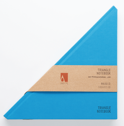
The Triangle Notebooks (both the original and improved versions) were created by Tan Mavitan, a creator based in Istanbul, Turkey and best known for his sculptures. As you can imagine, artists need someplace to collect designs and thoughts, so who better to imagine innovatively designed notebooks?
The Triangle Notebook appears to be just that: When closed, it’s a triangle. Flipped open, the notebook is square. The hard front and back covers and spine are encased in fabric, and the 160 interior (90 gr acid-free paper) sheets are narrowly ruled.
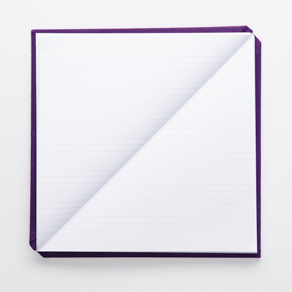
The Triangle Notebook comes in 13 solid colors, including Black, (light) Blue, Dark Green, “Green” (which looks more like chartreuse), Navy Blue, Pink, Purple, Red, Yellow, Dark Amber, Ghost White, and Mustard. There are also three Special Edition Triangle Notebooks: Triangle Thoughts (white with black avante garde style, and Yachtsman Blue (pictured below) and Yachtsman Red. All notebooks are 21 cm x 21 cm (8.26″ x 8.26″).
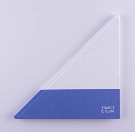
Personally, I find $33 to be a steep price, even for an admittedly lovely hardcover notebook, but my larger concern is that the pages may not lay flat when the notebook is open. Of course, at about 8 1/4″ square, you could place a small book weight in the center without obscuring too much of your content.
All versions of the Triangle Notebook are available from Amazon or from the Tan Mavitan Studio shop. The price in both venues is $33. The Studio often has discount codes listed at the top of the page; as of this writing, WELCOME2019 yields a 20% discount. However, there’s no shipping rate information on the site, and the notebooks do qualify for Amazon Prime two-day shipping, so check both options to see what works best for you.
SIDEKICK NOTEBOOK
Remember what I was saying about real estate on your desk being at a premium? Panobook isn’t the only option for handling this problem creatively. The Sidekick Notebook appears to be a mostly normal (if narrow) portrait-oriented notebook with a bottom margin cut strangely on the diagonal.
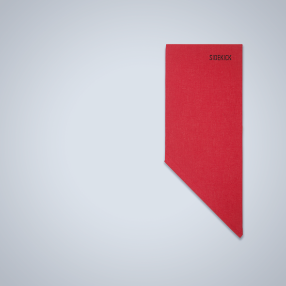
When closed, the Sidekick Notebook measures 21.5 cm x 8.5 cm (8.46″ x 3.34″). But once it’s flipped open, the Sidekick is actually an L-shaped notebook designed to hug the corners of keyboards, iPads/tablets, mousepads, books, and other square-ish items.
Instead of a portrait or landscape orientation, the Sidekick delivers both options simultaneously
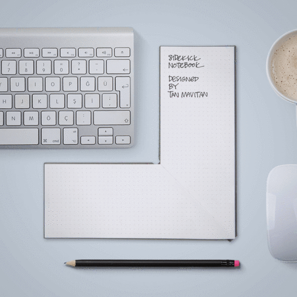
The Sidekick, which comes 160 sheets (of 90 gr acid-free paper) per notebook, has a hard fabric-encased cover and comes in four colors: Red, Black, Navy Blue, and Light Gray. The layout is dot- grid style.
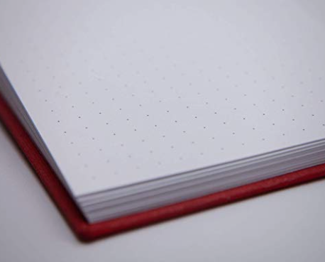
I suspect that the Sidekick won’t serve well for sketching large designs, but with both landscape and portrait writing areas, it’s good for taking notes and creating fiddly, small-detail designs.
The Sidekick is available for $24 per notebook from Amazon and from the Tan Mavitan Studio store, with the same discount and shipping caveats as noted above for the Triangle Notebook.
As always, the content you create and capture in your notebook is more important than the size, shape, color, or design. Sometimes, if a notebook is too spiffy (or expensive), we are reluctant to put anything but our “best” notions in them, which may mean procrastinating on doing anything at all.
If a unique design inspires you, embrace an unusual landscape or angle. Just give yourself permission to create first, and judge your work later.
Paper Doll Surveys the (Paper) Landscape
Serendipity is an interesting thing. Last year, an unexpected project introduced me to a wide-format clipboard, and a little research into that novelty turned into a revelation about the option of landscape-oriented office supplies. At the time, I mentioned the relative rarity of landscape-formatted writing pads, sourced one, and promptly forgot about them.
Then, just this week, while trying to solve the conundrum of my favorite (and suddenly unavailable) purple legal pads, two different blogs would prove to be the inspiration for this post. But not because they were profiling pastels — because they talking about writing pads with landscape orientation.
Suddenly, that previously discovered line of landscape-orientation, Roaring Springs Wide LandscapePads, have become this week’s must-have office supply. They come in four varieties:
Standard

- 11″ x 9.5″, WHITE, college-ruled. Each pad includes 40 sheets of 20-pound, 30% post-consumer recycled paper per pad, with left-side margins. Micro-perforations at the top yield an 11″ x 8.5″ sheet. (Available singly or in two-pad packs.)
- 11″ x 9.5″, CANARY (yellow), college-ruled. Each pad includes 40 sheets of 20-pound, 30% post-consumer recycled paper per pad, with left-side margins. Mirco-perforations at the top yield an 11″ x 8.5″ sheet. (Available singly or in two-pad packs.)
- 11″ x 9.5″, ASSORTED* PASTELS (orchid, pink and blue), college-ruled. Each pad includes 40 sheets of 15-pound 30% post-consumer recycled paper per pad, consumer recycled paper, with left-side margins. Micro-perforations at the top yield an 11″ x 8.5″ sheet. (Available in three-pad packs.)
Graph
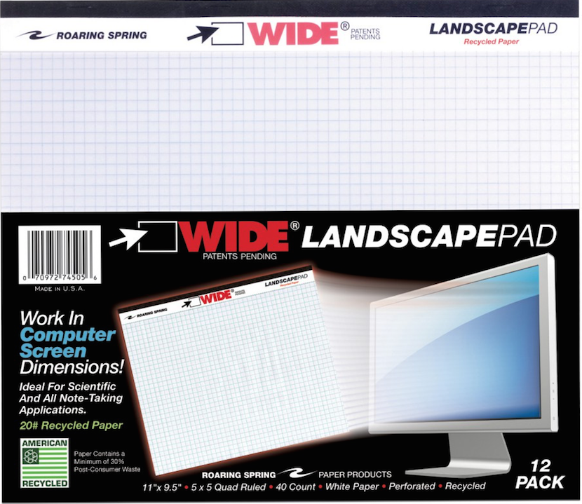
- 11″ x 9.5″, WHITE, gridded with 5×5 graph paper. Each pad includes 40 sheets of 20-pound, 30% post-consumer recycled paper per pad, with left-side margins and micro-perforations at the top. (Sold singly and in packs of two, four and six.)
Punched (for easy storage in traditional three-ring binders)
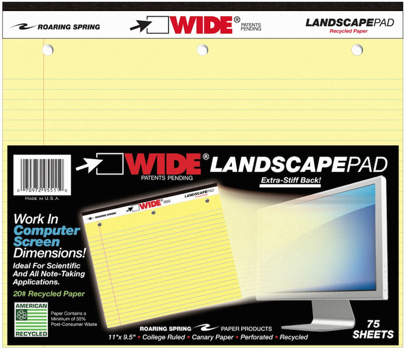
- 11″ x 9.5″, WHITE, college-ruled, three-hole-punched across the top. Each pad includes 75 sheets of 20-pound, 30% post-consumer recycled paper per pad, with left-side margins, backed by an extra-stiff 80-pt. chipboard backing. Mirco-perforations at the top yield an 11″ x 8.5″ sheet. (Sold in singly.)
- 11″ x 9.5″, CANARY (yellow), college-ruled, three-hole-punched across the top. Each pad includes 75 sheets of 20-pound, 30% post-consumer recycled paper per pad, with left-side margins, backed by an extra-stiff 80-pt. chipboard backing. Micro-perforations at the top yield an 11″ x 8.5″ sheet. (Sold singly.)
Junior
- 8″ x 6″, WHITE, college-ruled. Each pad includes 40 sheets of 20-pound, 30% post-consumer recycled paper per pad, with left-side margins. Micro-perforations at the top yield an 8″ x 5″ sheet. (Available as individual pads or in multi-packs.)
- 8″ x 6″, CANARY (yellow), college-ruled. Each pad includes 40 sheets of 20-pound, 30% post-consumer recycled paper per pad, with left-side margins. Micro-perforations at the top yield an 8″ x 5″ sheet. (Available as individual pads in multi-packs.)
- 8″ x 6″, ASSORTED* PASTELS (orchid, pink and blue), college-ruled. Each pad includes 40 sheets of 15-pound 30% post-consumer recycled paper per pad, consumer recycled paper, with left-side margins. Micro-perforations at the top yield an 8″ x 5″ sheet. (Available in three-pad assorted packs.)
*Note: Assorted pastel pads are listed on the website as 50 sheets/pad, but specifications and packaging verify they are 40 sheets/pad.
Roaring Springs Wide Landscape Pads are sold in office supply stores and on Amazon, and range from $5.28 for single pads to $13 for three-packs.
Thanks to Office Supply Geek for reminding me that these pads exist, and The Well-Appointed Desk, for inspiring me to dig more deeply.
OK, Landscape. But Why?
At first glance, landscape notepads may look a little funny to us — one client said she thought if legal pads were business suits, these landscape pads were more like crop tops. The question, though, is what can you do with them? In fact, Office Supply Geek‘s Brian Greene actually stated, “To be totally honest, after having them in my hands I still don’t really know what I’d do with them that I wouldn’t do with a regular legal pad.”
Well, Brian, that’s why Paper Doll is here!
Most of the time, when we hand-write, we are in portrait mode, and it usually makes sense. However, I can think of a sampling of reasons why we might want to have some side-to-side breathing room.
1) Notetaking — When we’re taking notes in a committee meeting or for class, we’re often creating a linear, outline-style set of notes. But, as we discussed when we reviewed the exceptional Cornell Notetaking Method, we need to make room for cues or other special attention-getting markings on the left side.

With traditional 8.5″ wide paper, that either reduces our notetaking space or forces us to write in the narrow margin, making it more likely that we’ll get inky smudges on that all-important cue-section. Landscape orientation provides more breathing room.
2) Ergonomics — Look at the available space on and around your desk. If your computer is in front of you, your keyboard is probably somewhere between elbow-and-wrist distance away, not leaving you very much space for alternating typed notes and handwritten notes. Because of that limited space, you may find you’re turning your traditional (portrait-orientation) notepad sideways, with the top to your left (unless you’re a southpaw). This lets you take written notes, but you’re probably twisting at the waist to do so. This is not sustainable or ergonomically friendly.
3) Expansive thought — When we take notes, journal, free-write, or craft letters, we’re often thinking linearly. It’s easy to follow a unidirectional flow of ideas, or paths, with a narrower piece of paper. When we’re on the computer, using Microsoft Word or any other word processing program, unless we’re using design features for creating signs or brochures, we echo that same tall/narrow format.
But what happens when we want to think more broadly (no pun intended)? When we’re on the computer, using a spreadsheet like Excel, we create multiple columns so that we can visualize information best seen side-by-side, like multiple fields in a record. But what’s the paper version? I can think of a number of times when I’ve been working with a client to brainstorm ideas in parallel (like how different departments will handle particular situations), and we end up turning a notepad sideways. The lines go the wrong way, and the content gets messy; it suffices, but it’s not optimum.
4) Mind mapping — Paper Doll is a fairly linear thinker, but when I’m trying to mind-map, or show the relationship between different processes, or do anything that’s more visual, I need more space. With some clients, we may choose mind mapping software or apps like MindNode or XMind, but we often find that an analog solution is faster and more immediate. Most often, we end up using multiple Post-It! Notes on a wall or window. That’s great when we’re in a house or office, but not so optimal when we’re in the field (even in a field), in a warehouse, or going mobile. That’s where these landscape notepads (and the aforementioned landscape clipboards) really come into their own.
5) Flow Charts — It might not be immediately apparent, but a number of law students have posted online comments regarding how landscape writing pads make it easier to visualize case-law timelines, precedents and conceptual flow. Scientists have also reported that wide-format paper helps conceptualize scientific reactions more clearly.
6) Computer/TV Screen Dimensions — Tablets and phones aside, we spend a lot of time looking at screens in landscape orientation, and sometimes we still need to make our analog notes approximate what we’re seeing, or make our digital notes approximate what we’d like to be seeing on the screen. Writing pads that parallel those dimensions are helpful.
Granted, web designers are more likely to use paper prototyping tools like the kind we discussed in Tech Planning on Paper: From Old-Fashioned to Cutting Edge, but the rest of us just need a good piece of paper that’s wider than it is tall.
Oh, but you ARE a web designer (or you play one on television)? Well, then, UI Stencils’ landscape-orientation Responsive Sketchpad may be just what you want.
Printed on both sides, the landscape-orientation, letter-sized pad is dot-gridded (150 PPI), includes fields for a project’s name, screen, date of work, and notes, as well as two device silhouettes on the front and three on the reverse.
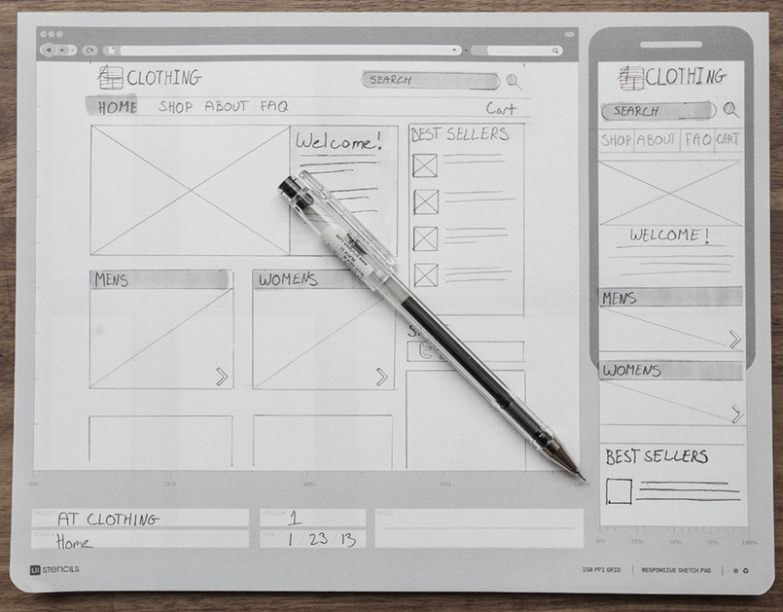
The Responsive Sketchpad comes 50 sheets/pad, with a cardboard backing and rounded bottom corners. It runs $12.95/pad and is available at discounted rates in three-packs, five-packs and with other UI Stencils’ sketchpads.
Upgrading the Landscape
The Roaring Springs Wide LandscapePads, as well as the more tech oriented UI Stencils’ Responsive Sketchpads, aren’t the haute couture of office supplies. You’ve got something to say, and you can get it down. Function is generally prioritized over form. The Roaring Springs pads are made of recycled paper, and the focus for all is in on utility rather than beauty.
As Ana Reinert pointed out in this week’s The Well-Appointed Desk’s “Ask the Desk” feature, there’s an assumption among notebook/notepad makers that landscape orientation is for the visual artists and not for the scribblers, writers, note-takers and wordsmiths. I think that’s short-sighted, and a bit of disappointment.
Ana’s post offered up some options for the individual who asked “the Desk” about finding attractive, non-black, fountain-pen-friendly landscape-oriented notebooks. Tall order! The Well-Appointed Desk covered a nice variety of these, but most of the options were for unlined sketchbook-type pages. For those of us looking for a wide spot in the road to make our (written) mark, the choices are limited. There are handmade options, of course, but whether we’re talking bespoke Etsy creations or fin Italian handcrafted leather bindings, veering from the ordinary is not inexpensive.
How limited are the choices? One of the only mid-range lined landscape-orientation notebooks I found was an intriguingly named Düller Croquis Note. It’s manufactured in Japan by I.D.E.A. Internationals, with a German name, as part of the Schreibwaren Kollektion. The website is only written in Japanese (the English-language URL yields an error), and the only English-language sales information I could find was through AAREVALO Ltd. in London!
The notebook contains recycled paper and a mysteriously unexplained “specially textured writing surface.” There’s a “practical pocket” on the back cover, and the notebook also comes in black or light grey.
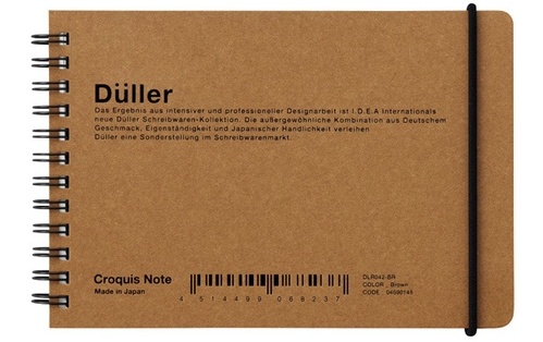 So, a Japanese company, selling a notebook described in German, is most easily accessed through a British stationery company’s online catalog? It shouldn’t have to be so hard!
It’s a little bit shocking that the go-to journal purveyor for hipsters, scholars, soccer moms and pundits, Moleskine, doesn’t have a single lined landscape-orientation journal or notebook. There really should be other widely available options aside from the Rhodia lined landscape Webnotebooks, with orange or black covers.

Paper Doll will be on the lookout (across the landscape, and over the horizon). Until then, I welcome your ideas for how you’d use landscape notepads and notebooks, and hope you will share your resources for finding lined landscape-orientation journals, notebooks and otherwise upscale writing pads.
NAPO 2015 Expo: Magically Organize Your Writing with the Equil® Smartpen 2
We professional organizers are pretty easy to intrigue, but hard to impress. We like novelty, and you can hear our oooohs and aahhhs across the ballroom floor at the NAPO Organizing Conference and Expo when a vendor lengthens a folder tab, come out with a poly version of a product formerly only available in paper, or builds a better hanging folder.
But as much as we appreciate novelty, we’re quick to note shortcomings as well. We’re dismissive of features we can’t see our clients actually needing, and we’re dubious of also-rans — the third or fourth or fifth practically identical copy of a product or app that doesn’t improve upon the original.
One of the products that caught Paper Doll‘s eye, and kept it focused, at this year’s Expo is a hybrid, bringing two separate but related processes together. In the past, we’ve focused on paper hybrid office products:
- An Organized Hybrid: The Evernote Smart Notebook By Moleskine
- From Paper to the Cloud: Ampad Shot Note
- It’s a Notebook! It’s a Whiteboard!: 3 Dry-Erase Notebook Innovations
In the above cases, we’ve looked at notebooks and notepads that work two ways. But what about a writing implement that can do double-duty?
Equil® SMARTPEN 2
Friend of the blog, Smead, is known primarily for paper-related office products (e.g., folders, organizers, dividers, folios, etc.), and we’ll get to the newest of them in an upcoming post. But recently, Smead has been acquiring interesting and useful tech and tech-ish products, like the MOS: Magnetic Organization System for cable and cord organizing, Stick N Find bluetooth trackers, and MOS Spring Cables for strong, tangle-free syncing, charging and playing audio.
The Equil® SMARTPEN 2 is the latest innovative acquisition, and it’s a doozy. What does it do? The SMARTPEN 2 lets you:
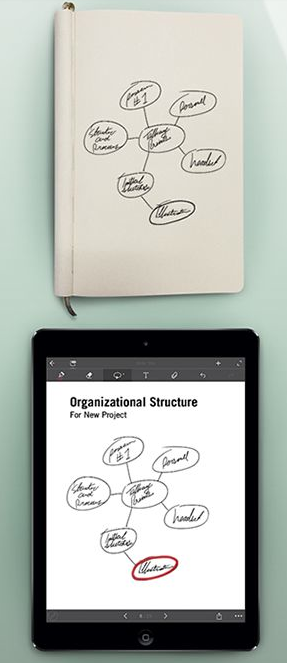
- Create handwritten notes, sketches and diagrams on real paper (whether that’s a fancy Moleskine or a cocktail napkin). But it can also be used as a stylus to write and draw on your iPad, which the company claims it does with superior accuracy. (Paper Doll‘s drawing skills would be a poor test of this acuity, I assure you.)
- Capture writing and doodlings and digitally transfer them to Windows, Mac, iOS and Android devices without scanning or snapping photos.
- Save, modify and share the digital version of your notes (so you’ve got the original paper version, suitable for framing on your wall or locking in your safe deposit box, and the digital — even modified — version in the cloud or on your devices.
- Oh, and that modification? It includes the ability to convert your handwriting into readable, searchable, editable printed text.
- Share via email, Facebook, Twitter, and other social media, or upload to the cloud for saving and sharing to Evernote, Dropbox and iCloud.
- Whatever you create with the Equil® SMARTPEN 2 syncs across all of your devices, so wherever you are, you’ll be able to create anew or access what you’ve already written.
THE BASIC ELEMENTS
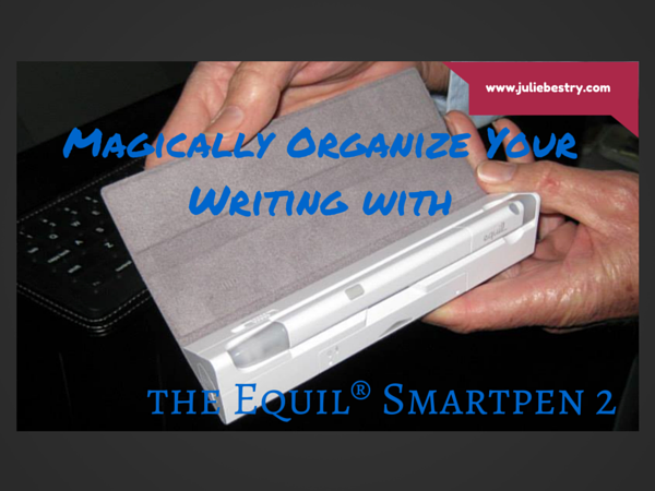
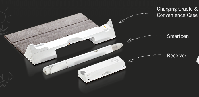
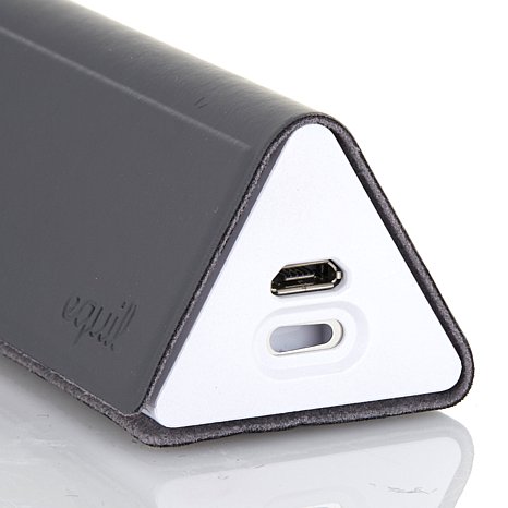
The Equil® SMARTPEN 2 looks like an Apple product. It’s all white-on-white, and comes packaged in a streamlined charging cradle, a triangular base into which the two operational parts snap, and the case comes with a grey “wrap” (called a convenience case) similar to the iPad Smart Cover.
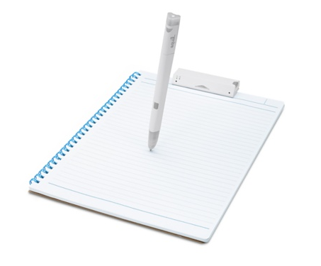
The Pen — This is a technology-“enabled” pen. That means it’s a real pen, on its own, and uses regular ballpoint ink cartridges. It’s pressure-sensitive, so it can capture every nuance of what you draw, and if you press heavily (and perhaps repeatedly), with insistence, the pen knows you’re doing the equivalent of bolding your text and SHOUTING with intensity.
In order to save the battery life, the pen goes to sleep if you don’t write for a while. One press of the small button atop the pen wakes it up, and that same button functions to alert the receiver to a “new page” (creating page breaks) and to let you go back and forth between saved pages of notes.
The charging cable includes one replacement ink cartridge.
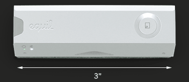
The Receiver — At first glance, the 3″ W x 1/2″ H receiver device looks like a clip for a clipboard, and it fastens to the top of your notepad or paper in a similar manner. The pen and the receiver connect via magic (OK, infrared and radio frequency communication). The receiver determines the boundaries of the page and flashes a small red light to alert you when you’re getting too close to the top or the bottom edge of what it can detect.
As you write with the pen, the receiver device saves your notes in the built-in memory.
The receiver holds 10,000 pages of notes. When you reconnect your pen to your digital device, you automatically receive an alert about any new notes, which are ready to be imported.
You can digitize your notes in real time, but it doesn’t matter if you’re not connected to your phone or other device when you’re in creation mode. When you are ready, at the touch of the button on the top of the receiver, whatever you’ve created can be uploaded from the device and imported to your computer, phone, or tablet. (Not your fancy watch, though. At least, not yet.)
The pen and receiver are rechargeable, and the specs claim you can write or draw for eight hours between charges. Just pop both the pen and receiver into the USB-compatible charging cradle. (The receiver has a battery life indicator and a charging indicator, so you shouldn’t have any surprises.)
The SMARTPEN works with two free apps:
Equil Note — This app lets you save and organize any of the written notes you take with the SMARTPEN 2. Edit, enhance, and share them with friends and colleagues. Convert your handwriting to text for easy editing and sharing.
Equil Note has apps for iPhone, iPad, and Android mobile devices, as well as Mac and Windows for desktop use. It’s available in English, French, Spanish, German, Italian, Portuguese, Russian, Chinese (Simplified and Traditional), Japanese, and Korean.
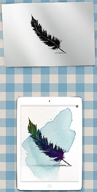
Equil Sketch — The sketch app lets you draw with a finer degree of control, and includes digital options like multiple brush styles and layering. You can start a picture on paper, and finesse it on the screen.
Through the apps, you can digitally choose from a variety of colors and pen tips, and up to 600 levels of pressure sensitivity, and then add more text and/or photos, digitally. You can also tag your notes so you can search and locate your content quickly.
The Equil Sketch app is only available for iPhone, iPad and Android digital devices (not desktop), and is compatible with all of the same languages as Equil Note, except for Korean, Portuguese, and Russian.
PRICE
The Equil® SMARTPEN 2 retails for $169.95 from the Equil shop, or for about $149 from Amazon, Apple and Best Buy. Access to the apps is free with a purchase of the pen.
THE FINE PRINT
There’s glossy marketing, and then there’s the occasional factual balloon pop.
Although the press materials reference doodling on a napkin, and the pen can capture notes on paper as small as a sticky note, the official specs say that the recommended paper size is 250mm x 330mm (9.85″ x 13″) or smaller — that’s anything below Letter size (US standard) or A4 (UK standard) — and notes that things “may not work properly if the paper is too small for the receiver to clip on and may have writing recognition issues if the paper surface is rough. (i.e., cardboard).“ So, don’t plan to write on something the size of a postage stamp or your next summer camp care package.
Next, the Equil® SMARTPEN 2 communicates to your digital devices through bluetooth pairing — if you’ve ever used a bluetooth headset for your phone or a keyboard for your iPad, you know to prepare for some set-up time before you can get started. One note I found in the FAQ caused a slight pause: “Make sure to go through bluetooth pairing process each time you switch the devices you are using with Equil JOT.” It’s not entirely clear whether this means you have to pair the pen each time you switch from your tablet to your phone, or just the first time for each. FYI.
Finally, the SMARTPEN 2 measures 1/2″ around the thickest part of its triangular shape, slightly thicker than a traditional Sharpie. It tapers down as you get closer to the pressure-sensitive pen-tip. Still, if you’re used to a slender, rounded pen, the grip of this might take some practice for creating fine detail.
Take a look at the Equil® SMARTPEN 2 in action.
THE COMPETITION
The Equil® SMARTPEN 2 isn’t the first to combine writing on paper with writing on a digital device and making it all interactive. (Even the SMARTPEN 1, the first iteration, wasn’t exactly first.) The Livescribe Smart Pen series (including the newest Livescribe 3, the Sky WiFi, and Echo, and older iterations) was the first to break out in this area, and for many years, I would gush when techie colleagues would show off their Livescribes. The Livescribe pens also had an embedded audio recorder, so you could tap a portion of your notes to hear what was being said contemporaneously with whatever you wrote. Pretty grand!
But the SMARTPEN 2 continues to have one advantage over the various Livescribe versions that can’t be overlooked. You can use the Equil® SMARTPEN 2 with pretty much any type of paper or notebook, so you can stick to your preferred notebook style, but after all these years, the Livescribe options still require that you buy special digital paper notepads to work. Paper Doll doesn’t know about you, but while I’m occasionally willing to shell out for a truly exceptional gadget, having to buy pricey notepads just so the pen can work is a deal-breaker for me.
WHO IS IT FOR?
Obviously, not everyone needs a smart pen. If you’re fine with keeping handwritten notes and rarely need information in digital form, you can pass. If you spend your time sitting at a desk, fully Wi-Fi-enabled, or are good with the “thumby” thing, typing without a real keyboard, even when standing or walking, it may not be for you. The SMARTPEN 2 is ideal, however, for those who are on-the-go, often standing, or in rough-and-tumble surroundings. I’m thinking of my client who is usually up in a bucket truck, using his iPad to take notes but risking damage to his expensive gadget. Or camp counselors checking kids in for the summer and taking notes of parents’ special requests. Engineers and architects, working on-site. Community physicians and nurses who don’t have immediate access to electronic medical records and are taking notes on-the-fly.
With the handwriting recognition feature, particularly the ability to turn handwriting into text, and the ability to use regular paper, the Equil® SMARTPEN 2 is worth some attention.
I’d love to hear your thoughts.
Magnetic Attraction Deferred: The MAGNOTE Notebook
When you think about using magnets to get organized, is the first thing that comes to your mind something like a dental appointment card stuck to the refrigerator with a novelty magnet? Me, too.
So I was surprised recently to hear about a Kickstarter campaign for a magnetic option for organizing handwritten materials.
THE MAGNOTE
The MAGNOTE Magnetic Notebook, from Orange Monkie, takes a page (pardon the pun) out of the playbook for tablet/keyboard combinations like the Surface and my newly beloved iPad + Logitech wireless keyboard set-up. Magnets hold things together — at least until you want to pull them apart. The MAGNOTE applies the same principle to keeping your paper notebooks together.
The neodymium magnets sound like something out of Star Trek, but have a nifty, streamlined appeal. If you’ve never used a bluetooth tablet keyboard/cover, it’s hard to explain the giddiness you experience with that first tidy, joyous click into place, but this image may indicate how cool it is.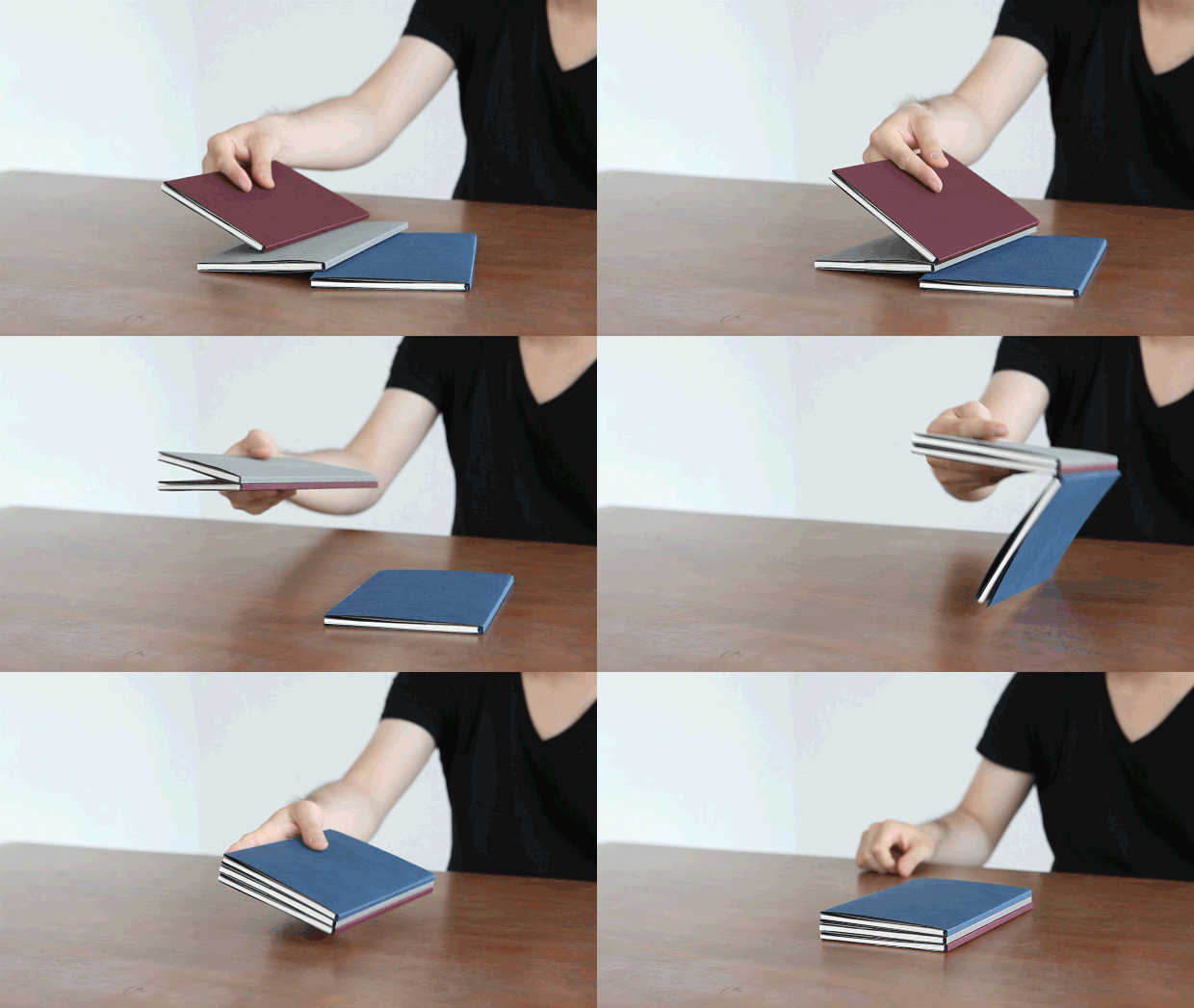
Keeping the notebooks you need (for the day, for a study session, etc.) all together without a giant elastic or a backpack is pretty cool, and, as this fun little video indicates, keeping your notebook visible yet out of the way is as easy as tossing it in the direction of your fridge or metal dorm room door!
However, to be honest, the magnets aren’t even the most interesting thing about MAGNOTE. But let’s start with the basics.
THE DESIGN
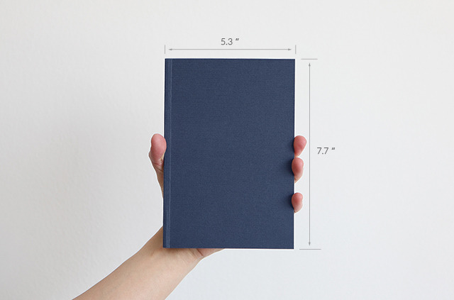
At 5.3″ wide by 7.7″ high, the MAGNOTE notebooks can be held in one hand.
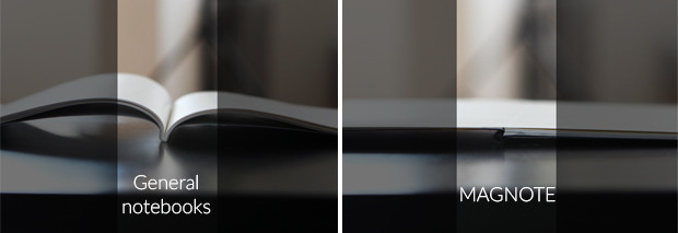
Each notebook has a bound cover that lays flat when open without risking the structural integrity of the spine. So, if you want to draw or write across the center dividing line of two pages, you can do so with confidence.
The planned paper stock is fountain-pen friendly, which is a boon for many of the types of users who prefer fancy Moleskine-like notebooks over composition books and legal pads.
THE TIME CIRCLE and LINE-LESS MONTHS
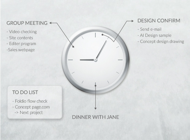
MAGNOTE’s minimalist approach is especially intriguing when you look at the daily planner style. Rather than traditional hour-by-hour lined grids stacking up the hours of the day like so much firewood, the MAGNOTE envisions daily life centered around an analog clockface.
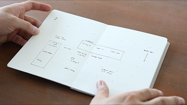
Each daily planner page has one simple circle with the day of the month in the middle. It all starts with the premise of the Time Circle, allowing for more free-flowing visualization of the high-, medium- and low-activity zones in the day. You’ll want to look at the Kickstarter page to get an in-depth sense of how these times blend together to get one twenty-four hour plan for a twelve-hour clock, but you can see, below, how chunks of dayparts can be assigned.
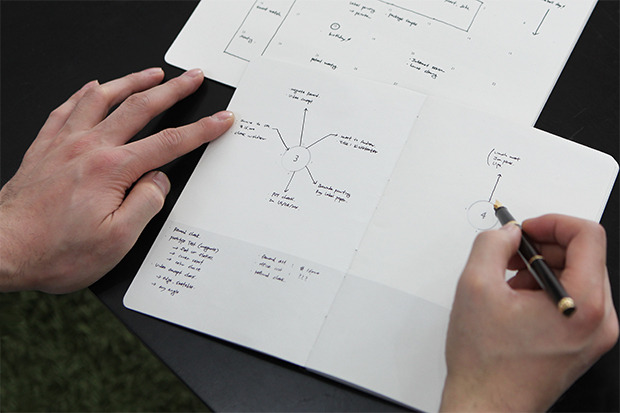
To plan your own day, you work your way around the circle, with mind-map style lines out from the hours of the day to when you’ve scheduled fixed appointments and planned work blocks. (Well, not blocks. They’re more like floating clouds.) The bottom of the page provides ample room for notes.
Paper Doll is a little too linear to use the Time Circle comfortably, but for those who don’t see their day like layered stacks, this might provide some fresh air for time management and planning.
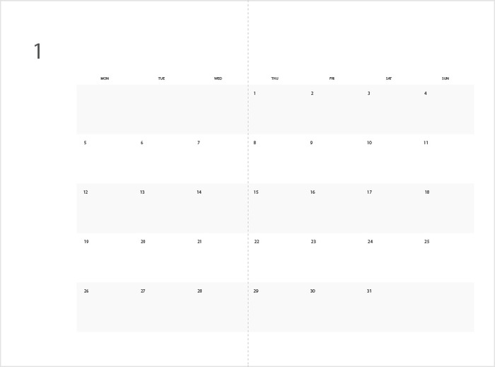
The monthly planner is equally minimalist. There aren’t even boxes or squares to indicate days. Alternating weeks are slightly shaded, to provide contrast, the months are numbered and not even named, and each day has the date noted.
Otherwise, the calendar page is left for the user to design, adding details and grouping projects by parts of the week or days of the month. You can definitely imagine some people adding serious color-coding to get the look that works for them.
BOXING IT UP
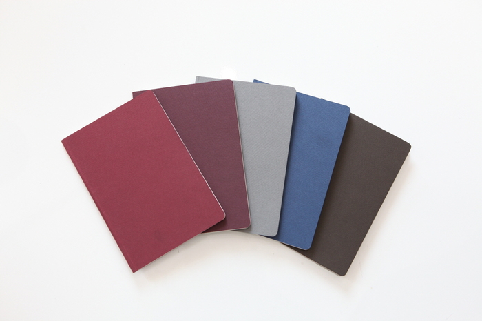
Orange Monkie’s original plan was for five colors, each representing one style of the MAGNOTE notebook.
Going left to right, the colors and styles of each 64-page notebook were envisioned as follows:
- Red: MagPlanner Monthly (two-year planner)
- Burgundy: MagPlanner Daily (two-month planner)
- Grey: Magnote Plain (plain pages, front-and-back, suitable for sketching, mind-mapping, free-form note-taking and any visual creativity you have in mind)
- Blue: Magnote Ruled (lined pages, with lines falling every 8mm)
- Brown: Magnote Grid (graphed pages, suitable for scale drawing, room design or math problems)
The whole kit and caboodle (sets of multiple notebooks, in whatever colors are preferred) fits in a diagonally-cut box cover, so you can display your notebooks (or not) tidily.
See it in motion:
The Kickstarter campaign’s initial pricing was set as:
- Early Bird pricing: any four notebooks/planners of the five for $39 (limited to the first 250 funders)
- Notebooks sets (Plain, Ruled, Grid), select 3/$29, 6/$47 or 10/$72
- Planner sets (planners or notebooks), select 4/$43, 6/$59 or 10/$88
The price, which initially seemed high, doesn’t compare unfavorably with the cost of Field Notes and soft-cover Moleskines, for those with a more refined notebook palate. But committing to the MAGNOTE would mean settling for only one size of notebook, which may be a deal-breaker for some users, no matter how magnetic the attraction.
MAGNETS ATTRACT, MANUFACTURING DISSATISFACTION REPELS
When I started researching this post, the Kickstarter Project for MAGNOTE had already reached 80% of its funding goal in under a week. Eventually, it hit $33,804 of a $35,000 funding goal — it was there, baby! But then, early last month, something funny happened. Orange Monkie wasn’t satisfied enough with the manufacturing process quality, did more research, and found a better company for mass production, one that would allow for even more exciting features, like refillable notebooks!
While this change of direction is a positive thing, doing it mid-Kickstarter meant they’d have to change the backer rewards, and redesigning the prototype for new options meant delaying the estimated delivery date. I think it took a lot of moxie for Orange Monkie to halt an almost fully funded campaign to basically say, “Wait, we trust our product, and we want you to trust it, so let’s drop this campaign, and we’ll meet you back here for a relaunch when we’re shiny and new!”
So, although it’s rare that I share a product that’s not-ready-for-Prime-Time, I encourage you to keep an eye on this concept. Until then, you can review some favorite Paper Doll posts to help you find your ideal notebook:
- 5 Key Points for Organizing With Notebooks
- Notions on Notebooks: Organize Your Paper Picks
- Paper Doll Writes Between the Raindrops: Waterproof Notebooks
- An Organized Hybrid: The Evernote Smart Notebook By Moleskine
- Organize Your Writing Right — With Left-Handed Notebooks
- Customizable Notebooks: Have It Your Way…Sorta
- It’s a Notebook! It’s a Whiteboard!: 3 Dry-Erase Notebook Innovations
- From Paper to the Cloud: Ampad Shot Note
- NAPO2014: Notetaking and Pendaflex/TOPS’ FocusNotes™


Follow Me