Paper Doll’s Guide to Picking the Right Paper Planner
With two weeks until the new year, you’ve probably already started planning for 2023. But if you’re agitated about next year not being any more orderly than this one, you might be hesitating about committing to a planning system. Today’s post is designed to put you more at ease, and give you some guiding principles.
WHY USE A PAPER PLANNER?
There’s nothing wrong with using a digital calendar. I use one myself, though not for scheduling. I use my digital calendar so that when I get an email with Zoom logins, or have a telephone consultation with a prospective client, I don’t have to go looking for the emails to find the links or phone numbers.
In Outlook, I can create an appointment or task directly from an email, and the system will prompt me at a pre-set time with all the key details. It’s like having my own personal Jeeves pop his head into the room to let me know the countess and duchess have arrived to join me for tea.
But honestly, I never use my digital calendar to plan my life. I’m a Paper Doll, so it stands to reason, I prefer a paper planner. But how do you know what’s best for you?
Let’s start with the mindset, and the different advantages and disadvantages of paper planners vs. digital calendars.
Learning Curve
If you are over the age of eight, you already know how to use a paper planner. On the monthly view, there are boxes for the days of the month to put major events, deadlines, and vacations. On the weekly and/or daily views, you can time block for tasks and list appointments.
Digital calendars aren’t complicated, per se, but they are not always intuitive. There might be a generational schism at play, but I’ve had clients try once, twice, even three times to input an appointment, only to have some technical or user kerfuffle lead them astray.
Why does this matter? Digital fatigue creates friction, and friction prevents people from completing a task, whether it’s removing the lid to the laundry hamper to toss clothes in, or schedule an appointment when the system isn’t working.
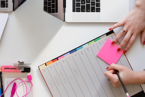
Woman With Planner Photo by Marten Bjork on Unsplash
Digital fatigue creates friction, and friction prevents people from completing a task, whether it's removing the lid to the laundry hamper to toss clothes in, or schedule an appointment when the system isn't working. Share on XControl vs. Convenience
At first, the ease of clicking to accept a meeting invitation would seem like an advantage for digital calendars. But is it?
When I train clients to improve their productivity, we focus on identifying priorities so that we can protect boundaries around them. On a digital calendar in your phone, you generally see the month with blobby dots signifying appointments on particular days.
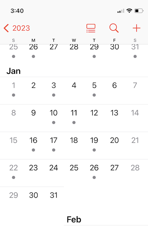
You have to click through to look at the individual date to schedule the meeting, but then you’re losing the surrounding context because you’re just seeing one appointed after another another in a list. Again, you can’t see time.
When we brainstorm ideas, schedule appointments, break projects into tasks and plan when we’ll do them, we’re thinking about context. When we see a whole month of appointments on the printed page, we instinctually know we have to give ourselves (and our brains) some recovery time. That’s less obvious when we only see the one time slot and the computer merely tells us if there’s a conflict. (Also, on the digital calendar, it’s less clear that you haven’t scheduled time for a potty break or commute.)
Many people — children, college students, people with ADHD, overwhelmed professionals —often suffer from a lack of ability to visualize the passage of time. An analog planner involves more tactile interaction with the appointments and tasks we schedule. As we deal with finding a reasonable time for each time, we gain mastery, not only over our schedules, but our comprehension of time.
Cost
Basic digital calendars are built-in to our phone and computer systems, and most apps are inexpensive. Conversely, paper planners may run you from $20-$50. But when it comes to our planning tools, cost does not necessarily equal value.
Yes, there’s a dollar value to the purchase price of an app vs. a paper planner. But there’s a time value related to mastering a new calendaring system. Are you prepared to commit yourself to learning the intricacies of a new app or the same app every time it updates?
Privacy vs. Searchability
This is another close call. Your paper planner is completely private, as long as you don’t leave it unattended; a digital planner generally syncs across all of your digital devices, which means that while it should be private, there’s never a 100% certainty that there are no prying, hacking eyes.
Conversely, your digital calendar is usually searchable. You can type a keyword or person’s name to find a scheduled appointment or task. Your planner can only be searched by trailing your gaze across each page, and the less careful you are with entering data, the more you risk losing the information when you need it.
Visual vs. Visual+Tactile
When you drive, do you think in terms of linear directions, or are you more inclined to recall what to do when you reach landmarks? If you prefer linearity, go digital; if you like touchpoints and landmarks, paper will likely resonate more.

Hand in Water Photo by Yoann Boyer on Unsplash
Does digital time “feel” real to you? On a digital calendar, every item appears in the same font and size. You can often color-code items, but digital entries have a vague sameness about them.
If you write something down, you can stop thinking of it, per se, and start thinking more robustly and contextually about it. Somehow, dragging an email into Outlook to set a meeting, or typing an appointment into your phone, leads to an out-of-sight, out-of-mind situation for many. But with a tangible paper planner, every time you eyeball your month or your week, you are speedily, comfortingly reminded of the important aspects your life.
Similarly, your fine motor skills applied to the task tend to be the same; you could be typing a grocery list or the key points for an interview (then buried into the notes section of a calendar event). With a paper planner, your tendency to print some things and handwrite others, your ability to use a particular color pen, to draw arrows and circles and adjust the size to shout or whisper on the page, yields a unique temporal language that makes sense to you.
Will a weighty paper planner “feel” more real to you vs. that free app (among dozens) on your phone?
Only you know for sure. For me, it’s a paper planner, all the way. But not all paper planners are created equal.
WHAT TO CONSIDER WHEN PICKING A PAPER PLANNER
Anxiety over making the wrong planner choice is common; it’s one of the reasons people give up one planner and buy another mid-year. You don’t want to plunk $30 or $45 on a pile of paper that will sit like a lump on your desk because you’re afraid to “mess up” a pretty planner. This keeps people from committing to their planners and being successful at scheduling events and tasks.
Some users want simplicity; others desire flexibility. Some clients want aesthetically pleasing planners to inspire them, while others seek a serious, “professional” look. There’s no one perfect planner for everyone, but there are clues in how you feel about potential features.
Page Design
- Adequate space — to show appointments and key information, especially on the monthly view. If you’ve got loopy handwriting, will small monthly view boxes cramp your style?
- Layout for monthly/weekly/daily views — Understand how you “see” time. Also, depending on your life and lifestyle, consider whether you need an academic or full-year calendar, or a planner with lots of extra space for weekend and night activities.
- Creative fields — Modern planners may give you spaces for more than just appointments and tasks. Do you want bubbles or fields or pages for note-taking, brainstorming, mind-mapping, or gratitude journaling?
- Practical fields for tracking metrics — On the flip side of those creative attributes, there are planners with spaces for habit tracking, budgets, meals/nutritional logging, goal-setting, and other countable, observable elements.
- Bonus features — Are you drawn to daily motivational quotes, religious references, or cartoons? I never loved my Franklin Planner so much as the year I was able to get one with a New Yorker cartoon each day. I’ve enjoyed my colorfully-tabbed Emily Ley planner for the last few years, but miss daily quotes and bits of wisdom.
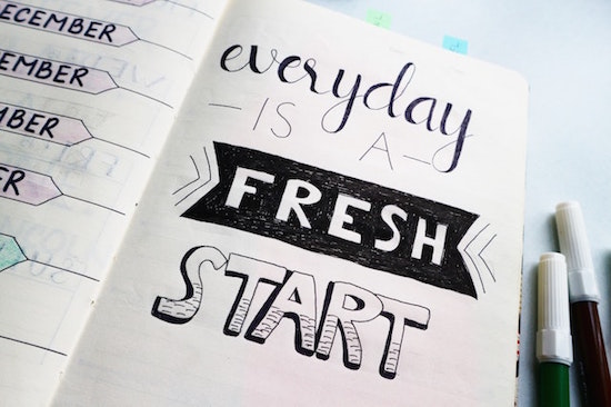
Planner Quote Photo by Bich Tran
Planner Design
In addition to features on the page, you might care about the design specifics of the planner itself:
- Size — Do you think you’d like an executive, classic, or condensed planner? The largest sized planner may not fit in your bag, or may take up too much real estate on your desk, but the tradeoff of picking the smallest option will be losing writing space.
- Weight — Does a hefty paper planner give you a greater sense of gravitas so that you’ll take your schedule seriously? Or will the bulk make it inconvenient for you to carry around?
- Binding — There are ring binders (usually with 7 rings), which let you choose how many pages you want to carry with you at any given time. (I like all the monthly pages, but prefer only last month, this month, and next month for weekly/daily pages.) Coil binding won’t let you remove or add pages, but tends to be more condensed. Both ring and coil binders assure your planner will stay open and lay flat; stitched binding may flop closed when the planner is new, and “perfect” binding (glued, like with a paperback book) can deteriorate with rough handling.
- Cover Style — Do your want your planner to have a leather (or “vegan leather”) cover for a fashion statement? What about a zipper? Are you good with a plastic or stiff paper cover? Will a simple planner cover help you take your planning more seriously or bore you? (Or are you willing to upgrade a staid cover with artwork or washi tape?)
Also remember that your planner is mostly about knowing what you have to do and when. If you need help with project management at the more granular level, take a peek at last year’s Checklists, Gantt Charts, and Kanban Boards – Organize Your Tasks.
PLANNER FORMATS: FOR WHOM ARE THEY REALLY DESIGNED?
As I research planners each year, I find that most planners fall into one of a few general categories:
Basic Planners
Think back to before the computer era, when you’d go to the dentist. Before leaving your appointment, the receptionist would consult a big, black-covered planner with neat columns, flip forward in the book, and write your name for a particular date (column) and time (row). That’s the what you’ll get when you seek various office supply store-branded calendars: columns and rows and not much else.
Basic planners offer a variety of the planner design elements above, but relatively few extra page design options. Popular examples:
At-A-Glance — is the most like that dental office planner in the days of yore. It’s efficient and practical. If you’re easily distracted by colorful design elements, this style should keep you on the straight and narrow.
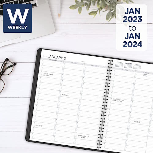
Franklin-Covey planners in the ring format are customizable. You not only get to pick your planner size, but also choose from a variety of themes. There are spaces for appointments, tasks, and notes on the same page; others have little boxes for tracking expenses. You can also purchase pages for contacts, more notes, budgeting, and a number of other extras.
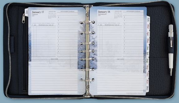
Levenger Circa SmartPlanners come in junior and letter sizes and some DIY customization. They use ring-like discs, such as we discussed in Noteworthy Notebooks (Part 4): Modular, Customizable, Disc-Based Notebooks.
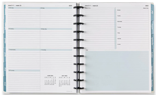
Moleskine planners comes in a wide variety of sizes, colors, bindings and styles for monthly, weekly, daily, and combination views. Much like Moleskine notebooks, these are well made, with curved corners and elastic closures. These are often suited to creative souls who still want to stick to a simpler style and format.
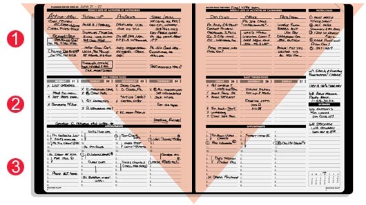
Planner Pads are the planners I recommend the most often to the widest variety of clients. There are monthly calendar pages, but the heart of the system is the weekly pages divided into three sections (projects/tasks, daily scheduled tasks, and daily appointments), which “funnel” the overall projects and tasks to where they belong each day. However, cover choice is limited to black and a sort of seafoam green. I’ve said it for years, but Planner Pads is missing a great marketing opportunity; they already have the best basic planners — why not make them a little more attractive?
Passion Planners are still pretty straightforward, with columns for each date and sections for work and personal tasks and for notes, but they add weekly sidebars for focus areas and a place to jot down the “good things that happened” that week. The covers are faux leather and come in a variety of sumptuous colors; choose cover design, pick one of three sizes, and decide whether you want your week to start on Sunday or Monday.
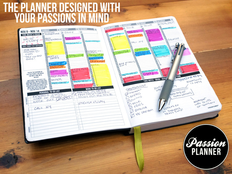
Basic planners are the best for time blocking. (For more on this, see my Playing With Blocks: Success Strategies for Time Blocking Productivity from last year.) They tend to be promoted as gender-neutral options, with rare prompts for life goals or touchy-feely stuff.
“Fancy” Planners
For want of a better term, these are a step up from the basics. It’s worth noting that fancy planners marketed to women tend to focus on aesthetics and tracking emotional/psychological factors; planners marketed to men tend to include more tracking of quantifiable action-based metrics.
There are a handful of smaller sub-categories I’ve noticed in this realm.
The Animal Planners
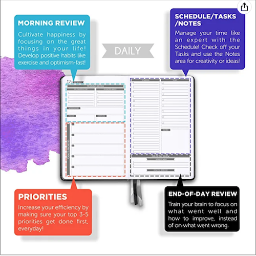
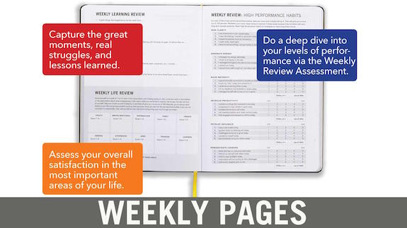
Panda Planner — In addition to scheduling tasks and appointments, it covers inspiration and goals in sections labeled “Today’s Priorities,” “Morning Review,” and “Things I Will Do to Make This Week Great.”


I’m geeking out on this post! Even though I no longer use a paper planner (and I did for decades,) I am fascinated by the array of options. And clearly, what you said about people procrastinating over buying the ‘right’ planner for them is so true. With all the options and variables, it can be challenging to pick “the one.”
The Agendio video is captivating but also overwhelming. If someone is having difficulty selecting their planner, the millions of customizable options offered by Agendio will make it even more challenging. Even so, I LOVED the video and the possibilities!
The Passion Planner also looks amazing! And with all that color and the layout, it almost makes me want to go back to paper. 🙂
It’s been decades since I switched to a digital planner. And it was traumatic at first. I loved my paper and the act of writing on it. However, going digital had distinct benefits, like searchability, repeatability, auto color-coding, and more.
While my devices are all synced (iPhone, iMac, and iPad), I mostly use my iPad for scheduling and viewing my weeks and months. It’s a great size for seeing the overall picture, not just the “dots,” as you referenced. Using the iPad has been the best workaround for me. I still use my iPhone as a reference and sometimes for scheduling, but the iPad is my preferred go-to.
Oooh, I do love a good geekout! And I only hit the big ones, the ones that constant get marketed. Sometime in 2023, I really need to do a post about the unusual ones — I came across a planner that comes with an audio course on how to use it and it’s like $300!
I think Agendio is brilliant, but it’s for the people who know EXACTLY what they want and how they want it and have been annoyed endlessly by the imprecision of whatever they’ve used before.
I think that for people who are already good at managing their time, digital solutions are great, but for anyone who still struggles with time (and for those of us who need to touch and fondle our time, paper is essential.
iPads are great, and there’s a case to be made for the hybrid systems developed where people use those aesthetically pleasing planner designs based in Good Notes, but I just haven’t gotten a good enough handle on them to write about them. But while everyone has a phone, not everyone has a tablet.
Well, this post is for me. I love paper, and I love not being tied to a screen. I think as I get older my eyes just get strained more quickly and it seems to be worse with screens than with paper.
Also, I love having a place to jot down thoughts or notes quickly, without having to open an app. I also love the freedom of paper, which doesn’t require upgrading or enrolling in the “pro” version to get what I want.
If I were young and starting out, I’d probably go digital. But my old, faithful paper Filofax is like a dear friend.
Thanks for sharing all these options for the paper-lovers like me out there!
Seana, we are sisters in paper! I don’t see Filofax marketed much anymore, but I’ll have to explore the design options to see if they’re worth a mention in an eventual follow-up. You’ll have to tell me whether you consider yours “basic” or “fancy.”
Thanks for reading!
So here’s the irony. This post is long and meaty and I truly want to dig in so what did I do? I printed it and put it in my folder of “stuff” I want to read on the plane tomorrow. I’m all about the paper. And I will say this to add a little edge to your post. Most planners are glorified to do lists. To truly see, plan and manage your time you need to be able to see your to dos alongside your time. So grid style is the only way to go. And as always thank you for being my biggest cheerleader!
Ha! Every time I talk about “seeing time” — even though I talked about the concept for years before I ever met you, Leslie — I hear it in your distinctive voice.
And trust me, long before I ever wrote a blog, my dream was to write a newspaper or magazine column. The only real advantage to having a blog is that I can write as many words as I want, without a column inch limitation. Otherwise, give me paper, baby!
What a comprehensive post. This is a wonderful resource for anyone trying to decide which is the best option for their planner needs. Thank you for sharing!
Thanks for reading, Janet! How do YOU plan?
Hi Julie,
One rule of thumb I offer anyone is not to make huge changes if they can help it. In other words, look for Pareto changes where an 80% improvement result comes from a 20% input of effort. This takes an investment in self-understanding.
I definitely agree with you — the next two posts after this one refer to planning and changes right in this vein. As for this post, I think the changes one makes for embracing a planner have to be organic. Jumping from all-paper to all-digital is probably overwhelming for most people, so starting with a hybrid approach until the transition feels more authentic might be helpful.