Archive for ‘General’ Category
NAPO Expo 2011 Recap (Part 1): The “I Feel Pretty” Edition
You may recall that last year, I complained about the dearth of attractive paper filing options, especially those of the mobile variety. Sure, there are lots of little, lightweight portfolio cases, but for the stylish person on-the-go with a heavy-duty load of papers, fabulous solutions have been hard to come by.
Whether you’re a trendsetting mommy/PTA president/volunteer coordinator/investment club treasurer keeping all those (paper) balls in the air, or a mobile professional (pharmaceutical salesperson, real estate agent, community healthcare practitioner, event planners, outside sales rep, etc.), Paper Doll hears you loud and clear: you want something as aesthetically pleasing as it is functional.

Last year, in my NAPO 2010 Conference Expo Recap Part 1: Boxing It Up post, I noted that KC Streamline Concepts had launched multiple varieties in their Alpha-Omega Collection, including the stylish black zip-top Alpha Omega tote.
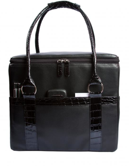
This year, the Alpha Omega Collection expanded, but in a different direction. The main products (the Standard and Executive desktop file boxes and the Alpha-Omega Tote) haven’t changed, but there’s a new little sibling.
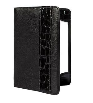
Notable Xchange is a snazzy upgrade from old school assignment notebooks or even Moleskin notebooks, an analog departure from nouveau iEverything, and is designed for the modern networker. On the left side of the 4.25″ wide by 5.75″ high notebook, there’s a slot for keeping business cards and a pocket for keeping the cards you receive, parking vouchers or receipts. KC Streamline Concepts notes that smart phones will fit in that pocket, too. I didn’t have the chance to test that feature, in part because I don’t own a smart phone (don’t judge me!), but one assumes only a streamlined phone would fit.
In the center divider, there’s a place to keep your pen (which is included). To the right, a stack of fifty note cards helps you track (and follow up on) your brilliant ideas or note the Twitter ID of someone you encounter in real-world networking (who has neither brought along a card or who has thus far relied on using his or her cell phone’s “bump” feature).
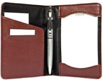
The Notable Xchange comes in Black Iris (pictured above, closed), Black Iris with a faux croc finish, Terra (pictured above, open), Terra with a faux croc finish, Poppy, Bluebell, Sweatpea, Clover and Violet. To see the Clover in action, my colleague Jeri Dansky showed off her iPhone-matching acquisition in her own blog review. The introductory price is $24.95 and includes a subscription to KC Streamline Concept’s tip-laden organizing-themed newsletter.
When I last wrote about it, the Alpha-Omega Tote came in blackberry, cherry or coconut — currently the latter two colors are on a production hiatus. While I kvelled over it as the sole attractive paper toting option we’d seen in some time at the NAPO expo, I didn’t really talk about fashion.
Sure, I recognize that not everyone is interested in understated elegance. Some of us — OK, by which I mean myself — opt for black for almost every occasion. My colleague, Geralin Thomas, noted my all-black wardrobe in the hotel closet at the 2010 conference and dubbed me “the organizing nun”.

(Hey, being The Flying Nun didn’t do any damage to Sally Field’s career. And you like her. You really, really like her!)
But for those who want bright colors and a double-rainbow kind of wardrobe, there’s now a bold, colorful option.

JamieRaquel offers an entire line of stunningly fun leather(ish) LifeSTYLE file totes designed for the fashionable users I’ve described. Although I believe function trumps aesthetics in the long run, for the purposes of this post only, form shall be followed by function. These totes are just too pretty not to show off.

Each of the eight colorful totes has a correspondingly fashionable lining. For example, going from left to right:
Pumpkin is lined in a pattern of vibrant vertical bands or strips of orange, white, cranberry and lime. (Note to Paper Mommy: this does not mean the orange plaid curtains in my childhood bedroom will ever again be in vogue. They never were. Really!)
Jet Black’s lining is a jaunty black, white and burgundy plaid.
Ruby calls to mind the snappiest of raincoats with what JamieRaquel is calling a Burberry-esque taupe, red and charcoal print.
Royal Blue, Lime, Chocolate and Plum all bear striped linings with corresponding color themes.
As Paper Doll’s favorite color is pink, I was delighted to snap former NAPO President Stephanie Denton modeling her raffle prize, the JamieRaquel LifeSTYLE tote in Hot Pink,
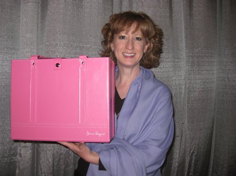
with the lining of zippy pink, plum and tan squiggly squares and oblongs.
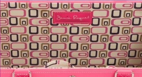
The LifeSTYLE Tote has a sturdy box-bottom construction, making it less likely to tip over, and it won’t collapse in on itself (like a backpack or oversized purse), which could put files and papers at risk for wrinkling or shmushing.
Because the LifeSTYLE tote is designed to carry standard letter-sized hanging files and has an open-top box style to offer easy access to those files, it’s as simple to use as your desk-top file box or file drawers. Vertically arraying papers eliminates the paper pile-up, making work (or the work of life) easier to file or retrieve and prevents anything from financial and legal documents to field trip permission slips from getting lost at the bottom of the tote.
The tote measures 11.5″ high by 14″ wide by 6.5″ deep. The core body is constructed of sturdy, modified-density fiberboard to ensure that the two six-inch hanging file rods — embedded directly in the core — can withstand any heavy hanging files and prevent wobbly loosening. The bottom of the LifeSTYLE tote has reinforced cleat footing to protect the fabric from scratches and nicks.
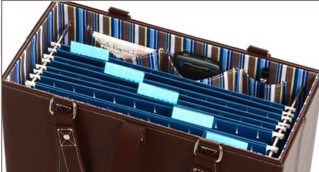
The outer fabric, handles and security straps are covered in a PVC-based leather or patent-leather style. The handles are cross-stitched and reinforced with studs to increase durability. The interior linings are cotton, cotton/nylon, PVC-only, or PVC-backed cotton/nylon, depending on the pattern selection. There are three interior pockets (to hold your glasses, phone, business cards and other incidentals) on the long front wall (opposite the wall with the JamieRaquel label).
The JamieRaquel LifeSTYLE Tote sells for $59. Although the totes do not come with hanging folders included, if you’re the kind of person who color coordinates every bit of your life, you can purchase five-to-a-package sets of coordinating color (Pendaflex-brand) hanging folders for $5 in black, blue, burgundy, green, navy, orange, pink, red, teal, violet and yellow.
The main drawback I see in this initial iteration of the LifeSTYLE tote is that although there’s a snap-closed security strap to keep files from sliding out if you take a tumble over a tricycle or your flight experiences turbulence, but there’s no full-enclosure lid to protect from either the elements or askew glances of prying eyes. However, I was assured by JamieRaquel’s founder, Diana Peck, that this is merely JamieRaquel Version 1.0, and that future varieties will include other functional and stylistic elements.
For those wondering about the name, Diana told me that when she was pregnant with her fourth child, after three boys, she was so certain that she’d have a girl, she’d picked out the name Jamie (after her husband) and Raquel (after her mother, Rachel). When Diana learned this baby, too, was a boy, it only made sense to give the name to her “other” baby, the company that birthed the LifeSTYLE tote, and give her son another name. (Because we all know what Johnny Cash told us happened to the boy named Sue!)

From the minute Paper Doll walked into the expo at this year’s NAPO conference, I was excited to share a new product line from Rubbermaid that fit all my criteria for Best-in-Show. The new product is:
- Durable
- Aesthetically pleasing (both in color and form)
- Able to serve multiple functions
- Flexible (in terms of both usage and, to some extent, form)
Thus, the last item in the “I Feel Pretty” edition of the NAPO Expo 2011 Recap is…

Seriously?
Seriously! Everything about the product line, from what it looks like to its description to its name has been embargoed until the August launch of the line. And although I share most of the same first name as Julian Assange, I’m no Wikileaker (or OrganizingProductLeaker?), and though a few industry members may be unaware of the press embargo, my contact at Rubbermaid has confirmed today that we’re still all to be Silent Sams and Samanthas until the official word is ready for release four months from now.
So you’ll just have to trust me. It’s pretty, it’s classy, it’s nifty and Paper Doll wants it already.
Certainly there were other visually arresting products at this year’s NAPO expo, including:
— new file folders that made me say, “Wow!”,
— devices for corralling gadgets (some, which made me wonder, “How?”)
— and some other not-yet-ready-for-purchase products (I’m looking at you, Pliio!) that made me plead, “Now?!”
Be assured, readers, you’ll get more than a glimpse of these items, too, as we continue our look back at the delights of the 2011 NAPO expo. See you next time!
Rock Stars, Heartthrobs, Brainiacs and Organizing Innovators: NAPO 2011 In a Nutshell
Tony Bennett may have left his heart in San Francisco, but Paper Doll seems to have left her voice in San Diego. It’s a good thing this blog gives me a chance to shout from the rooftops via (digital) text.

In the coming posts, I’m looking forward to sharing highlights from the expo — the paper-related organizing products that dazzled and delighted. This year, I hope you won’t mind that I indulge a little and share not just organizing tools for the paper realm, but I’m going to broaden the scope so readers can see all the wonderful products for organizing other areas of life, as well. The way I see it, organizing saves time, and time is money, and money is made of paper, so by the transitive properties Mrs. Schultz taught me about in tenth grade geometry…everything is related to paper organizing in some way, shape or form.
Today, however, I’d like to share just a few special attributes of the conference other than the products and services displayed in the expo.
NO ORGANIZER IS AN ISLAND: THE GLOBAL PERSPECTIVE
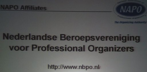
Although we’re the National Association of Professional Organizers, we are closely allied with our international colleagues. We had attendees from the United Kingdom, Japan, South America, Germany, South Africa, and The Philippines, and representative members of the Professional Organizers in Canada, the Australasian Association of Professional Organizers, and from an association whose name is especially cool to read, in the Netherlands:
IT’S ALL ABOUT THE EDUCATION
While we love to socialize, eat, and tour the expo, the major element of the annual conference is always education. With six session blocks, each with five concurrent educational offerings, plus keynote speakers, Ask The Organizer panels (not one, but two, to cover everyone from novices to veterans, tag-team led by Monica Ricci and Lisa Montanaro) and general sessions, we learn how to serve our clients, run our businesses and save our (individual and collective) sanity. Some of us even arrive a day early to take half- and full-day courses on subjects ranging from “Residential Needs Assessments” and “The Missing Link: Getting from “To Do” to “Done!”” to “Advanced Social Media Marketing”.
This year’s educational offerings included:
- 20 Best Practices for Organizing the Creative Mind
- Closet Design for Organizers
- The Emotional Facet of the Client Relationship
- Navigating the Slippery Slope of Ethical Dilemmas
- Photo Organizing
- Organizing Beyond Your Own Personality Style
- Managing Client Expectations
- Organizing Students and Loving It
- Welcome to the Wide, Wide World of Aging Services
- Creating Organizing Sustainability and Lasting Change With Our Clients
- Still Someone: Working With People Who Have Memory Loss
And that’s not quite a third of the concurrent session offerings, which also included the two-parter I told you about last week, with three classic time management systems and three innovations, and a session called “Getting Your Clients’ Financial and Legal Clutter Together — Today!”, for which I was a session host. (I can’t imagine why they thought I might be interested in that. A whole session on legal and financial paper clutter? I was like a kid in a candy-store. Or maybe a candy wrapper store?)
One of the rock stars of the professional organizing industry, Julie Morgenstern, gave our opening keynote address on the history and future of professional organizing, while Colette Carlson spoke another day about the importance of sincerity in communicating with prospects and clients. Lee Silber made us laugh with an amazing presentation just for the Golden Circle (veteran) organizers…and then cry, with the documentary he created, Undercover Organizer, for our closing keynote.
FRIENDSHIP IS PRICELESS
In the age of Skype and satellite communication, it may surprise some of you that professional organizers — dedicated productivity specialists — board planes, risk lost luggage and suffer the indignities and inconvenience of travel — just to come to the NAPO conference every year. Why do we do it? The people! Camaraderie at conference draws us back like moths to a flame (or professional organizers to an unlabeled pile of papers).
Friends and colleagues got together to compare notes about business, to dine, to explore San Diego, to strategize, and to have (or pretend to have) committee meetings — that’s three-fourths of NAPO’s Social Media Task Force-turned-Committee, down below:
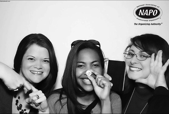
(And yes, I realize that alongside my partners in crime acting out LinkedIn and Twitter, I’ve failed to take into account that cameras reverse images and am displaying the social media juggernaut Bookface!)
When we see fellow organizers (even those we chat with each day on Twitter or Facebook or even on the phone — and yes, believe it or not, phones can still be used for voice conversations), we run across grand ballrooms as if we were small children and not … um, slightly older than children, who were bemoaning our sore feet and aching shoulders mere moments before. We pick up conversations where we left them a year (or a few years) ago, in hallways, at the luncheons, over powder room stalls. We make each other think and question and we nod over sage advice. And former NAPO president (2001-2003) Stephanie Denton made me laugh so hard with

a whispered aside during one of the keynotes that I not only almost fell off my chair, but I dreamed about it two days later…and woke up laughing! (I’ll never think of self-promotion, Charlie Sheen, Taylor Swift or the Grammy Awards in the same way again!)
In one session, our speaker invited attendees up to the microphone to praise and show appreciation to individual colleagues, and the warmth, sincerity and genuine esteem could have melted the heart of the grinchiest Grinch. (Note to Margaret Lukens: recalling your kind words makes me blubber anew.)
Speaking of tears, many of us cried tears of joy, having our own Krista Colvin back in our midst after a year where she was Putting On Her Big Girl Panties and Kicking Breast Cancer in the Ass. Krista’s the one in the photo who actually exceeds 5’3″ — the others are yours truly, the blogger extraordinaire and product maven Jeri Dansky and organizing and social networking dynamo Deb Lee.

Got a few minutes more? Take a peek at the gorgeous (seriously, they photographically removed all evidence that Paper Doll is not still 29 years old) photos the HD Photobooth Team took during our first full day at conference. See how delighted we all are to be together again!
WE’RE NOT ONLY WOMEN
It’s a common misconception that all NAPO members are women, but we have some powerhouse guys in the industry, including former NAPO presidents Tom Nevermann and Barry Izsak and media fave Peter Walsh. Pictured below, you see witty and debonair
John Trosko and Chris McKenry, West Coast stars of the NAPO-LA chapter (the driving force behind the LA Organizing Awards) and our fearless Conference Committee chair,

THE COMPANIES THAT MAKE OUR JOBS EASIER
From big name companies like Rubbermaid to up-and-comers like Pliio (and all the neato companies in between, about whom you’ll be hearing in the next few posts), NAPO’s expo features the products and services that make organizing easier and more delightful.
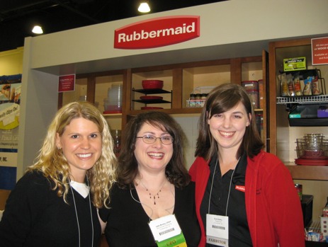
Speaking of delightful, I’m flanked by the fabulous duo of bride-to-Be Lauren Spahr and Erin Gentry.
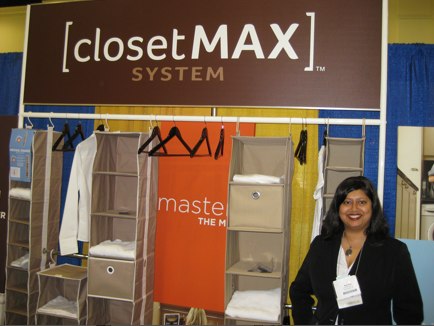
NeatFreak Group‘s Mimi Dhar returned to show off the Closet Max System.
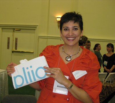
(Oh, are you going to LOVE hearing about how Pliio‘s Clare Kumar has invented a way to file clothes!)

Smead‘s Jim Riesterer posed with a cross between the typical file folder and the Angry Birds app!
SMART IS SEXY: MULTI-TALENTED ROCK STARS OF ORGANIZING
So yes, we’ve got global flair and we’ve got BFFs, we’ve got brains and we’ve got boys. We also have rock stars of our industry walking among us. We’ve got brilliant bloggers, technologists and yes, even TV stars, sometimes all on one panel:

While you may be pardoned for assuming this is the cast of the new Charlie’s Angels TV series, it’s actually the panel for the session “Bridge the Digital Divide: How to Organize & Be Productive in the Information Age”, with session host Helene Segura, SOHO Solutionist Brandie Kajino, CPO-CD and star of TV’s “Hoarders” Geralin Thomas, digital productivity specialist Lauren Halagarda and triple-threat organizer-blogger-speaker Josh Zerkel. (Lookie, yet another princely fellow!)
ALL TOGETHER NOW
Combining our expertise with our expo partners’ thingiebobbers and innovations (and you readers and clients, of course), organizing is beautiful…even if travel is sometimes not. Below, we see some members of the NAPO-Georgia chapter (pictured here with Edgewater Grill server and diet Coke savior, Paul) mere moments after

after struggling with a taxi driver who had a few issues related to hygiene and personality, such that the girls were tempted to start singing, “I’m gonna wash that man right outta my hair…”

Tune in next time for the start of our in-depth report on the fascinating products and services presented at the 2011 NAPO conference and expo.
Don’t Be Listless…Be Listy (And Happy!) With WorkFlowy
Recently, a few social networking pals on Twitter and Facebook posted about a new list-related site called WorkFlowy. I thought that was an awfully odd little name, and figured I’d pull up the site, give it a glance and then save it in the bookmark folder I’m using to collect sites to update the information I provided the last time I talked with you about To Do lists and sites to help others with their To Dos.
It’s been almost three years, but I’ve been in no rush to revamp and revise. As much as I enjoyed testing to provide readers with a sense of what nouveau To Do-ness they offered, each site left me cold. (Of course, in the case of Remember the Milk, that’s a good thing. You can’t stay awake to write a blog post if your milk is warm, right?)
As I’ve been examining newer To Do sites, apps and programs, I’ve clarified my vision of what I hope to present. Eventually, there will be a Paper Doll series on paper-based time management systems. I’ve reviewed all my old Getting Things Done notes from my readings of David Allen, and I’ve followed the teachings of Mark Forster, mostly second-hand via the blog of fellow Professional Organizer, Janine Adams of Peace of Mind Organizing. (Forster’s the one who came up with the various iterations of the AutoFocus system that went viral a few years ago and the new SuperFocus system, which I’ve yet to research.) Among the paper-based time management systems, there’s even The Pomodoro Technique, which creates a time-limited system for achieving goals and has something (obliquely) to do with tomatoes.
I’ve researched all of these (and am excited to investigate further, as my colleague Emily Wilska, of San Francisco’s The Organized Life will be presenting two jam-packed sessions on these systems at this week’s annual conference of the National Association of Professional Organizers.

To me, paper-based really means list-based. I’m flexible. It doesn’t have to be on paper. However, none of my research, back then or in recent months, had yielded a To Do list site or app that had the the paper-y ease of use I was seeking. Until WorkFlowy.
Readers, you know I don’t generally gush, but (at the risk of sounding like a late-night infomercial) thirty minutes after starting to use WorkFlowy, I was tweeting its merits to fellow professional organizers and the public at large. Over the last few weeks, I’ve put WorkFlowy through its paces during one of my busiest times of the year, and it has not disappointed.
I love it. Not just for what it does do, but for what it does not. WorkFlowy is elegance in its simplicity. It lets you create lists, sub-lists and sub-sub-lists. It lets you see what you want, hide what you don’t want to see (until you want to see it again), move items as necessary and more. Yet WorkFlowy does not offer so many options that you’d likely forget the features exist, and nothing requires reading a manual to understand (although there is a nifty video to help you get things started).
I’ve found what is, to Paper Doll, the Holy Grail of To Do lists. It lets you do everything you could do with a pad of paper, with all the features that we’ve come to love from word processing programs, like the ability to cut and paste to rearrange text. While mind-mapping is great for visual people, many of us think in words and outlines, in bullet points and lists. But if third grade Social Studies outlines (Roman Number I, capital letter A, numeral 1, lowercase letter a) is a bit overambitious for your cognitive framework, WorkFlowy bridges the gap between complexity and chaos. It’s just yummy. (See? I gushed!)

GETTING STARTED
WorkFlowy is easy to use. Sign up by providing your email address and creating a password. That’s it. Really.
Once you’ve signed up, you’ll be presented with a pop-up screen that shows the same introductory video to which I linked above, and a cheat sheet of commands and shortcuts. But don’t worry — everything is so intuitive, you won’t really need the cheat sheet.
When you’ve soaked it all in, hit the close box in the upper right corner, which points helpfully to the “Help” menu. If you ever need to access either the video or the cheat sheet, it’s as near as clicking “Help”. (Forgive me for not being able to show you the Help button, but WorkFlowy is wider than my blog screen.)
You’ll be provided with a blank page with one bullet point. One lonely little dot.

Type something. Let’s say it’s your task list. Type “Task List”. Then hit enter and type something else, like “Shopping List”. Lather, rinse, repeat.
FORMATTING YOUR LISTS
At the end of any given bullet point, you can hit enter and tab, and the next bullet will indent underneath the parent bullet. You can type wherever your insertion cursor is blinking, or click the plus sign next to “Create new item” and that lonely little dot becomes an active, powerful task item.
If you forgot something that you want to add in a list, place your cursor at the end of any item in that list, hit enter, and you’ll have a bullet item, properly lined up. If you realize you’ve created a sub-tab too deep in the hierarchy, you don’t even have to erase and re-replace your cursor. Just as you increase the indenting by clicking your tab key, you can decrease the indenting by clicking shift and tab.
To promote a bullet to a higher level in the hierarchy, decrease the indenting; to demote it, increase the indenting. However, if you wish to move a sub-bullet to another location, just grab the little multi-directional arrow parallel to any bullet point but all the way on the right of the screen:

and drag the arrow in any direction and drop it where you want the bullet to relocate.
THE DETAILS
WorkFlowy’s interface is exactly like Word or any other word processing program — use the same keyboard shortcuts you’d normally use to cut and paste, copy or edit text. If you type a complete URL (including the http://), WorkFlowy will make it an underlined, clickable link. (This makes it ideal for researching and planning blog posts.)
You can collapse (hide) or expand (show) any given list or sub-list by clicking the tiny plus or minus sign that appears next to any given bullet when you hover your cursor. If everything is currently hidden:
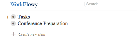
you merely hover your cursor over the bullet (to make the + appear) and click the plus sign to expand so you can see just that bulleted list and any or all the bulleted sub-lists:
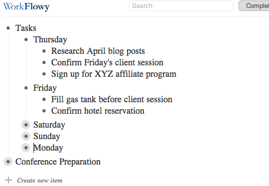
Above, Thursday and Friday’s bulleted sub-lists are visible, Saturday-Monday’s are collapsed and everything under the next main bullet is hidden. With one keystroke, you can expand or collapse as you see fit. In under two seconds, my view of the above list can change to:
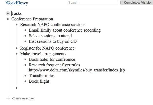
As you type, WorkFlowy auto-saves every few seconds. However, there is a “Saved” button at the top of the page so that you can gauge whether your very last keystroke was saved before you log out or close the browser window. There’s also a “Search” box, so even if a list is collapsed, you can locate a key word or reference.
THE EXTRAS
In addition to controlling the formatting of the page, you can modify any item by hovering your cursor over the bullet. A little menu will pop up to the left to indicate your options for that specific bullet point:
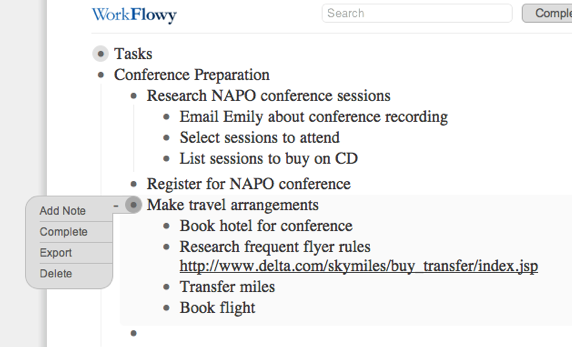
You can:
Add a note, which opens un-bulleted space right under any bullet, so you can make notes to yourself about the list without the note becoming caught up in the list hierarchy.
Complete allows you to strike through that bullet item to indicate completion. Once you have lots of completed items, if it gets untidy, there’s a button at the top of the screen giving you the option to toggle Completed: Visible or Completed: Hidden so you can decide, on a macro level, whether you wish to see completed tasks.
Export lets you export a particular list or sub-list (rather than the whole shebang):
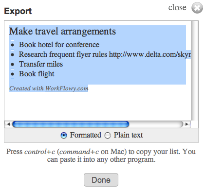
so you can include it in a report, email or any other document. If you want to export your whole mega-list (for backup purposes), there’s an “Export All Lists” link at the bottom of the screen.
Delete lets you delete a particular bullet and any sub-bullet under it. I was all set to warn you to be careful, because WorkFlowy does not ask for confirmation of deletion, and Control-Z or Command-Z does not apply. However, I discovered that whenever you delete a bullet or series of bullets, a menu appears at the top of the screen, offering you an option to UNDO the deletion. If you click it, you’ll be offered further instructions:
THE DRAWBACKS
While WorkFlowy is perfect for Paper Doll, certain missing attributes are deal-breakers for other users. For example, WorkFlowy:
—does not have color coding. Text is in black on white. When you mark an item as complete, it appears slightly dimmed with strikethrough text.
—does not have aesthetic formatting. You can highlight a word and click Control-B or Command-B until the cows come home, but you won’t be able to make the text bold.
—does not sync with iCal, Google Calendar or any other app. It’s up to you to figure out when you’re going to accomplish any given task and how you’ll alert yourself to do it.
—doesn’t have offline support, which I know is a sticking point for those who use laptops, tablets and smart phones in environments where Wi-Fi (or any Fi, or 3G or 4G or any old G) may not be available.
THE FUTURE OF WORKFLOWY
What about other high-tech issues, like security, mobility and collaboration?
WorkFlowy already works in a secure environment. Just go to https://workflowy.com/ and you’re all set. (In fact, WorkFlowy beat Facebook to the punch on this feature.)
WorkFlowy is continuing to work on fully-featured mobile versions. Just three months ago, their preview version for mobile devices let users view lists, expand and collapse sub-lists and zoom in, but it was more “read” than “write” because it lacked editing features (and the aforementioned offline support).
The WorkFlowy team moves quickly, though. iPhone, iPad and Android users can now edit on their devices, and the mobile interface is constantly being upgraded.
As for collaboration, team access to lists is in development. As a first step, if WorkFlowy is open in two tabs, or on a computer and a device, changes made in one are reflected on the other.
Not bad for a five-month-old site that’s still in beta, eh?
There’s no shortage of To Do apps on the web, and Paper Doll isn’t a savvy enough prognosticator to call this the next Google, Evernote or Dropbox. But I really, really like WorkFlowy, and I think you might, too. Try it out, and please share your comments below.
Gaslight? A Mysterious Art Theft?
Readers, we have a small mystery here at Paper Doll Central.
On March 15, 2011, my post Displaying Children’s Art: Reframing Grandchild Moses & Making Raggedy Andy Warhol More Magnetic posted without difficulty. It was the first part of a two-part series on children’s art. The next week, we had a small hiccup, so the follow-up post, Children’s Art: Curating Not-So-Little Collections, instead of appearing on its regular day, appeared on Wednesday, March 23, 2011.
On that day, some people did have the chance to read the post, but sometime in the intervening two weeks, the post disappeared from the archives, and clicking “next post” at the end of the March 15th post links directly to last week’s post on frequent traveler rewards…skipping the second art post altogether. For those of you who use RSS feeds or have linked to the post from my Facebook business page, you’ll note that clicking on the link that used to work now yields a strange error message. (This does not feel very organized at all!)
Paper Doll was tempted to fear she imagined having written the post altogether. (I always did want to be more like Ingrid Bergman, though perhaps not in Gaslight.) However, one can still access tweets quoting the post — apparently, my line about “Not everyone is a Picasso. Heck, not even every Picasso was a Picasso!” was pretty popular.
Plus, the original post does still exist in Google’s cache:
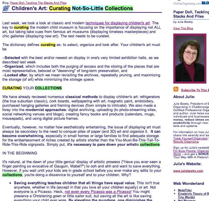
We’re working to get the original post recovered, but it may be a while. For those of you who were left hanging and requested information about the missing post, I encourage you to click the link to read the post in its entirety via Google’s cached version (even if the colorful highlighting is a bit disconcerting).
Thank you to all the readers who wrote in to find out about this mysterious little art theft. We’ve got everyone, from Hercule Poirot to the staff of Where In The World Is Carmen Sandiego? on the case, and as soon as we know something, you’ll know something.
Points and Miles and Rewards–Oh, My! Organizing Frequent Travel Programs
Travel can be a real headache. First, there are the modern indignities, from taking off your shoes to choosing between TSA-fondling and subjecting yourself to the radiation and embarrassment of airport security backscatter scanners.

Then there are hotel alarm clocks that require a PhD to set, woefully indifferent desk clerks and overly attentive bedbugs. (Ick! But at least there’s a national registry!)
The recession led to staycations (the name, not the concept — people have been staying home since long before the internet). The cost of travel keeps going up, with airlines charging for everything from checking luggage to selecting seat assignments to booking a ticket. (Isn’t charging for booking a ticket like a supermarket charging to let you pay for your groceries?) One airline actually considered charging for use of the bathroom until Boeing refused to install the requisite equipment out of fear for flyer safety!
Frequent travel loyalty programs used to be a highlight of the travel experience. Sure, sometimes it was hard to find dates on which you were able to use your miles or points, but generally, the experience took some of the sting out of travel, because you knew the money you spent would be, in part, rewarded down the line. Now, you not only must pay to purchase miles (for yourself or for a gift — which, of course, makes sense), but you now have to pay to transfer — yes, to GIVE — your miles to someone else, even in your own family. (Imagine if you had to pay Macy’s if you decided to pass along a sweater or purse to a friend or sibling!) It’s enough to make a Paper Doll “harrumph!”
It’s a comfort, then, to know that at least keeping track of travel miles and points need not be difficult or paper-intensive. Once upon a time, there were only a few domestic airlines and primarily business travelers made use of loyalty programs. Now, every credit card seems to have an affinity program, and airlines and hotel chains have intricate reciprocal arrangements. You can earn, buy, sell, trade and combine miles with the help of ingeniously sophisticated sites and wise travel points gurus.
THE OLDEN DAYS
A decade ago, I used to help my clients organize their loyalty points by creating file folders for each of the travel programs and filing paperwork in reverse chronological order. Back then, all the programs mailed quarterly updates, so we just popped the most recent mailing into the front of the folders and purged the out-of-date paperwork once a year. For an occasional heavy-duty traveler, we created Excel spreadsheets to track miles added or redeemed.
Nowadays, it’s a rare loyalty program that sends any mail unless trying to induce you to sign up for an affinity credit card. Instead, the programs send emails which may reference your point/mile balance but probably require you to log in to the web site, forcing you to search for the password. (Technology is great, but I still prefer letting one’s fingers do the walking across a few file tabs vs. through layers of online validation.)
Paper Doll is not a frequent “frequent traveler”. I generally use one of two airlines, and as for hotels, it would be far from exact to call me loyal, but hedging my bets against a future in which I am a jet-setter (or am able to creatively combine points and miles for a big reward), I participate in the loyalty programs of every hotel chain in which I’ve stayed in the past few decades. Trying to track all of that data at each individual site and supervise a DIY spreadsheet is so taxing that I don’t see myself doing it, let alone my clients.
Enter, the loyalty point aggregators!
THE AGGREGATORS

AwardWallet tracks loyalty reward points and miles in 321 (and counting) programs, including major airline (100+), train (5), hotel (40+) and car rental (13) programs.
You can also use it to aggregate and track credit card reward point programs like American Express Membership Rewards and Thank You Network points, and frequent shopper programs as varied as Aveda’s Pure Privileges, office supply rewards programs for Staples, Office Depot and Office Max, Hallmark Crown Rewards and Ebates. Track dining programs, from the big guys (iDine, Open Table) as well as individual restaurant chain programs (from Landry’s and Outback to Panera and Qdoba).
Registration is simple: create a username and password, provide your name and email address (which doesn’t have to match the email addresses with which you’ve registered for your loyalty programs), and agree to the terms and conditions.
Once you join, begin adding program information by clicking the green plus sign at the top of the page. Then type the name of any program into the search box or select from a long alphabetized list. Enter your user name (or rewards account number) and password, and AwardWallet pulls up all the vital information. It will always automatically update all information for that account upon login, and you can sort by program name, balance or expiration date.
Even if you lack a few key pieces of login data, it’s easy enough to go to a program web site and use the password recovery to straighten everything out before adding the information to AwardWallet. (Heck, you’d have to do it sometimes, so why not now?) I added eight major travel programs in about 20 minutes, and now when I log in, I can not only see updated point tallies (associated with the program, account number, and, if applicable, expiration dates), but also trip details for upcoming flights, rentals or hotel stays.
AwardWallet has two plan levels. At both the (free) basic level and (paid) Plus level, you can automatically track rewards balances for an unlimited number of plans, organize rewards into “custom” views, automatically track travel plans, and share rewards balances and travel plans. You can also get notified of impending expiration of loyalty points or miles (90, 60, 30, and 7 days in advance), though the basic level limits you to warnings for only three programs.
The Plus level has additional features, such as historical charts of point balance changes and the ability to export data to an Excel spreadsheet (e.g., for corporate record-keeping). If you upgrade to Plus status but choose not to renew the next year, AwardWallet will merely downgrade you to the basic level, keeping all of your data fully available.
Interestingly, the Plus has a Priceline-esque name-your-own-price fee that seems both quirky and mysterious. For what it’s worth (which remains undefined), AwardWallet has provided me with a code that the first ten registrants can use to upgrade to a free year of AwardWallet Plus. Have at it, Paper Doll readers — enter the following code during the registration process:

Points.com is similar to AwardWallet, but offers a few twists in terms of functionality. To sign up, provide your email address and create a username and password, plus your country and state or province. (You can also provide your city or community, in order to be provided with earning opportunities, but this is optional.)
Points.com participates in fewer programs than AwardWallet, including 55 airlines, 14 hotel chains, 4 credit card rewards programs, and 29 (mostly obscure) retail programs. To add a program to your account:
1) Scroll down in the correct category and click “add” for the intended program.
2) Click on the Register Program button.
3) Supply the requested program login information and click (again) on the Register Program button.
The system will then update your account with your point details for your reference. But Points.com isn’t just for tracking points — it enables users to buy, sell and trade points!
Once you register your account, use the search function to find someone who needs, say, 3000 of your airline program points and is willing to offer 7000 of his hotel program points in return, via the site’s Global Points Exchange. (There are fees associated with most trades, in part to cover the fees charged by the individual programs.)
The site also helps you make trades between your own accounts, allowing you to turn certain hotel or dining points into airline points, and vice versa (again, with fees attached). You may also use Points.com to redeem miles or points for gift cards from retailers including Amazon, Best Buy, Home Depot, Pottery Barn and Crutchfield — a great idea if you’ve got a small number of soon-to-expire miles.
Points.com has an intriguing model, but the trading functions may be more confusing or complicated than you’d want to bother with unless you have an urgent, pending need to acquire miles or points. For reference, similar sites which broker sales or trades of frequent traveler miles include AwardTraveler.com and Air-Awards.com.
![]()
Mile Tracker started out a decade ago as a Windows-only downloadable software program created by “a guy named Mike”. Now, the cloud-based program is powered by USA Today and can be used by everyone.
Once you create an account by supplying your name and email address and creating a password, the system will send you an activation key by email. After activation, you’ll have one more step–creating a user name–before you can get started. At first, I wondered at the disorganization in not creating the user name as part of the initial set-up, but it turns out that one MileTracker account can track miles for multiple travelers (Mom, Dad, the kids, Alice, Sam the Butcher, etc.)
Add mileage programs easily: select the user and program to add, then enter the login information required by any given program. Just wait a few minutes for the system to populate the fields with your mile/point information, which you can view under the Account Summary tab. A nice time-saving feature of MileTracker allows you to not only view and track your points and mileage on the site, but a navigation button grants you one-click (already-logged-in) access to whatever program you want to view at its official site.
In addition to mileage and point tracking, MileTracker boasts features including airport links, currency converters, flight trackers (including information on flight delays), mileage calculators and a USA Today feed of travel-related news via the Today In the Sky blog. However, I did encounter some odd programming hiccups that make it hard to recommend.

MileageManager.com is an oldie-but-a-goodie, dating back to an offline service that began in the 1980s and went online in 2001. It’s much more than a consolidation service, providing some real comprehensive mileage management, but at a price (albeit a small one, of $14.95/year, and there’s a 30-day trial membership). And, unlike AwardWallet and MileTracker, MileManager only allows one person’s loyalty programs to be tracked per account, so a married couple would have to maintain two separate accounts.
MileageManager tracks balances and activity for frequent traveler (hotel, airline, car rental) and credit card rewards programs, as well as elite status-related characteristics. Like the paid version of AwardWallet, MileageManager offers unlimited notifications for expiring points/miles, but in a unique offering among these sites, MileManager has an Award Planner service (in beta development) to help identify which of your programs have award travel bookings available.
Members type in basic information regarding an impending trip (dates of travel, number of award-related tickets needed, the airports of origin and destination, etc.), and the Award Planner locates free tickets and opportunities in each applicable loyalty program. This saves an inordinate amount of time, whether surfing airline sites or being lulled into an elevator music-induced stupor while on hold with your frequent traveler customer service line.
While I’d encourage readers to check out all possible point management options and evaluate them with regard to individual needs, frugal Paper Doll gives top scores to the free, easy-to-navigate AwardWallet. Happy traveling!

Follow Me