Archive for ‘General’ Category
NAPO Expo 2012 Recap (Part 1) — Paper Lovers’ Dreams Come True
Readers, I ask you to imagine the coolest shopping mall or bazaar you’ve ever encountered, but every product or service sold focuses on the wonders of organizing, and shopping hours are severely limited. Now imagine throngs of friends you haven’t seen in at least a year, circling around you, mingling and hugging and talking at an ever-elevating pitch. Throw in some delicious (looking) appetizers, and you have Paper Doll‘s experience at the Expo portion of the NAPO 2012 Conference and Expo.
Torn between researching the magnificent products, visiting with friends and delighting in the delicacies, I feel I gave everything short shrift, but over the next couple of posts, I hope to share with you some of my favorites of this year’s Expo — the innovations, the updates and even a few novelties.
At a point in time when technology seems to be the Belle of the Ball, Paper Doll is pleased to note that a variety of paper organizing products shone as stars at NAPO 2012. Indeed, today, we can start with the Arc of the Expo!
ORGANIZERS OF THE FLEXIBLE ARC
In every NAPO 2012 attendee’s conference bag this year, in addition to the itineraries and documents, was a lovely surprise — a leather notebook with five sturdy, colorful, re-positionable poly tab dividers and a three-pad stack of 50 task pads.
M by Staples’ Arc customizable notebook system is visually appealing. To be honest, having merely looked at the packaged product, Paper Doll didn’t quite understand the hubbub at first. Apparently, Arc is designed as a more affordable version of Levenger’s Circa, a high-end customizable notebook system. But I must say, Arc is plenty luxurious, without need for comparison, at affordable prices.
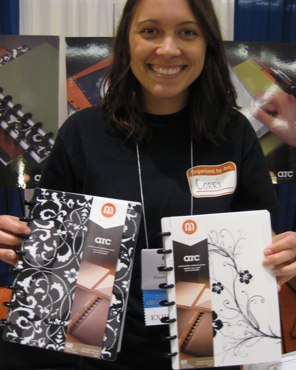
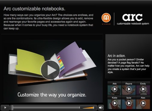
The intriguing aspect is how it’s put together. At first, before the unwrapping, it seemed to be another take on a daily planner, like my Franklin Covey Classic — a leather cover for a ringed notebook that holds a variety of pre-punched paper elements. Ah, how naive I was. Arc is actually much more like a Chinese menu, columns A, B and C from which you can pick a dizzying array of tasty options. To get an overview, check out the different demo videos of Arc personalities (Arlo, Alex, Reyna, Katie, Izzie and Emily).
The “spine” of the system is not, as it first appeared, the traditional metal ring. Rather, Arc employs solid plastic discs (though they’re called rings) which fit into the grooves in the front and rear panels to form the exterior of the notebooks.
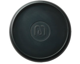
The paper pages and other inserts fit snugly around the unusually-shaped ring edges. The M by Staples Arc system rings come in two sizes, 1″ and 1 1/2″, both in a sturdy, shiny black, priced about $2 for a package of twelve, so you can expand the girth of your system like a tailor might let out a pair of trousers.
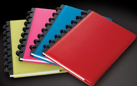
The Arc System covers come in two styles, leather (from $14.99) and poly (from $7.99). The leather versions come in velvety, traditional blacks and browns, as well as modern brights, like red, pink, blue and a chartreuse-ish green. Although the official web site lists the leather notebooks available in two sizes, 6 3/4″ x 8 3/4″ and 9 1/2″ x 11 1/2″, my own red notebook measures 8.5″ x 5.5″, so it seems the marketing is just slightly lagging the innovation.
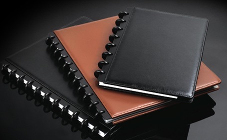
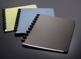
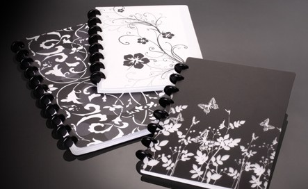
The durable poly versions come in solids (black, blue and green) and black-and-white patterns (flower, hibiscus and a mysteriously unnamed pattern), in two sizes, 6 3/4″ x 8 3/4″ and 9 3/4″ x 11 31/4″.
The Arc system is not just affordable and highly functional. It’s also customizable, making it highly flexible for multiple professional, academic and personal uses. The system offers a wide array of options for re-positionable pop-in insert accessories for the letter and junior-sized platforms:
—Stacks of 50 premium heavyweight pages, including narrow ruled paper, graph-ruled paper, project planners (with space for titles and dates, project elements and summary comments) and To Do pages ($3), as well as an assortment of weekly/monthly page options
–Sturdy poly pocket dividers with pockets cut on the diagonal for easy access ($3)
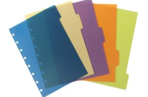
—Poly tab dividers, in packs of five, in black or assorted colors (with labels) ($3)
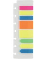
–Sturdy sheets bearing 200 adhesive page flags in assorted colors ($3)
—Task pads ($4), similar to the sturdy Franklin Covey “Weekly Compass” pages.
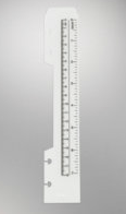
Other accessories include rulers ($1), and business card holder pages ($9 for a package of five). Arc also manufactures special hole-punches ($40) for achieving that Arc-style punch, which looks to Paper Doll to be best described as a sideways umbrella or mushroom.
I would recommend checking out the Arc system (either online or at your local Staples) for anyone who prefers upscale appearances and flexibility without an upscale price.
EVERYTHING IS JUST PEE-CHEE!
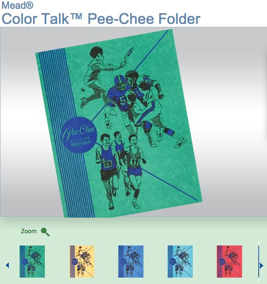
Longtime readers of Paper Doll will recall that about a year and a half ago, we talked about mysteries in the office supply aisle and discussed some back-to-school items of note. At the time, I recalled the warring popularity of Trapper Keeper folders vs. the individual two-pocket types of my youth, and mentioned my fascination when colleagues Brandie Kajino and Krista Colvin informed me that folks in the Pacific Northwest (and elsewhere to my far left, geography-wise), referred to folders by a particular nickname: PeeChee.
Imagine my surprise when Krista Colvin greeted me at the NAPO Expo with the declaration that she had something for me, and she produced my very own, 100% official, PeeChee All Season Portfolio, manufactured by Mead…the very same people who created the Trapper Keeper!
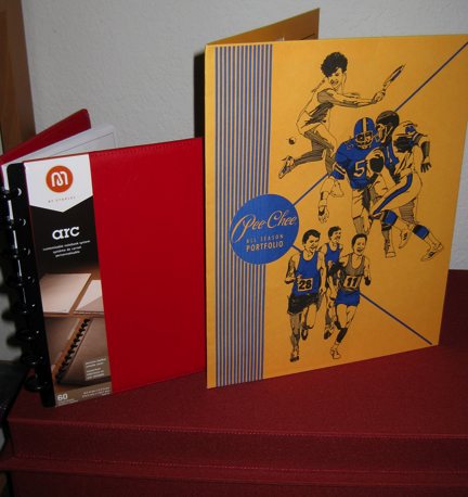
My new PeeChee, seen here, for scale, with my Arc notebook.
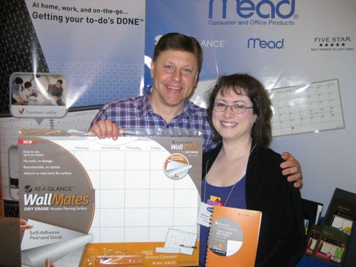
PeeChees weren’t on display at the NAPO Expo, but I’m delighted to learn that PeeChees are still going strong. In fact, a quick perusal of Mead’s web site finds that the Wild West (well, Wild West to this native Buffalonian) back-to-school staple isn’t just peach-y, but is also blue-y, rose-y and green-y, now that Mead makes a Color-Talk line of PeeChee folders.
ALL YOU NEED IS (A FEW) DOLLARS AND AN ORGANIZING DREAM
Speaking of folders, I had to mention (even though we’re not nearly ready to talk about the big guns of the paper world) something nifty I saw at the Pendaflex booth. Below, Paper Doll‘s BFF — financial organizing maven and Professional Daily Money Manager Nanette Duffey — with Esselte/Pendaflex’s Rick Drish, are showing off a new kind of folder.
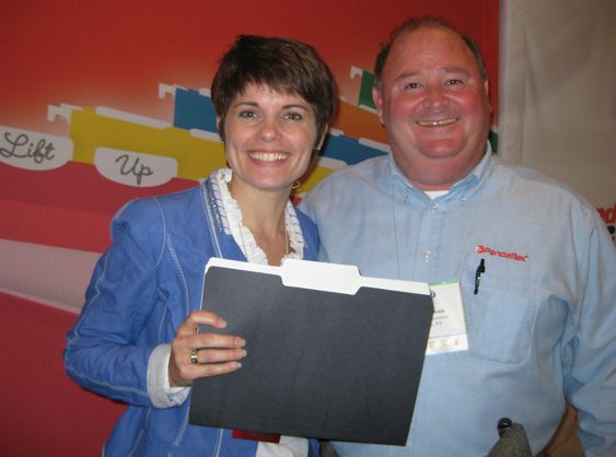
“New, Paper Doll? What’s new about it?” you might wonder.
“Oh, the color scheme?” you posit? Well, yes, I did think the idea of 1/3 cut file folders with a black exterior and white interior was nifty. Black and white is quite elegant, and for the fashionable set, turning the folder inside out provides double the artistry. Black with white interiors, or white with black interiors — you pick!
But no, that’s not what really got me going. You may (just barely) be able to see that the folder has a slight graininess, befitting recycled paper. And if you guessed that, you’d be getting warmer — it is a variation on Pendaflex’s multi-color 100% recycled file folders.
But what really gave me the giggles was the fact that these Black and White Recycled Folders aren’t just recycled — they’re recycled from used lottery ticket paper! This earth-friendly, snazzy-looking folder is made from 100% recycled fiber and 40% post-consumer fiber, and is acid-free. It can be purchased in boxes of 50 from office supply retailers, and is part of Esselte’s Pendaflex-Oxford-Ampad line of Earthwise products, of which we’ll be discussing more, closer to Earth Day.
Readers, that’s just a taste of what’s to come as we continue to recap the delicious fascinations of the NAPO 2012 Expo! (Which gives you more than I got in the Expo hall, as I never did get to taste any of the supposedly delicious hors d’oeuvres, busy as I was, playing intrepid reporter. Appreciative comments left below, and crab cakes packed in dry ice and sent to Paper Doll headquarters, will be acceptable recompense.) See you next time!
If It Quacks Like a Duck, Then It Might Be a Zebra – A Shoplet/Duck Tape Review
The nice people at Shoplet sent me a care package just as I was departing for the National Association of Professional Organizers 2012 Conference and Expo in Baltimore. Although duct tape and packaging tape weren’t foremost on my mind as I left for conference, by the end of the week, I was wishing for a Star Trek transporter to beam my care package to Baltimore.
Although I encourage my clients to pick up as little swag and advertising as possible when they attend conventions, the material I pick up at the NAPO Expo is essential for helping me analyze and review items in Paper Doll posts all year round. The problem? Attending this year’s conference required flying, and my suitcase (and shoulder strength for carry-on luggage) was at maximum capacity.
Having spent a few days after conference with a spectacularly organized friend, I called on her assistance (and supply of cardboard boxes) to pack and ship my newfound treasures. All I needed were scissors and some tape, and I’d be all set. I eyed my otherwise spectacular friend with dismay when she handed me a roll of mailing tape. You know the roll I mean – a gruesome color seen only in basements – a sort of shiny yet muddy brownish shade of flimsiness that sticks to itself (but not always to packages), wrinkles, and otherwise disappoints.
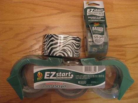
I admitted I was literally craving the Duck EZ Start Premium Packaging Tape that Shoplet had sent me, to organize my stash. Lovingly unperturbed by my tape snobbery, my friend disappeared and returned with an entirely satisfactory roll of packaging tape, and I set about to complete my task, made longer only by the repeatedly loss of the end of the roll. (My friend gamely offered up bread ties to use as end-markers.)
Back home, my luggage and shipped package having both arrived, I’ve been able to sit down and make some evaluations. First, I love that the Duck EZ Start Premium Packaging Tape is clear. Certainly my aesthetic preference has to be secondary to any functional issues. But I have greater confidence in the security of a package whose edges, creases and seams I can see through the packing tape.
A bigger plus is that the Duck EZ Start Premium Packaging tape is, indeed, easy to start. True to its word as I’ve been testing it, this brand is easy to start, each time. Never once, as I’ve experienced in the past, has the left side of the tape lifted while the right side remained stuck to the roll, creating a shaggy tectonic plate shift. Swift to start, sticking where it ought and nowhere else, and tearing only (and perfectly) when the dispenser’s teeth cut cleanly across it, Duck dispenses well and serves its purpose admirably.
Speaking of dispensers, Shoplet’s care package also included the Duck EZ Start Premium Packaging Tape with Dispenser with, as noted on the packaging, a “One-Handed Dispenser.” Dispensing (pun somewhat intended) for a moment with a funny naming convention that implies Duck includes an actual hand rather than enabling one-handed dispensing, the Duck dispenser’s white plastic roller and small plastic arm extensions makes it easier to use only one hand for taping while squeezing together box edges or otherwise holding to-be-taped parts in place. I’ve never been particularly adept at one-handed taping, but I imagine, with practice (were I helping a Santa-like organizing client package items in bulk), Duck would be very useful.
My one constructive criticism is that I would have preferred a heavier-duty packaging tape, something a little less flexible and with a little more thickness. Of course, some users might be particularly pleased by a slimmer tape footprint.
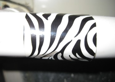
(Actual Paper Doll household pipe, Duck Zebra-fied!)
Finally, I can wholeheartedly recommend readers check out the third product line included in the care package, the Zebra Printed Duck Tape. As a not-particularly handy gal, I’ve always hoped that any problem could, as promised by folksy fellas, be solved with WD-40 or duct tape. And of course, one key to being organized is to eliminate all the nagging little distractions of under-performing (i.e., broken) parts.
However, while I always encourage readers to focus on function over form, traditional duct tape has never been what one might call fashionable.Well, tradition as been bucked, or shall we say, Ducked, because this duct tape is wackily fabulous. It works just like regular duct tape to fix ducts, pipes, ripped auto upholstery and anything else you might need to repair. It tears or cuts easily and holds firmly, but it does so with style. Duck is not your granddad’s duct tape.You know the expression used ad nauseam on medical dramas – “When you hear hoofbeats, think horses, not zebras?” Well, if you hear the hoofbeats of home repairs, thinking “zebra” and “Duck” is the way to go. Functionally, it satisfies, and if you’re tired of metallic grey, Duck also delights.
Niftily, Duck makes a Leopard Printed duct tape, too, as well as patterned tapes in Totally Tie Dye and Digital Camo. There are even colored Duck duct tapes in Purple Duchess (wouldn’t that be Duck-ess?), Sunburst Yellow, Cha Cha Cherry, Electric Blue and Deep Blue Ocean. Of course, Duck Colored and Printed Duck tape aren’t just useful for home and auto repairs, but crafting (if you’re the crafty type), or color-coding areas in the garage, kitchen or laundry room.You know I’ve got to say it. It’s just Ducky!So, stop procrastinating on your office and home supply tasks, and Duck them, instead!

By the way, I often peruse Shoplet’s blog to find intriguing or unusual products or line extensions to share with Paper Doll readers, which is how I learned that Shoplet was starting a product review program. While the regular Tuesday morning schedule will stay in place, I’m looking forward to providing occasional bonus Paper Doll posts in the coming months.
Disclosure: I received these products for review purposes only, and was given no monetary compensation. The opinions, as always, are my own. (Who else would claim them?)
NAPO Conference and Expo 2012 — An Introduction

Hello, patient readers! Although I’ve been back from the National Association of Professional Organizers 2012 Conference and Expo in Baltimore for a week, it’s taken some time to get re-acclimated. It’s a heady experience to be surrounded by about 830 of the smartest (and loudest) organizing experts in the nation, all sizzling with excitement to gain knowledge, explore new organizing products and services, catch up with their colleagues…and eat.
And it was definitely exciting to find that while we were off filling our heads, hearts and tummies, our national president, Angela Wallace, was spreading the word about the professional organizing world.
THE BIG CHEESE and EDUCATIONAL FEASTS
NAPO 2012 was overseen by a conference committee headed by fearless leader Scott Roewer (seen here with financial organizer (and my conference roommate) Nanette Duffey and technology maven Lauren Halagarda).

Scott’s intrepid team reviewed and winnowed a mountain of educational proposals to select the final 30 breakout sessions, panel presentations and courses on a wide variety of topics of exceptional benefit to clients, including titles like:
- Lifekeeping, Not Just Bookkeeping: Advanced Financial Organizing for Seniors
- Stand Up & Be Counted: Support a Hoarding Task Force
- Helping Your Client Eat a Frog…Understanding the Causes, Consequences and Cures for Procrastination
- It’s 10 PM: Have You Done Your Homework Yet? (Tips, Tools and Tricks for Teaching Time Management to Students)
- Organizing the ADHD Brain Using Executive Functions
- Cleaning Clutter the “Fun” Shui Way
- The Photo Organizing Dilemma: Meeting the Needs of Your Overwhelmed Clients
- Digital Disorganization and New Organizing Skills
and the most popular organizing-themed breakout session at conference, Krista Colvin and Allison Carter‘s Organizer’s Favorite Things — Tools of the Trade for the Modern Home and Home Office!
Of course, not all of the classes focused on the art and science of developing organizing expertise. Professional organizers also flocked to two courses taught by the exemplary Rich Brooks,  one on YouTube marketing and another on building business through blogging. Other popular classes included:
Speaking NAKED — Stripping Away the Barriers of Effective Public Speaking
In Good Company: Building Professional Collaborations and Organizer Teams
and Taking Your Organizing Products to the Market — What You Need to Know, taught by Clare Kumar, whose Pliio clothing-filing product 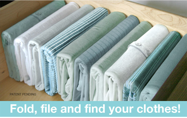
I reviewed in the NAPO conference 2011 recap. Coincidentally, the sale of Pliio went national via HSN a mere 48 hours before Clare’s presentation at NAPO.
EDUCATION ON A GRAND SCALE
NAPO’s educational foundation isn’t just built on the smaller breakout sessions, which attract anywhere from 50 to about 200 attendees, each. The whole kit and kaboodle of organizers (tidily) crammed themselves into standing-room-only ballrooms to hear stirring keynotes from the original Apprentice, Bill Rancic, who shared his ideas on How To Think Like an Entrepreneur and Joanne Lichten, PhD, RD (Dr. Jo), who imparted wisdom on How to Stay Focused, Energized and More Productive.
NAPOites like Paper Doll, who had been lucky enough to attend the 2002 NAPO conference in Atlanta were especially delighted to experience the return of our closing keynote speaker, Dan Thurmon. His inspirational keynote on personal growth and expanding your opportunities was accompanied by his impressive
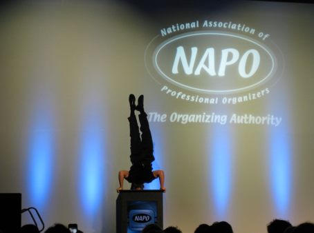
acrobatic flips, juggling lessons and performance atop a 6 foot unicycle! He taught us how to be Off Balance On Purpose!
It wouldn’t be a NAPO conference without Ask the Organizer panels, and like last year, we had two, one led by Monica Ricci, Ask the Organizer’s creator and decade-long moderator, and another made up of NAPO’s Golden Circle veterans, led once again by Lisa Montanaro. There was also a first-timer orientation and two Golden Circle goal-planning sessions. Paper Doll, along with colleagues Helene Segura and the Board of Certification for Professional Organizers‘ reigning queen, Audrey Levine, led a Jeopardy-inspired presentation on the ins-and-outs of certification and re-certification.
PEOPLE-WATCHING
Conference is almost as much about who you get to know as what you learn, and 2012 was no different. There were (NAPO) presidents:


TV stars and published authors:

and celebrities of the blogosphere:

HEARTWARMING
NAPO values the heart as much as the intellect. In 2011, NAPO members helped collect over 168,000 pairs of shoes for non-profit partner Soles4Souls — watch the video for the full story.
At our conference, NAPO gave Organizing Excellence Awards to two Baltimore-based organizations. The first went to the House of Ruth, one of the nation’s leading domestic violence centers. The second award, to United Network for Organ Sharing (UNOS), brought tears to the eyes of many as Ellen Palestine delivered a deeply personal story of the role UNOS has played in her life. Readers, I urge you to watch the video and hear just a bit of what NAPO members heard that Saturday afternoon.
YUMMY TIMES

Standing: Helene Segura, Paper Doll
NAPO members cannot live by words alone — not even blog posts. In large groups and small ones, we ventured out into Baltimore to explore the Inner Harbor, Federal Hill, Fell’s Point and elsewhere in Charm City, share convivial conversation, and at least once, dine on-the-go when a fire alarm interrupted the salad course.

What? Paper Doll was hungry! I thought it was quite organized of me to carry my Caesar salad, napkin and coat through the rain, to safety, especially my when dining companions, including Professional Organizers in Canada‘s President Jacki Hollywood Brown and Vice President Carolyn Caldwell, and NAPO’s own Jeri Dansky, all left their beverages at the table! (This might all have involved the “luck of the Canadians”, as POC’s leaders encountered three fire alarms on this conference trip.)
THE EXPO
Over the coming posts, we’ll be exploring the great new organizing products (paper and otherwise) NAPO conference attendees saw this year. I don’t want to spoil the experience, but to tantalize you, here are a few thematic hints:
- All You Need Is (About) a Dollar and an Organizing Dream
- Pretty (and as Organized) as a Princess
- A New Way to Do Long Division
- Stick’em Up!
Until next time, happy organizing!
Pinning It Down (Part 2): Pinterest Speciality Alternatives for Menfolk & More
Over the weekend, my colleague Clare Kumar tweeted, “If Pinterest had been named Online Scrapbooking do you think it would have taken off?”
It’s an interesting question. Last week, we explored the world of pin boards, from conquering heroine Pinterest and fashionista site Polyvore to Pinterest’s body-double Pinspire, youthful We Heart It and super-shopper Fancy. What they all have in common is a decidedly femme-centric bent. Certainly many of the same qualities that make scrapbooking so popular with women attract the same users to last week’s pin board stars.
It’s not surprising that pin boards, the digital equivalent of decorated school lockers, scrapbooks, style look-books and wedding-planning notebooks, have catered almost exclusively to women. After all, it’s mainly women who tend to buy, and clip from, glossy magazines to plan weddings and parties, decorate their homes and design their wardrobes.
Paper Doll isn’t saying that there’s anything wrong with the fellas who are curating clipped pages from GQ as carefully as the distaff side does from Vogue, just that it doesn’t seem to be as common. However, there are definitely categories that strongly appeal to the menfolk, including alcoholic beverages, sports, gadgets and shiny metal objects (including motor vehicles), and the digital start-ups have taken notice.
Of course, with regard to those guy-centric items, it brings to mind the old Irish Spring motto. “It’s manly, yes, but I like it too!”
We begin with the leaders in male-oriented pin boards, those that might joust for the title of HIMterest. (Quick, let me trademark that!)

Gentlemint is upfront about its testosterone level. A testimonial from the American Mustache Institute declares it to be “…one of the more manly websites on the planet.”
The site proudly states that “Gentlemint is a mint of manly things” and included among these are life, liberty…oops, sorry, that’s the Declaration of Independence of the United States. Manly independence is, instead, declared by the collecting and curating of virile visuals like science fiction, bottles of scotch, action movies, greasy breakfasts, homages to Don Draper, sports, Scottvest jackets, Ron Swanson’s mustache, Barbasol, bacon, and bourbon, and, charmingly for women as well as men, Dean Martin’s burger recipe.
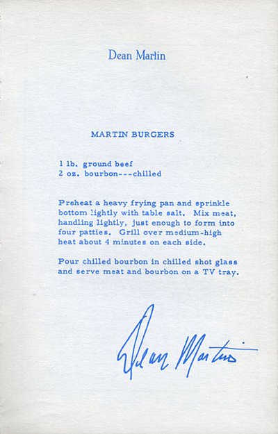
Like its better-known sister Pinterest, Gentlemint is currently accessible by invitation only. While the fellas are waiting, they might bide their time by reading the Gentlemint blog. The first post, on February 8, 2012, noted that the site’s architectural scaffolding went up some time in December, though initial users (aside from the creators) only gained access in late January. It’s a baby, man.
The basics echo Pinterest, but in manly ways. Click the mustache to “like” something. Tack, instead of pin, favorite visuals to mints (like Pinterest’s boards). If you see something ungentlemanly posted, click the Report button. Users can leave comments on individual tacks and/or share them on various social networking sites.

MANteresting claims to be the first pin board catering to men, but they blogged Friday that they’d just reached their 30 day mark. I’ll let MANteresting and Gentlemint duke it out for the title.
With its own manly lingo, MANteresting directs members to nail images to create themed workbenches. MANteresting notes that, “Invites are lame. Get started today.” So, sign up and log in via Facebook or Twitter or create a personal sign-in, and then, they direct members to:
2) Share manly things with the community.
3) View what other members are posting.
Drag and drop a “Nail it” bookmarklet to a browser’s bookmark bar and click to link an image to your workbench. As with many other pin boards, including Pinterest’s, the functionality of the bookmarklet is dependent upon which sites one is using. It’s largely impossible to nail (or pin, or heart, or tack) from Facebook or Flickr.
You can follow all of any friend’s workbenches, or just specific ones. Like Pinterest, MANteresting shares my favorite pin board feature, a “scroll to top” button that fast-forwards back to the top of any given page. For more information, play the MANteresting tutorial video.
As with Gentlemint, there’s a whole garage and work shed of hunky man-things, like booze, meat, sports, and humor.
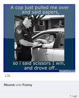
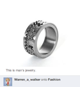
I’d like to note that there’s something of the real man (as opposed to the faux macho stereotype) that should make many women happy to find their husband’s cheerily nailing visuals. Indeed, Paper Doll was struck by the following on the MANteresting blog (or bloggity, as they’re calling it — about which I reserve comment):

There’s hope for men, yet.

DartItUp — Pretty soon, Gentlemint and MANteresting won’t be the only cool guys in the game room. DartItUp’s creators describe the site as a virtual dartboard. It’s in closed beta, so an invitation is required. Their mission?
Use dartitup to collect ideas for everything from bachelor parties to bachelor pads, sports, glutinous food and all of life’s glorious wonders. To sum it up, all things guys love. (Don’t worry ladies, you’re welcome too.)
Each visual is a dart; a redart (like a repin) gets added to your own dartboard. Each dart and redart features a link to its original source and a caption to say whatever you wish.
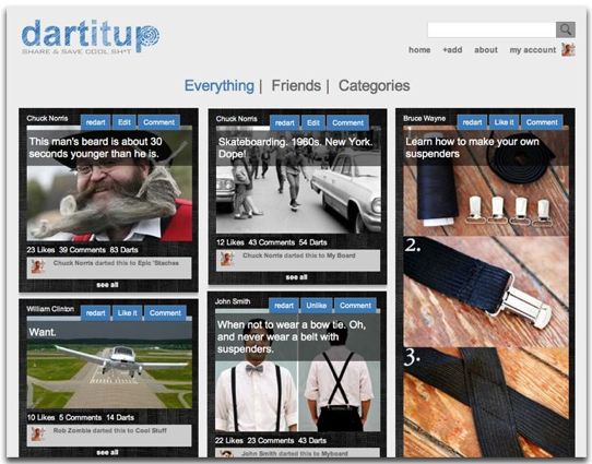
Dartitup has a twist not yet seen on the other manly pin boards: challenges! Every few days, Dartitup will issue challenges for users to find and dart the most interesting, humorous or relevant visuals to meet the challenge’s theme.
Of course, it’s not all boys vs. girls, fashion vs. Ferraris, wedding vs. World of Warcraft. Myriad pin boards join the fray to help people organize and curate their visuals. While Paper Doll can’t do justice to them all, I’d like to share a few that caught my eye.

Visual.ly is a specialty pin board for graphic design. As the site explains:
“Infographics and data visualizations … help communicate complex ideas in a clear, compact and beautiful way, taking deep data and presenting it in visual shorthand. We’ve collected the best examples on the web and gathered them for you to reference, share, and enjoy.”
You’ve probably seen some fun, interesting or illuminating infographics on the web. Let’s say you wanted to explain how big the coupon industry is, or identify the most efficient beers (potency per calories consumed); this might be your first stop. It’s not your general pin board — but if you’re a graphic designer, a blogger or in a professional realm, or even if you really just love infographics, Visual.ly is an intriguing resource.
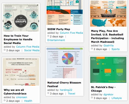
No invitation is necessary; just sign up with your pertinent information. And Visual.ly isn’t just a pin board. Sure, you can use it to explore and share spectacular infographics, but the real draw is the ability to use Visual.ly to create your own custom infographics.

Chill — is like Pinterest for videos, helping members “Make video sharing beautiful, simple and contextual.”
Chill lets you curate and share archived videos you’ve found on YouTube, Vimeo, VEVO, and Hulu. Chill also supports curating live events streamed over Ustream, Livestream, Justin.tv, and YouTube Live.
Invitation aren’t required — just authorize and sign in with Facebook. Select categories that fit your interests, like sports, music, nature, art and design, television, or technology.
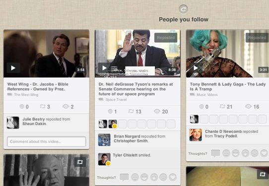
Start by dragging and dropping the pink “Chill” bookmarklet onto your browser bar. When watching a video elsewhere, merely click the “Chill” to share it with Chill friends and the wider community. You can also share videos on Facebook and Twitter, either when chilling or later on, or share a video’s URL in email and elsewhere. There’s even a private chat area nestled into a corner of the site, just like on Facebook.
I should note that Chill can be a little difficult to navigate. After several efforts, I’m still unable to figure out how to view just my own collections.

Jux lets you create professional and personal portfolios in a visually creative manner:
“Jux is the best showcase for your stories. Share words, photos and videos with unprecedented ease and impact. Fullscreen on every screen. Desktop, iPad and iPhone.”
The captivating edge-to-edge viewing offers an inventive, even futuristic, experience. Ad-free, and without sidebars or much in the way of logos or navigational buttons, Jux is designed to be thought of more as an app than a site, allowing users to manipulate and redesign material to their own specifications and style options. Whether you’re artsie or techie — I’m neither– Jux’s approach seems novel, if a bit learning-curve intensive.
Jux appears to understand the importance of organizing in the creative process, particularly eliminating the clutter of navigational tools and excess formatting. Jux breathlessly envisions a design space where:
“Content and velocity is the social network thrill. Next, stronger words, bigger pix, more opinionated countdowns and other surprises will enter the stream. Welcome to the era of high-fidelity social media. Because your beautiful, crazy-big digital camerawork ain’t going to the printer.”
In full disclosure, I can’t get past this Jux page.

He’s so dreamy.
Finally, there’s Friendsheet, a logo-less, Mark Zuckerberg-approved social plug-in for viewing your friends’ Facebook photos without having to get caught up in personal dramas, political rants or game updates. Just authorize access to your Facebook account and you’re in — the pin board has been made for you, showing just the photos from the friend profiles and business pages you follow.
This is a “Just The Photos, Ma’am (or Sir)” approach. Users can even opt to hide captions, comments and/or fan pages, and you can narrow your view to just pictures of yourself, or your friends, or your albums.
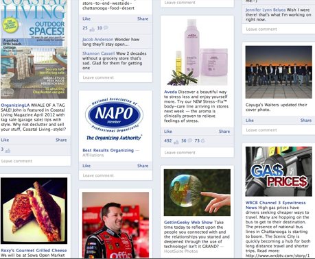
There’s no bookmarklet. Like, comment or share directly from Friendsheet to your Facebook page as if you were actually on Facebook, without viewing all the excess. You can even create albums of photos you’ve gathered from others. Most importantly, because your eyes can scan the thumbnail photos quickly, you can absorb a great deal of information, find what you want, and move on to the next part of your day. How organized!
There are many more sites to explore, but for now, we’ll have to put a pin in it.
Pinning It Down (Part 1): Not the Usual Pinterest Post
It seems like you can’t go anywhere on the web without hearing about Pinterest. You’re probably either a devoted user or have heard just enough that it’s at least on the edge of your consciousness. If you think of it as just one more social network, you may be disinclined to get involved, but the organizational benefits, whether or not you use the social features, are worth exploring.
Launched in March 2010 and accessible by invitation only, by last August, Time Magazine had named Pinterest one of the Top 50 web sites of 2011. By December, Pinterest entered the elite as one of top 10 social networks by number of users. But the uninitiated might still wonder…what is it?
Pinterest, like its less well known clones and sister sites, centers around the concept of curating visuals the way a museum curator selects, organizes and oversees the items in a collection. It follows the idea of a bulletin board or pin board, where you take the digital equivalent of snapshots, comics, magazine ads and “food porn” recipe photos and create a themed board, or series of boards. It’s a bit like your seventh grade locker.
But pin boards don’t just enable you to easily clip the visuals you like and gather them together. It’s the 21st century, so there has to be a social element. Everything you clip and pin is visible to others, both friends and strangers, who can re-pin what you’ve pinned and treat it like it’s their very own.
WHY YOU SHOULD PIN PINTEREST (AND ITS PALS)
Pin boards provide an organizational framework and creative outlet while cutting down on tangible and digital clutter. As a professional organizer, I’ve been intrigued to find that pin board usage cuts down on clutter in multiple ways:
Fewer paper clippings — I often find snow drifts of magazines and catalogs in clients’ spaces. If they’re not keeping the whole Southern Living or O, they’re piling up clippings of visually appealing items, creating a two-dimensional hoard of the things they’d like to possess in three dimensions. In an era where practically every magazine and catalog page is duplicated on the web, it’s easy to find an image and digitally clip it for safekeeping on a pin board. Trees are breathing a sigh of relief.
Less Printing — In what should theoretically be a paperless age, people are still printing recipes and food photos, online catalog pages, new car specs, fashion ideas and more. If you were confident that all of the pretty visuals that interested you were digitally tucked away, you might feel more at ease about skipping the print queue.
Less bookmark clutter — We’ve previously talked about how bookmarklets for sites like Instapaper allow you to limit printing by saving articles and posts to read later, without cluttering your computer with bookmarks you’ll never remember to revisit or use. Pin boards take this a step further because you can see what you’ve pinned in a quick scrolling glance.
Pin boards have other advantages in addition to the organizational aspects. Professionals and business owners can use pin boards to promote their businesses. Research has found that Pinterest sends more traffic to company websites and blogs than YouTube, Google+ and LinkedIn combined and that more people spend time “pinning” than conversing on Facebook. As 90% of Pinterest users are women, it’s an especially prime spot for marketing to female consumers. While marketing is outside the scope of this post, you may want to check out two recent articles on the subject:
Copyblogger’s 56 Ways To Market Your Business On Pinterest
Social Media Examiner’s 26 Tips For Using Pinterest For Business
Finally, I’ve observed one other advantage of pin boards over other social networking sites, and indeed, over other activities on the web, like reading articles and blogs. Pinning is calming. It’s hard to go anywhere on Facebook or Twitter or the blogosphere without running into something that makes your blood boil, whether it’s a political diatribe, a sign of cultural apocalypse or just egregious spelling and grammar errors that make one want to cry.
But pinning is serene — an intellectual palate cleanser. The rare comments are almost uniformly polite and encouraging, sharing in your delight at a photo of kittens snuggling stuffed animals or raindrops on roses. Pin boards are the Pause button of the web.
WHY YOU MIGHT PULL THE PIN
It can be a time sink. Like any social site — and, indeed, like most of the web — it’s easy to get sucked in and lose track of time. Remember: you don’t have to give in to the social side of it. In all cases, you can use Pinterest and other pin boards to save and organize visuals you like, as you go about your daily surfing, without seeking out friends’ and strangers’ pins. You can get the benefit while limiting, or completely avoiding, everyone else, and unlike “likes” and “retweets,” nobody’s really keeping track of how much other people are repinning their pins.
Privacy is at a premium. On Pinterest, you cannot create a private collection of pins. Everything you pin is visible to everyone else. If you’re collecting pictures for personal reasons, or wish to surprise someone with the plans you make based on pinned visuals, Pinterest will not accommodate you. (Some of the clones, however, do allow private pinning.)
Copyright violations are worrisome. In recent weeks, a hubbub has arisen over the issue of how users pin, and therefore, publish, copyrighted works in their own collections. These are then shared socially and exponentially, both on pin boards and on other social networks, without authorization or attribution. Pinterest purports to take copyright seriously, but the jury is out on what these sites might mean, long-term. For more on this topic, you may wish to read:
A Lawyer Who Is Also A Photographer Just Deleted All Of Her Pinterest Boards Out of Fear
What You Should Know About Pinterest and Copyright
Pinterest, Copyright and Terms of Service
PINTEREST AND PALS
To borrow from an old saying, if you build a better mouse trap and take a picture of it, and then post it on the web, lots of people will repin it and eventually the world will beat a path to your door.
Pinterest is widely seen as a women’s playground. While that’s not the whole story, many of the pinned themes — food, fashion and decor — lend themselves to stereotyping. Today, we’ll look at a number of those possibly (but not exclusively) femme-centric pin-a-likes. Next week, we’ll examine specialty sites targeting men (there are more than you think), and other niche pin boards.

Pinterest is the original pin board-based social photo-sharing site. In their own words:
“Pinterest lets you organize and share all the beautiful things you find on the web. People use pinboards to plan their weddings, decorate their homes, and organize their favorite recipes. Best of all, you can browse pin boards created by other people. Browsing pin boards is a fun way to discover new things and get inspiration from people who share your interests.”
Paper Doll is not particularly girlie — I have no wedding plans, no decor and no recipe boards, though I do have one non-organizing board with very yummy-looking food.
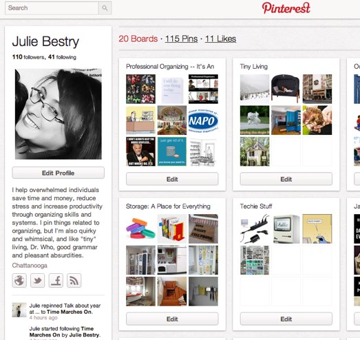
Simply install a bookmarklet in your browser bar. As you surf the web and find a visual you like, click the bookmarklet (or a Pinterest icon a site owner may have already installed) to alert Pinterest you wish to pin this photo to one of your pre-existing collections (boards) or create a new board. Name the board, name the pin and write some brief descriptive copy, and even opt to post your find to Twitter and/or Facebook. Follow others’ individual boards (or all of their collections in one fell swoop) and surf Pinterest to see all users’ contributions or just those of the people you follow.

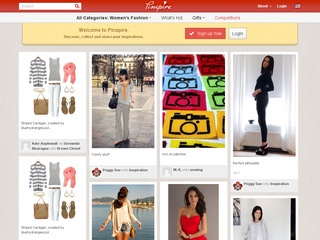
Pinspire — is a German-based pin board allowing international users to “Discover, collect and share.” It appears to be an exact duplicate (some might say copycat) of Pinterest, down to the color scheme and layout, with one appealing twist — users may join immediately via Facebook or Twitter authorizations. No invitation is necessary.
Polyvore, with the motto “Clip, Style, Share,” is one of the biggest sites you’ve probably never heard of! One of the web’s largest fashion community sites, it has more than 13 million unique monthly visitors in a global community that has created over 42 million wardrobe “sets” shared across the web.
Polyvore is a pin board for true fashionistas. Grab individual photos as if you were tearing apart magazine layouts, then recombine items to your heart’s desire to get a handle on the kinds of wardrobes you want to create.
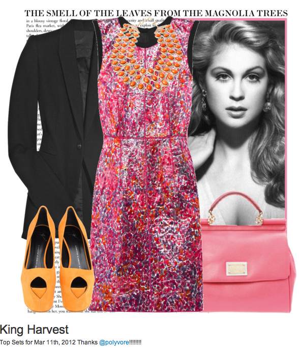
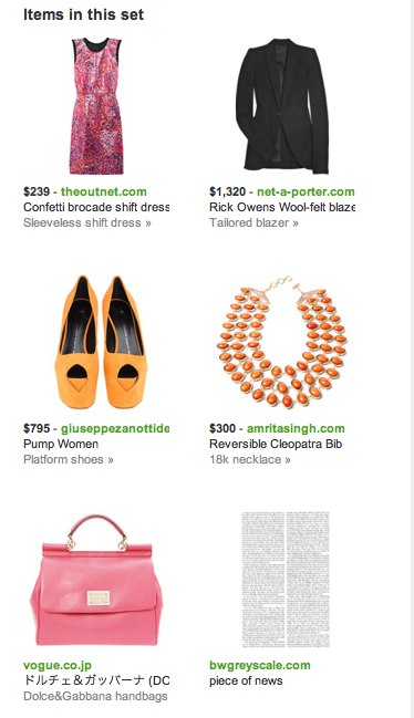
On the same page with the collage of the items you’ve “torn” from elsewhere, you’ll find the individual items in the set, each with its pertinent purchase information.
There’s even an Ask section for seeking fashion advice from fellow Polyvorians.

Fancy calls itself “part store, blog, magazine and wishlist,” and is definitely consumer-oriented, encouraging users to follow high-end retailers’ collections and unlock special deals as they add to their personal catalogs. Connect with Twitter or Facebook, then drag the bookmarklet to your browser bar and start “fancying” the things you might want to buy! Alternatively, you can upload photos from your hard drive or add fancied items via email, attaching visuals and addressing them to your personalized Fancy address.
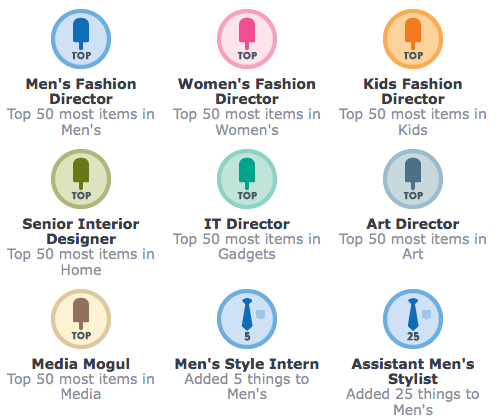
Fancy has some of the most visually arresting photos of travel destinations, high-tech gadgets and the hautest of haute couture, but a much lower cutesie quotient than Pinterest. Browse the entire site or search by categories, stores or brands. You can make catalogs, as well as followed category lists, private, and earn social achievement badges for curating your visuals:
Paper Doll must note that navigation of Fancy is the most unintuitive of all the pin boards I’ve tried.

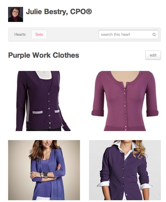
We Heart It calls upon you to “organize and share the things you love.” Sign up via Twitter or Facebook, then automatically follow all of your friends from Twitter, Facebook or Gmail from there. Create a set (like a board on Pinterest) and then start hearting things from We Heart It or elsewhere.
With a seriously poppy fashion-oriented bent, We Heart It skews female and young, more teens and college age — think of it as the daughter or (much younger) sister of Pinterest. This may explain why, when I searched for “suits” I found pictures of men in suits…and girls in bathing suits that appeared to be made of dental floss. Pinning from other sites may yield the mature “hearter” more appropriate choices.
Pin yourself a note to return next week, when we explore alternative boards for men and sites that focus on videos, graphic design, and other nifty pinning niches.


Follow Me