Tech Planning on Paper: From Old-Fashioned to Cutting Edge
Are you techie? Or do you have a loved one (a geeky grandkid, a web-designing date, a TechCrunch crush) whom you want to impress with a gift that shows you really get it? Last December, Paper Doll‘s 2012 Holiday Gift List: A Compendium of Practical Delights referenced an item that I thought would be a fun little gift for web-designing pals.
It was a short reference to UI Stencils’ Browser Dry-Erase Board. I didn’t even review the 9″ x 12″ twenty-pixel grid browser template — I’d merely mentioned that it “bridges the gap between brainstorming and web design with a page-organizing tool that can be revised with the swipe of a dry-eraser. It’s $26.95 and no batteries or chargers are necessary!” And I put up a photo.
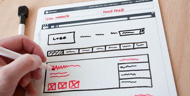
It turns out that I’d stumbled onto an area of paper organizing that I didn’t even know existed. It’s called paper prototyping, and my tech peeps tell me that even in this modern world of apps, the best way to start brainstorming and designing a user-facing digital experience is on paper. Who knew?
The above photo excerpt is taken from Paper Prototyping for Tiny Fingers, a 1994 article from the Practical Programmer column in Communications of the ACM, a computer and IT industry journal/site. I had no idea how much this concept would appeal to my tech peeps (and their loved ones, who were able to cross the perfect stocking stuffer off their shopping lists) until the mail (and tweets) started pouring in. Since then, two other nifty paper-based tech planning tools have come my way.
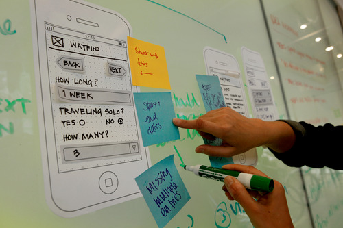
Sticky Jots is the brainchild of two grad students from the School of the Visual Arts in New York City, Pam Jue and Rae Milne, who really love and believe in the power of sticky notes. In their own words, “When designers go straight to the computer instead of starting out with pen and paper, they get caught up in the details instead of seeing the bigger picture. Not thinking systemically can lead to miscommunication or, worse, unintended consequences and inappropriate design choices.” (For more, read, “So Why Sticky Jots?”) Of course, by starting with paper, these gals are warming Paper Doll‘s heart.
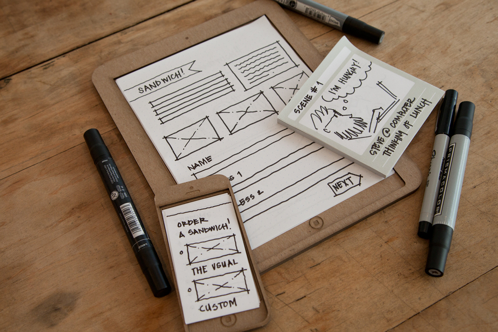
Sticky jots start with two basic elements: a pad of sticky note templates and a clipboard-esque base. Both are designed to scale to reflect the size and shape of a smartphone and/or tablet so the designer (or you, wearing your “Look at me, I’m a designer” hat) can get a sense of the big-picture approach to designing the app interface in a less abstract, more systematic way. Start with your initial image, and then sketch out different approaches, switch elements until you get the look and flow you want, and you never have to erase (or even create) a line of code until it’s all looking the way you envision.
Sticky Jots come in kits and individual elements, including:
- Everything Kit ($50) — One mobile template base, two mobile template sticky pads, one tablet template base, two tablet template sticky pads, and two storyboard (of which, more later) template sticky pads
- Mobile Kit ($24) — One mobile template base, two mobile template sticky pads and one storyboard sticky pad
- Tablet Kit ($24) — One tablet template base, two tablet template sticky pads and one storyboard sticky pad
- Storyboard template sticky pads, set of six ($12)
- Mobile template sticky pads, set of six ($8)
- Tablet template sticky pads, set of six ($24)
Each sticky pad includes 50 template sheets. The mobile and tablet pads have dot grid patterns to enable easier and more precise sketching. To aid in the design process, Sticky Jots provides a downloadable workflow template.
(Sticky Jots aren’t just for budding tech-heads. Maybe you’re a novelist, filmmaker, or some other narrative wunderkind. If so, you can use Sticky Jots to create and modify storyboards in a visual way. Left-brainers like Paper Doll think of narratives as bulleted or numbered plot points in outline form. But those of you creative types who are at home in your right-brained thinking can move dialogue from the introduction to the denouement or switch the action sequence in Act II for the love scene in Act III with a quick flip of some sticky notes…without that ever-present fear that you’ll accidentally delete something. Lift, move, stick. Done!)
App Seed, which like Sticky Jots, got its start on Kickstarter, reminds me a little of the Evernote Smart Notebook by Moleskine, which we’ve discussed previously, in terms of the interactivity between the paper and the digital. The Canadian team is led by Greg Goralski.
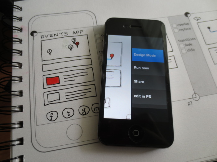
App Seed has two parts: a sketchbook and an app. (There are also whiteboard stickers because, well…because stickers are cool.) Basically, you start with the printed paper template and start drawing the elements of your user-interface design. But then the tech part gets added. As the creative team explains the concept:
AppSeed lets you take your sketches and make them into functioning prototypes, bridging the gap between pen/paper and digital, through computer vision. It allows you to sketch your designs as you normally would and then manipulate your sketches directly on your phone. Unlike similar products, the use of computer vision speeds up the process and understands your sketches. AppSeed can identify an enclosed space in your sketch, allowing you to make it into a button, input text, map, or another UI element. Making your sketch into a functioning prototype running on your phone.
In other words, it’s magic. See how it works:
So, you sketch your designs and then capture them, using your smartphone or tablet’s camera. Then, App Seed uses “computer vision” (which sounds like a superpower to Paper Doll) in order to automatically crop your paper design to the right space. Then it isolates each element that you drew — separately — so that you can manipulate and interact with those elements — for real!
For some perspective, with Sticky Jots, you create the vision of what you’d like to have your technology do, but eventually you have to seek out someone (or some way) to make it happen. With App Seed, once you upload your design into the “computer vision,” you can then actually make the elements work in the user interface you’re designing. It takes the big picture and makes it come alive. (Try to tell me that’s not magic!)
Actually, these magicians are willing to share their secrets, as they explain,
“The secret sauce behind AppSeed is the use of computer vision to search your sketch and isolate individual elements. Specifically, we use the wonderful OpenCV (an open source computer vision code library: opencv.org) to isolate lines and drawn shapes within your sketches. We then use our own algorithms to identify the UI elements.”
The OpenCV takes your elements and creates buttons, maps, street views, form inputs and more, and then lets you run and share an HTML5 prototype with others on your team (or, y’know, someone who actually understands what you’re trying to accomplish).
From this point, you can export and edit the elements “in Photoshop through PS Connection. This creates a Photoshop document that has all your drawn elements on their own layers, giving you the pixel perfect control to move your design into the next stages of production,” per App Seed.
App Seed’s Kickstarter campaign just hit its funding goal this week, so it’s not available quite yet. Per the Kickstarter page, it should be up and running by January 2014.
Whether these paper prototype templates seem nifty because you’d use it for your own tech design, or neato because you have absolutely no idea what any of it means but it sounds like Sci-Fi, they’re nonetheless a fascinating set of examples of the intersection of paper and technology and how the two can be combined to better organize our world.


Sticky Jots is very cool – and I could see how it would work well for story boarding. It also vaguely reminds me of a software called Scrivener that writers often use to organize their work.
But AppSeed…well, that DOES look like magic.It’s fascinating.