Don’t Be Listless…Be Listy (And Happy!) With WorkFlowy
Recently, a few social networking pals on Twitter and Facebook posted about a new list-related site called WorkFlowy. I thought that was an awfully odd little name, and figured I’d pull up the site, give it a glance and then save it in the bookmark folder I’m using to collect sites to update the information I provided the last time I talked with you about To Do lists and sites to help others with their To Dos.
It’s been almost three years, but I’ve been in no rush to revamp and revise. As much as I enjoyed testing to provide readers with a sense of what nouveau To Do-ness they offered, each site left me cold. (Of course, in the case of Remember the Milk, that’s a good thing. You can’t stay awake to write a blog post if your milk is warm, right?)
As I’ve been examining newer To Do sites, apps and programs, I’ve clarified my vision of what I hope to present. Eventually, there will be a Paper Doll series on paper-based time management systems. I’ve reviewed all my old Getting Things Done notes from my readings of David Allen, and I’ve followed the teachings of Mark Forster, mostly second-hand via the blog of fellow Professional Organizer, Janine Adams of Peace of Mind Organizing. (Forster’s the one who came up with the various iterations of the AutoFocus system that went viral a few years ago and the new SuperFocus system, which I’ve yet to research.) Among the paper-based time management systems, there’s even The Pomodoro Technique, which creates a time-limited system for achieving goals and has something (obliquely) to do with tomatoes.
I’ve researched all of these (and am excited to investigate further, as my colleague Emily Wilska, of San Francisco’s The Organized Life will be presenting two jam-packed sessions on these systems at this week’s annual conference of the National Association of Professional Organizers.

To me, paper-based really means list-based. I’m flexible. It doesn’t have to be on paper. However, none of my research, back then or in recent months, had yielded a To Do list site or app that had the the paper-y ease of use I was seeking. Until WorkFlowy.
Readers, you know I don’t generally gush, but (at the risk of sounding like a late-night infomercial) thirty minutes after starting to use WorkFlowy, I was tweeting its merits to fellow professional organizers and the public at large. Over the last few weeks, I’ve put WorkFlowy through its paces during one of my busiest times of the year, and it has not disappointed.
I love it. Not just for what it does do, but for what it does not. WorkFlowy is elegance in its simplicity. It lets you create lists, sub-lists and sub-sub-lists. It lets you see what you want, hide what you don’t want to see (until you want to see it again), move items as necessary and more. Yet WorkFlowy does not offer so many options that you’d likely forget the features exist, and nothing requires reading a manual to understand (although there is a nifty video to help you get things started).
I’ve found what is, to Paper Doll, the Holy Grail of To Do lists. It lets you do everything you could do with a pad of paper, with all the features that we’ve come to love from word processing programs, like the ability to cut and paste to rearrange text. While mind-mapping is great for visual people, many of us think in words and outlines, in bullet points and lists. But if third grade Social Studies outlines (Roman Number I, capital letter A, numeral 1, lowercase letter a) is a bit overambitious for your cognitive framework, WorkFlowy bridges the gap between complexity and chaos. It’s just yummy. (See? I gushed!)

GETTING STARTED
WorkFlowy is easy to use. Sign up by providing your email address and creating a password. That’s it. Really.
Once you’ve signed up, you’ll be presented with a pop-up screen that shows the same introductory video to which I linked above, and a cheat sheet of commands and shortcuts. But don’t worry — everything is so intuitive, you won’t really need the cheat sheet.
When you’ve soaked it all in, hit the close box in the upper right corner, which points helpfully to the “Help” menu. If you ever need to access either the video or the cheat sheet, it’s as near as clicking “Help”. (Forgive me for not being able to show you the Help button, but WorkFlowy is wider than my blog screen.)
You’ll be provided with a blank page with one bullet point. One lonely little dot.

Type something. Let’s say it’s your task list. Type “Task List”. Then hit enter and type something else, like “Shopping List”. Lather, rinse, repeat.
FORMATTING YOUR LISTS
At the end of any given bullet point, you can hit enter and tab, and the next bullet will indent underneath the parent bullet. You can type wherever your insertion cursor is blinking, or click the plus sign next to “Create new item” and that lonely little dot becomes an active, powerful task item.
If you forgot something that you want to add in a list, place your cursor at the end of any item in that list, hit enter, and you’ll have a bullet item, properly lined up. If you realize you’ve created a sub-tab too deep in the hierarchy, you don’t even have to erase and re-replace your cursor. Just as you increase the indenting by clicking your tab key, you can decrease the indenting by clicking shift and tab.
To promote a bullet to a higher level in the hierarchy, decrease the indenting; to demote it, increase the indenting. However, if you wish to move a sub-bullet to another location, just grab the little multi-directional arrow parallel to any bullet point but all the way on the right of the screen:

and drag the arrow in any direction and drop it where you want the bullet to relocate.
THE DETAILS
WorkFlowy’s interface is exactly like Word or any other word processing program — use the same keyboard shortcuts you’d normally use to cut and paste, copy or edit text. If you type a complete URL (including the http://), WorkFlowy will make it an underlined, clickable link. (This makes it ideal for researching and planning blog posts.)
You can collapse (hide) or expand (show) any given list or sub-list by clicking the tiny plus or minus sign that appears next to any given bullet when you hover your cursor. If everything is currently hidden:
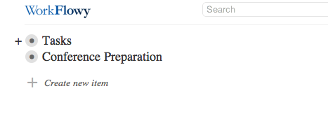
you merely hover your cursor over the bullet (to make the + appear) and click the plus sign to expand so you can see just that bulleted list and any or all the bulleted sub-lists:
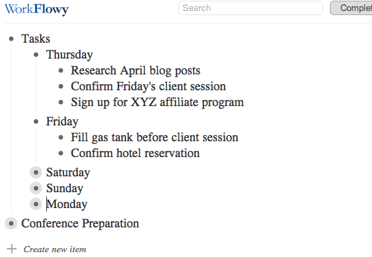
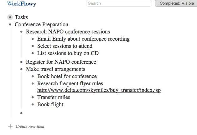
Above, Thursday and Friday’s bulleted sub-lists are visible, Saturday-Monday’s are collapsed and everything under the next main bullet is hidden. With one keystroke, you can expand or collapse as you see fit. In under two seconds, my view of the above list can change to:
As you type, WorkFlowy auto-saves every few seconds. However, there is a “Saved” button at the top of the page so that you can gauge whether your very last keystroke was saved before you log out or close the browser window. There’s also a “Search” box, so even if a list is collapsed, you can locate a key word or reference.
THE EXTRAS
In addition to controlling the formatting of the page, you can modify any item by hovering your cursor over the bullet. A little menu will pop up to the left to indicate your options for that specific bullet point:
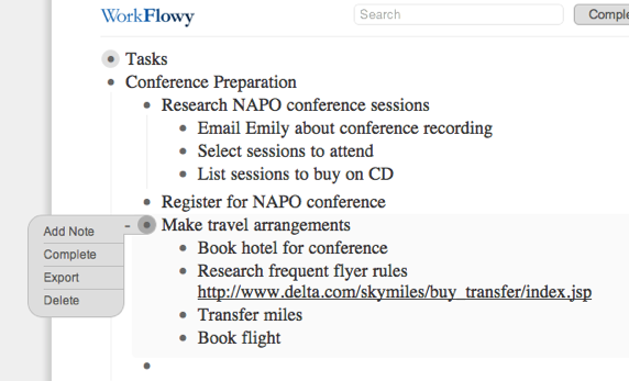
You can:
Add a note, which opens un-bulleted space right under any bullet, so you can make notes to yourself about the list without the note becoming caught up in the list hierarchy.
Complete allows you to strike through that bullet item to indicate completion. Once you have lots of completed items, if it gets untidy, there’s a button at the top of the screen giving you the option to toggle Completed: Visible or Completed: Hidden so you can decide, on a macro level, whether you wish to see completed tasks.
Export lets you export a particular list or sub-list (rather than the whole shebang):
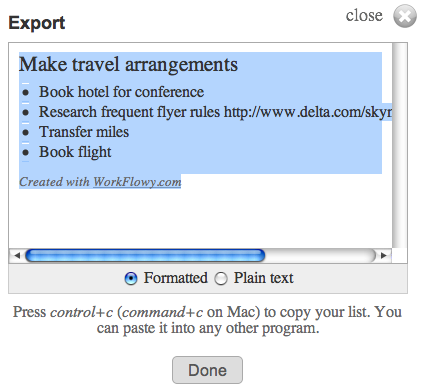
so you can include it in a report, email or any other document. If you want to export your whole mega-list (for backup purposes), there’s an “Export All Lists” link at the bottom of the screen.
Delete lets you delete a particular bullet and any sub-bullet under it. I was all set to warn you to be careful, because WorkFlowy does not ask for confirmation of deletion, and Control-Z or Command-Z does not apply. However, I discovered that whenever you delete a bullet or series of bullets, a menu appears at the top of the screen, offering you an option to UNDO the deletion. If you click it, you’ll be offered further instructions:
THE DRAWBACKS
While WorkFlowy is perfect for Paper Doll, certain missing attributes are deal-breakers for other users. For example, WorkFlowy:
—does not have color coding. Text is in black on white. When you mark an item as complete, it appears slightly dimmed with strikethrough text.
—does not have aesthetic formatting. You can highlight a word and click Control-B or Command-B until the cows come home, but you won’t be able to make the text bold.
—does not sync with iCal, Google Calendar or any other app. It’s up to you to figure out when you’re going to accomplish any given task and how you’ll alert yourself to do it.
—doesn’t have offline support, which I know is a sticking point for those who use laptops, tablets and smart phones in environments where Wi-Fi (or any Fi, or 3G or 4G or any old G) may not be available.
THE FUTURE OF WORKFLOWY
What about other high-tech issues, like security, mobility and collaboration?
WorkFlowy already works in a secure environment. Just go to https://workflowy.com/ and you’re all set. (In fact, WorkFlowy beat Facebook to the punch on this feature.)
WorkFlowy is continuing to work on fully-featured mobile versions. Just three months ago, their preview version for mobile devices let users view lists, expand and collapse sub-lists and zoom in, but it was more “read” than “write” because it lacked editing features (and the aforementioned offline support).
The WorkFlowy team moves quickly, though. iPhone, iPad and Android users can now edit on their devices, and the mobile interface is constantly being upgraded.
As for collaboration, team access to lists is in development. As a first step, if WorkFlowy is open in two tabs, or on a computer and a device, changes made in one are reflected on the other.
Not bad for a five-month-old site that’s still in beta, eh?
There’s no shortage of To Do apps on the web, and Paper Doll isn’t a savvy enough prognosticator to call this the next Google, Evernote or Dropbox. But I really, really like WorkFlowy, and I think you might, too. Try it out, and please share your comments below.




Follow Me